Bootstrap is a popular and open-source tool for building websites and web apps that work great on any device. It provides a range of ready-to-use HTML, CSS, and JavaScript components. Like buttons, forms, and navigation bar, etc. These elements can be put right into any project.
Bootstrap's main use is to make building user interfaces easier and quicker. It provides uniform and flexible tools that suits various devices and screen sizes. Bootstrap uses a flexible grid system. This system allows developers to make layouts that adjust themselves to different screen sizes.
Prerequisites
- HTML and CSS Knowledge: Understanding of HTML, CSS is important.
- Basic JavaScript Knowledge: Having a basic understanding of JavaScript can be beneficial.
- Text Editor or IDE: A text editor or IDE to write and edit HTML, CSS, and JavaScript files.
- Web Browser: A web browser to view and test the Bootstrap projects.
Basics of Bootstrap
- Grid System: Bootstrap uses a 12-column layout. This lets coders make stretchy, adaptable designs. They split the layout into rows and columns.
- Components: Bootstrap has many ready-to-use UI parts. These include buttons, forms, navigation bars, cards, and more. They easily fit into projects.
- Utilities: Bootstrap has utility classes for usual CSS properties. These cover spacing, typography, colors, and more. They let coders make fast style adjustments.
- Responsive Design: Bootstrap helps make designs that adapt. They fit different screen sizes and devices, keeping user experience uniform across platforms.
- Customization: Bootstrap can be changed using SASS variables and mixins. This lets coders adapt the framework to meet specific project needs and design likes.
- Layout Choices: Bootstrap gives you layout choices like containers, fluid containers, and responsive breakpoints. It makes web designing flexible.
- JavaScript Plugins: Bootstrap has JavaScript tools. They add fun stuff like modals, tooltips, and carousels to web applications.
- Browser Friendly: Bootstrap works well with different web browsers. It helps websites and web app look the same on all of them.
- Documentation and Community: Bootstrap offers easy-to-understand guides, tutorials, and a helpful community. These resources help developers use the framework well.
- Accessibility: Bootstrap keeps everyone in mind. It follows the best practices to make websites and web apps helpful and accessible to all, even those with disabilities.
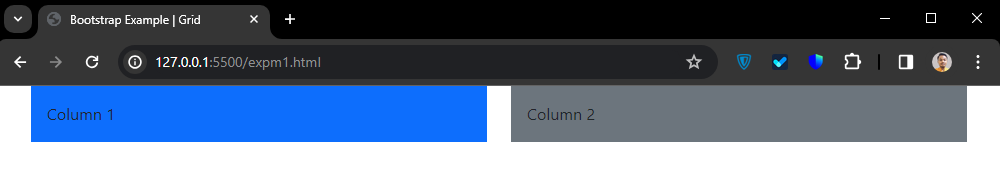
Example: This shows a basic two-column design using Bootstrap's grid system. The column sizes adapt based on the device's screen size. It's an adjustable design for various devices.
<!DOCTYPE html>
<html lang="en">

<head>
    <meta charset="UTF-8">
    <meta name="viewport" content="width=device-width,
                                   initial-scale=1.0">
    <title>Bootstrap Example | Grid</title>
    <link href=
"https://cdn.jsdelivr.net/npm/bootstrap@5.3.3/dist/css/bootstrap.min.css"
          rel="stylesheet">
</head>

<body>
    <div class="container">
        <div class="row">
            <div class="col-md-6">
                <div class="bg-primary p-3">
                    Column 1
                </div>
            </div>
            <div class="col-md-6">
                <div class="bg-secondary p-3">
                    Column 2
                </div>
            </div>
        </div>
    </div>
    <script src=
"https://cdn.jsdelivr.net/npm/bootstrap@5.3.3/dist/js/bootstrap.bundle.min.js">
      </script>
</body>

</html>
Output:
grid
Steps to run the code
- Create theHTML File
- Write Html, css and js code.
- Save the HTML File
- and Open the HTML File in a Web Browser
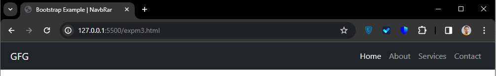
Example: Here's a simple example on Bootstrap's Navigation Bar! It makes a responsive bar that resize for screens sizes. It has a logo, a toggler button, and a menu with links that collapsible. All styled with Bootstrap's ready-to-use classes for a uniform look on any device or browser.
<!DOCTYPE html>
<html lang="en">

<head>
    <meta charset="UTF-8">
    <meta name="viewport" content="width=device-width,
                                   initial-scale=1.0">
    <title>Bootstrap Example | NavbRar</title>
    <link href=
"https://cdn.jsdelivr.net/npm/bootstrap@5.3.3/dist/css/bootstrap.min.css"
          rel="stylesheet">
</head>

<body>
    <nav class="navbar navbar-expand-lg
                bg-dark navbar-dark px-2">
        <div class="container-fluid">
            <a class="navbar-brand"
               href="#">GFG</a>
            <button class="navbar-toggler"
                    type="button"
                    data-bs-toggle="collapse"
                data-bs-target="#navbarSupportedContent"
                    aria-controls="navbarSupportedContent"
                    aria-expanded="false"
                aria-label="Toggle navigation">
                <span class="navbar-toggler-icon"></span>
            </button>
            <div class="collapse navbar-collapse"
                 id="navbarSupportedContent">
                <ul class="navbar-nav ms-auto mb-2 mb-lg-0">
                    <li class="nav-item">
                        <a class="nav-link active"
                           aria-current="page"
                           href="#">Home</a>
                    </li>
                    <li class="nav-item">
                        <a class="nav-link"
                           href="#">About</a>
                    </li>
                    <li class="nav-item">
                        <a class="nav-link"
                           href="#">Services</a>
                    </li>
                    <li class="nav-item">
                        <a class="nav-link"
                           href="#">Contact</a>
                    </li>
                </ul>
            </div>
        </div>
    </nav>
    <script src=
"https://cdn.jsdelivr.net/npm/bootstrap@5.3.3/dist/js/bootstrap.bundle.min.js">
      </script>
</body>

</html>
Output:
navbar
Advantages of using Bootstrap
- Responsive Design: Bootstrap simplifies the process of creating websites and web applications optimized for an various devices, from large desktop monitors to compact smartphone screens.
- Time-saving: With a variety of ready-made templates, elements, and styles, it affords coders the convenience to quickly build and prototype user interfaces precluding the need to initiate from scratch
- Consistency: Bootstrap extends a consistent and standardized set of UI elements and styles, thus ensuring a united and professional impression across different parts of a project.
- Ease of Use: The grid system of Bootstrap, simplistic and user-friendly, combined with pre-constructed elements and utilities, avails developers of all levels to use and personalize it effortlessly.
- Community and Support: Bootstrap has a large, robust community of users and builders, proffering comprehensive guides, instructional materials, and resources for guidance and troubleshooting.
- Customization: Bootstrap has ready-made components, it is also customizable. Styles, layouts, and components are easily modifiable by developers to meet the specific project requirements.
How to use Bootstrap in a Project?
- HTML and additional CSS classes from Bootstrap are what Bootstrap components use.
- If we want Bootstrap in our project, we have options. we can download the compiled CSS and JavaScript files or use something called a content delivery network (CDN).
- The way to use Bootstrap classes is by putting them right on the HTML elements. That helps with style and setting up things.
Bootstrap can set up in several ways:
By using npm:
One way is using npm (Node Package Manager). To do this, go to your project folder in the terminal(or cmd). Run the command npm install bootstrap. Bootstrap will automatically download and set up in your project.
npm install bootstrapto install with npm we have to run the following command, this will install bootstrap.
Example:
<!DOCTYPE html>
<html lang="en">
<head>
  <meta charset="UTF-8">
  <meta name="viewport" content="width=device-width, initial-scale=1.0">
  <title>Bootstrap Downloaded By NPM</title>
  <link href="node_modules/bootstrap/dist/css/bootstrap.min.css" rel="stylesheet">
</head>
<body>
  <h1 class="text-danger text-center">Bootstrap Downloaded By NPM</h1>
  <script src="node_modules/bootstrap/dist/js/bootstrap.bundle.min.js"></script>
</body>
</html>
By downloading files:
- Another option is Download Bootstrap by manually from its official site (https://getbootstrap.com/). Then, add it to your project's HTML file with a relative path.
- Download Bootstrap from https://getbootstrap.com/docs/5.3/getting-started/download/ Compiled CSS and JS there was a zip file, so extract it and include it in your project directory.
Example:
<!DOCTYPE html>
<html lang="en">

<head>
  <meta charset="UTF-8">
  <meta name="viewport" content="width=device-width, initial-scale=1.0">
  <title>Direct manually Download example</title>
  <link href="bootstrap-5.3.3-dist/css/bootstrap.min.css" rel="stylesheet">
</head>

<body>
  <h1 class="text-success text-center">The manually Download example</h1>
  <script src="bootstrap-5.3.3-dist/js/bootstrap.bundle.min.js"></script>
</body>

</html>
By using CDN:
- You can also use Bootstrap via a CDN (Content Delivery Network). To do this, add the Bootstrap CSS and JavaScript CDN links to the <head> section of your HTML file.
- The latest bootstrap cdn can found in the bootstrap website https://getbootstrap.com/docs/5.3/getting-started/introduction/ .
Example:
<!DOCTYPE html>
<html lang="en">
<head>
  <meta charset="UTF-8">
  <meta name="viewport" content="width=device-width, initial-scale=1.0">
  <title>bootstrap CDN example</title>
  <link href="https://cdn.jsdelivr.net/npm/bootstrap@5.1.3/dist/css/bootstrap.min.css" rel="stylesheet">
</head>
<body>

    <h1 class="text-info text-center">bootstrap CDN example</h1>
  <script src="https://cdn.jsdelivr.net/npm/bootstrap@5.1.3/dist/js/bootstrap.bundle.min.js"></script>
</body>
</html>
Note: Each method is easy and straightforward. You can decide what suits you best depending on the project's requirements!