Dropdowns in navigation bars are used to organize and display a variety of menu options within a limited screen size. Dropdown allow users to access multiple pages or sections of a website without hampering the interface of a website. We will see how to create a responsive navigation bar with a dropdown in HTML, CSS, and JavaScript.
Approach
- First, create a basic HTML structure for your web page and add some nav elements and a drop-down button so that when a user hovers over it the drop-down menu should be visible to the user.
- Then use CSS to style your navigation bar elements, including fonts, colors, spacing, and layout.
- And use the javascript to show the hamburger menu when the screen size is small and also add an event listener on it to show the navbar on the small screen.
- You can make the website responsive using CSS media query.
Example: The example shows how to create a responsive navigation bar with a dropdown.
HTML
<!DOCTYPE html>
<html lang="en">
<head>
<meta charset="UTF-8">
<meta name="viewport"
content="width=device-width, initial-scale=1.0">
<title>Responsive Navigation
Bar With Dropdown
</title>
<link rel="stylesheet" href=
"https://cdnjs.cloudflare.com/ajax/libs/font-awesome/5.15.4/css/all.min.css">
<link rel="stylesheet" href="style.css">
</head>
<body>
<header class="header">
<a href="/" class="brand-logo-a-tag">
<img src="https://media.geeksforgeeks.org/gfg-gg-logo.svg"
alt="Brand logo">
<span class="brand-logo-name">GFG</span>
</a>
<nav class="navbar">
<ul class="navbar-lists" id="myTopnav">
<li>
<i class="fas fa-home"></i>
<a class="navbar-link home-link"
href="#">
Home
</a>
</li>
<li>
<i class="fas fa-user"></i>
<a class="navbar-link about-link"
href="#about-us-section">
About Us
</a>
</li>
<li>
<i class="fas fa-envelope"></i>
<a class="navbar-link contact-link"
href="#contact-form">
Contact Us
</a>
</li>
<li class="dropdown">
<button class="dropbtn">
Dropdown
<i class="fas fa-caret-down"></i>
</button>
<div class="dropdown-content">
<a href="#" class="navbar-link">
<i class="fas fa-user"></i>
Your Profile
</a>
<a href="#" class="navbar-link">
<i class="fas fa-newspaper"></i>
Your Articles
</a>
<a href="#" class="navbar-link">
<i class="fas fa-graduation-cap"></i>
Your Collage
</a>
</div>
</li>
<li>
<label class="switch">
<input type="checkbox"
id="darkModeToggle">
<span class="slider round"></span>
</label>
</li>
</ul>
<a href="javascript:void(0);"
class="icon" onclick="myFunction()">
<i class="fa fa-bars"></i>
</a>
</nav>
</header>
<main>
<section id="about-us-section">
<div class="about-us-container">
<h2 class="aboutus-heading">
About Us
</h2>
<p>
<strong class="subheading">
Company Profile and Brand:
</strong>
GeeksforGeeks is a leading platform that
provides computer science resources and
coding challenges for programmers and
technology enthusiasts, along with
interview and exam preparations for
upcoming aspirants. With a strong
emphasis on enhancing coding skills
and knowledge, it has become a trusted
destination for over 12 million plus
registered users worldwide. The platform
offers a vast collection of tutorials,
practice problems, interview tutorials,
articles, and courses, covering various
domains of computer science. Our
exceptional mentors hailing from top
colleges & organizations have the ability
to guide you on a journey from the humble
beginnings of coding to the pinnacle of
expertise
</p>
</div>
</section>
</main>
<footer>
<p>© 2024 Responsive Navigation Bar
With Dropdown. All rights reserved.
</p>
</footer>
<script src="script.js"></script>
</body>
</html>
CSS
* {
    margin: 0;
    padding: 0;
    box-sizing: border-box;
}

:root {
    --header-green-color: #36ed22;
    --aboutus-background-green-color: rgb(28, 225, 97);
    --heading-color: #000;
    --primary-color: #2162e3;
    --heading-a-tag-color: #fff;
    --heading-a-tag-hover-color: #212121;
    --all-h2-color: #000;
    --aboutus-strong-color: #000;
    --aboutus-p-tag-color: #201f1f;
    --aboutus-border-color: rgb(28, 225, 97);
    --body-bg-color: rgb(28, 225, 97);
}

.dark-mode {
    --header-green-color: #515251;
    --aboutus-background-green-color: rgb(7, 8, 7);
    --heading-color: #fff;
    --primary-color: #212121;
    --heading-a-tag-color: #f2f3f9;
    --heading-a-tag-hover-color: #36ed22;
    --all-h2-color: #fff;
    --aboutus-strong-color: #36ed22;
    --aboutus-p-tag-color: #fff;
    --aboutus-border-color: rgb(142, 144, 143);
    --body-bg-color: #000;
}

body {
    font-family: Arial, sans-serif;
    background-color: var(--body-bg-color);
    line-height: 1.6;
    overflow-x: hidden;

}

.brand-logo-name {
    text-decoration: none;
    color: #fff;
    font-size: 1.75rem;
    padding: 5px;
}

a {
    text-decoration: none;
    color: var(--heading-a-tag-color);
    transition: color 0.3s ease;
}

a:hover {
    color: var(--heading-a-tag-hover-color);
}

.header {
    padding: 1.6rem 4.8rem;
    display: flex;
    justify-content: space-between;
    align-items: center;
    background-color: var(--header-green-color);
    box-shadow: 0px 0px 20px 0px rgba(132, 144, 255, 0.2);
    width: 100%;
    height: 10vh;
}

.header img {
    height: 30px;
    padding-top: 8px;
}

.navbar-lists {
    list-style-type: none;
    margin: 0;
    padding: 0;
    display: flex;
}

.navbar-lists li {
    margin-right: 20px;
}

.navbar-lists li:last-child {
    margin-right: 0;
}

.navbar-link {
    color: var(--heading-a-tag-color);
    padding: 10px;
    transition: background-color 0.3s;
}

.icon {
    display: none;
}

.navbar-lists li:nth-child(1) i {
    color: rgb(221, 228, 215);
}

.navbar-lists li:nth-child(2) i {
    color: rgb(33, 105, 239);
}

.navbar-lists li:nth-child(3) i {
    color: rgb(11, 12, 11);
}

.dropdown-content a:nth-child(1) i {
    color: rgb(33, 105, 239);
}

.dropdown-content a:nth-child(2) i {
    color: rgb(15, 223, 36);
}

.dropdown-content a:nth-child(3) i {
    color: rgb(230, 102, 17);
}


.switch {
    position: relative;
    display: inline-block;
    width: 50px;
    height: 24px;
}

.switch input {
    opacity: 0;
    width: 0;
    height: 0;
}

.slider {
    position: absolute;
    cursor: pointer;
    top: 0;
    left: 0;
    right: 0;
    bottom: 0;
    background-color: #ccc;
    -webkit-transition: .4s;
    transition: .4s;
}

.slider:before {
    position: absolute;
    content: "";
    height: 16px;
    width: 16px;
    left: 4px;
    bottom: 4px;
    background-color: white;
    -webkit-transition: .4s;
    transition: .4s;
}

input:checked+.slider {
    background-color: #2196F3;
}

input:focus+.slider {
    box-shadow: 0 0 1px #2196F3;
}

input:checked+.slider:before {
    -webkit-transform: translateX(26px);
    -ms-transform: translateX(26px);
    transform: translateX(26px);
}

.slider.round {
    border-radius: 34px;
}

.slider.round:before {
    border-radius: 50%;
}

@media screen and (max-width: 768px) {
    .icon {
        display: flex;
        position: absolute;
        top: 20px;
        left: 20px;
        z-index: 999;
        color: #fff;
        font-size: 24px;
        cursor: pointer;
        flex-direction: row-reverse;
    }

    .navbar-lists {
        display: flex;
        position: fixed;
        top: 10%;
        left: -100%;
        background-color: var(--header-green-color);
        width: 40%;
        height: 100vh;
        flex-direction: column;
        align-items: flex-start;
        justify-content: flex-start;
        transition: left 0.3s ease;
        z-index: 998;
        padding-left: 40px;
    }

    .navbar-lists.responsive {
        left: 0;
        margin-right: 2rem;
    }

    .navbar-lists.responsive li {
        margin: 10px 0;
    }

    .navbar-link {
        padding: 5px 20px;
        text-align: left;
        width: 100%;
    }

    .navbar-link i {
        display: none;
    }

}


#about-us-section {
    background: var(--aboutus-background-green-color);
    text-align: center;
    width: 100%;
    margin: 0 auto;
    margin-bottom: 3rem;
    padding-bottom: 20px;
    border: 3px solid var(--aboutus-border-color);
    border-radius: 5px;

}

.dark-mode #about-us-section {
    border: none;
}

.about-us-container {
    max-width: 800px;
    margin: 0 auto;
    padding: 0 20px;
}

h2 {
    color: var(--all-h2-color);
}

.subheading {
    color: var(--aboutus-strong-color);
}

.about-us-container p {
    font-size: 1.125rem;
    line-height: 1.6;
    color: var(--aboutus-p-tag-color);
    text-align: left;
}

.about-us-container p:first-of-type {
    margin-top: 0;
}

.about-us-container p:last-of-type {
    margin-bottom: 0;
}

@media screen and (max-width: 768px) {
    .aboutus-heading {
        font-size: 2rem;
    }

    .about-us-container p {
        font-size: 1rem;
    }
}

footer {
    background-color: #333;
    color: #fff;
    text-align: center;
    padding: 20px 0;
    position: fixed;
    bottom: 0;
    width: 100%;
}

.dark-mode footer {
    background-color: #222;
    border-top: 2px solid #fff;
}

/* Dropdown */
.dropdown {
    position: relative;
    display: inline-block;
}

/* Dropdown Button */
.dropbtn {
    background-color: var(--primary-color);
    color: var(--heading-a-tag-color);
    padding: 10px 20px;
    border: none;
    cursor: pointer;
    border-radius: 5px;
    transition: background-color 0.3s;
    display: flex;
    align-items: center;
}

.dropbtn:hover {
    background-color: var(--primary-color-hover);
}


.dropbtn i {
    margin-left: 5px;
}

.dropdown-content {
    display: none;
    position: absolute;
    background-color: #fff;
    box-shadow: 0px 8px 16px 0px rgba(0, 0, 0, 0.2);
    z-index: 1;
    border-radius: 5px;
    top: 100%;
    width: 160px;
}

.dropdown-content a {
    color: black;
    padding: 12px 16px;
    text-decoration: none;
    display: block;
}

.dropdown-content a i {
    margin-right: 5px;
}

.dropdown-content a:hover {
    background-color: #f1f1f1;
}

.dropdown:hover .dropdown-content {
    display: block;
}


@media screen and (max-width: 768px) {
    .dropdown {
        display: block;
        margin-bottom: 10px;
    }

    .dropdown-content {
        position: static;
        display: none;
        background-color: transparent;
        box-shadow: none;
        min-width: auto;
        border-radius: 0;
        width: 100%;
        top: initial;
    }

    .dropdown:hover .dropdown-content {
        display: block;
    }

    .dropbtn {
        padding: 10px 20px;
    }

    .dropdown-content a {
        padding: 10px 20px;
    }

    .dropdown-content a i {
        display: none;
    }

    .dropdown:hover .dropdown-content a i {
        display: inline-block;
    }
}
JavaScript
let darkModeToggle = document
                        .getElementById('darkModeToggle');
let body = document.body;
darkModeToggle.addEventListener('change', function () {
    if (darkModeToggle.checked) {
        enableDarkMode();
    } else {
        disableDarkMode();
    }
});

function enableDarkMode() {
    body.classList.add('dark-mode');
};

function disableDarkMode() {
    body.classList.remove('dark-mode');
};


function myFunction() {
    let x = document.getElementById("myTopnav");
    if (x.classList.contains("responsive")) {
        x.classList.remove("responsive");
    } else {
        x.classList.add("responsive");
    }
}
Output:
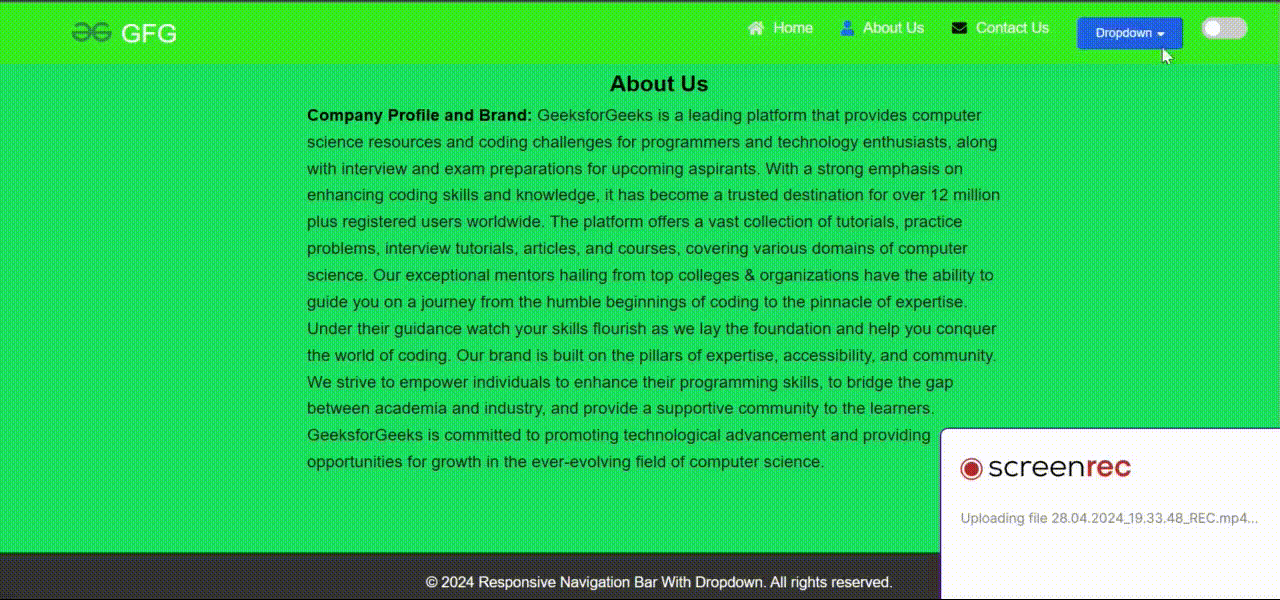
Output
Recommended Articles