Dropdown menus play a crucial role in web design, providing users with a convenient way to access additional options or navigate through a website's content hierarchy.
Preview
Approach
- The HTML structure and CSS classes used in this code are designed to create a responsive dropdown menu. Tailwind CSS provides utility classes for responsive design, allowing the menu to adapt to different screen sizes.
- Each dropdown menu is represented by a button element styled with Tailwind CSS classes for padding, background color, text color, and rounded corners. This button serves as the trigger to toggle the visibility of the dropdown menu.
- Each dropdown menu is implemented as a hidden div element positioned absolutely relative to its parent container. The menu items are styled as anchor elements within this div. Tailwind CSS classes are used for styling, including text color, background color on hover, and shadow effects.
- JavaScript functions are provided to toggle the visibility of each dropdown menu when the corresponding button is clicked. This functionality allows users to show or hide the dropdown menu by clicking the associated button.
- The dropdown menus include a fade-in animation using CSS keyframes. This animation provides a smooth transition when the menu becomes visible, enhancing the user experience.
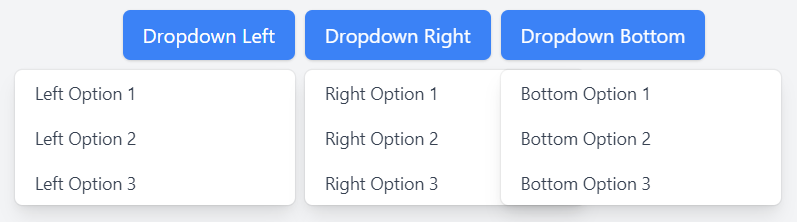
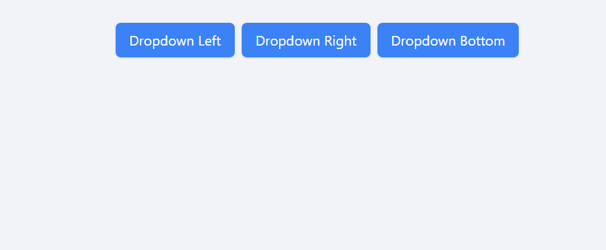
Example: Illustration of designing a responsive dropdown menu in Tailwind CSS.
HTML
<!DOCTYPE html>
<html lang="en">

<head>
    <meta charset="UTF-8">
    <meta name="viewport"
          content="width=device-width,
                   initial-scale=1.0">
    <title>Directional Dropdowns using Tailwind CSS</title>
    <link rel="stylesheet" href=
"https://cdn.jsdelivr.net/npm/tailwindcss@2.2.19/dist/tailwind.min.css">
</head>

<body class="bg-gray-100 p-4 flex flex-col
             justify-center items-center
             min-h-screen space-y-8">

    <!-- Dropdowns with buttons -->
    <div class="flex mx-2">

        <!-- Dropdown to the Right -->
        <div class="relative inline-block text-left mr-2">
            <button class="px-4 py-2 bg-blue-500 text-white
                           rounded-md shadow hover:bg-blue-700
                           focus:outline-none"
                    onclick="toggleDropdown('dropdownMenuRight')">
                Dropdown Left
            </button>
            <div class="hidden origin-top-right absolute
                        right-0 mt-2 w-56 rounded-md
                        shadow-lg bg-white ring-1
                        ring-black ring-opacity-5
                        animate-fadeIn"
                 id="dropdownMenuRight">
                <a href="#" class="block px-4 py-2 text-sm
                                   text-gray-700
                                   hover:bg-gray-100">
                  Left Option 1
                  </a>
                <a href="#" class="block px-4 py-2 text-sm
                                   text-gray-700
                                   hover:bg-gray-100">
                  Left Option 2
                  </a>
                <a href="#" class="block px-4 py-2 text-sm
                                   text-gray-700
                                   hover:bg-gray-100">
                  Left Option 3
                  </a>
            </div>
        </div>

        <!-- Dropdown to the Left -->
        <div class="relative inline-block text-left mr-2">
            <button class="px-4 py-2 bg-blue-500 text-white
                           rounded-md shadow hover:bg-blue-700
                           focus:outline-none"
                    onclick="toggleDropdown('dropdownMenuLeft')">
                Dropdown Right
            </button>
            <div class="hidden origin-top-left absolute left-0
                        mt-2 w-56 rounded-md shadow-lg bg-white
                        ring-1 ring-black ring-opacity-5
                        animate-fadeIn"
                 id="dropdownMenuLeft">
                <a href="#" class="block px-4 py-2 text-sm
                                   text-gray-700
                                   hover:bg-gray-100">
                  Right Option 1
                  </a>
                <a href="#" class="block px-4 py-2 text-sm
                                   text-gray-700
                                   hover:bg-gray-100">
                  Right Option 2
                  </a>
                <a href="#" class="block px-4 py-2 text-sm
                                   text-gray-700
                                   hover:bg-gray-100">
                  Right Option 3
                  </a>
            </div>
        </div>

        <!-- Dropdown to the Bottom -->
        <div class="relative inline-block text-left">
            <button class="px-4 py-2 bg-blue-500 text-white
                           rounded-md shadow
                           hover:bg-blue-700 focus:outline-none"
                    onclick="toggleDropdown('dropdownMenuBottom')">
                Dropdown Bottom
            </button>
            <div class="hidden origin-bottom absolute left-0 mt-2
                        w-56 rounded-md shadow-lg bg-white ring-1
                        ring-black ring-opacity-5 animate-fadeIn"
                 id="dropdownMenuBottom">
                <a href="#" class="block px-4 py-2 text-sm
                                   text-gray-700
                                   hover:bg-gray-100">
                  Bottom Option 1
                  </a>
                <a href="#" class="block px-4 py-2 text-sm
                                   text-gray-700
                                   hover:bg-gray-100">
                  Bottom Option 2
                  </a>
                <a href="#" class="block px-4 py-2 text-sm
                                   text-gray-700
                                   hover:bg-gray-100">
                  Bottom Option 3
                  </a>
            </div>
        </div>
    </div>

    <!-- Animation -->
    <style>
        @keyframes fadeIn {
            from {
                opacity: 0;
                transform: translateY(-10px);
            }

            to {
                opacity: 1;
                transform: translateY(0);
            }
        }

        .animate-fadeIn {
            animation: fadeIn 0.5s ease-out forwards;
        }
    </style>

    <!-- JavaScript function to toggle dropdown visibility -->
    <script>
        function toggleDropdown(menuId) {
            const dropdownMenu = document
            .getElementById(menuId);
            dropdownMenu.classList.toggle('hidden');
        }
    </script>

</body>

</html>
Output:
Output