A responsive navbar menu is a crucial element of a website that adjusts its layout and appearance based on the screen size and device type used by the user. This adaptability ensures that users can easily navigate the website and access its various features regardless of whether they are using a desktop, tablet, or mobile device.
Approach
- Create a <nav> element with a <ul>, <li>, and <a> for the navigation links.
- Create a CSS file and set the display-flex property as flex for <nav> element to use flexbox for layout. Set the justify-content property to space-between to keep the logo and links at opposite ends of the navbar. Apply spacing to nav links to keep space between links. Add hover effects to the navigation links for interactivity.
- We will use media queries for responsiveness. When the screen width becomes less we will change the flex direction to the flex-direction column and align items to flex-start to display them vertically.
- We will hide the navigation links by default and display them when a toggle button is clicked. Style the toggle button for visibility and interaction.
Example: Implementation of creating a responsive navbar menu in CSS.
HTML
<!DOCTYPE html>
<html lang="en" dir="ltr">

<head>
    <meta charset="utf-8">
    <meta name="viewport"
          content="width=device-width,
                   initial-scale=1.0">
    <link rel="stylesheet" href=
"https://cdnjs.cloudflare.com/ajax/libs/font-awesome/5.15.3/css/all.min.css" />
    <link rel="stylesheet" href="style.css">
</head>

<body>
    <nav>
        <input type="checkbox" id="check">
        <label for="check" class="checkbtn">
            <i class="fas fa-bars"></i>
        </label>
        <label class="logo">GFG</label>
        <ul>
            <li><a class="active" href="#">HTML</a></li>
            <li><a href="#">Javascript</a></li>
            <li><a href="#">ReactJS</a></li>
            <li><a href="#">NodeJS</a></li>
        </ul>
    </nav>
</body>

</html>
CSS
/* style.css*/

body {
    margin: 0;
    padding: 0;
    font-family: Arial, sans-serif;
  }

  nav {
    background-color: green;
    color: white;
    display: flex;
    justify-content: space-between;
    align-items: center;
    padding: 10px 20px;
  }

  .logo {
    font-size: 1.5rem;
  }

  ul {
    display: flex;
    list-style: none;
    padding: 0;
    margin: 0;
  }

  ul li {
    margin-right: 20px;
  }

  ul li a {
    color: white;
    text-decoration: none;
    transition: color 0.3s;
  }

  ul li a:hover {
    color: lightgreen;
  }

  .checkbtn {
    font-size: 30px;
    color: white;
    cursor: pointer;
    display: none;
  }

  #check {
    display: none;
  }

  @media (max-width: 768px) {
    .checkbtn {
      display: block;
      order: 1;
      margin-right: 20px;
    }

    ul {
      position: fixed;
      top: 80px;
      right: -100%;
      background-color: green;
      width: 100%;
      height: 100vh;
      display: flex;
      flex-direction: column;
      justify-content: center;
      align-items: center;
      transition: all 0.3s;
    }

    ul li {
      margin: 20px 0;
    }

    ul li a {
      font-size: 20px;
    }

    #check:checked ~ ul {
      right: 0;
    }
  }
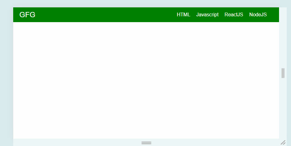
Output: