Mastering exploratory data analysis (EDA) is crucial for understanding your data, identifying patterns, and generating insights that can inform further analysis or decision-making. Data is the lifeblood of cutting-edge groups, and the capability to extract insights from records has become a crucial talent in today's statistics-pushed world. Exploratory Data Analysis (EDA) is a powerful method that allows analysts, scientists, and researchers to gain complete knowledge of their data earlier than projecting formal modeling or speculation testing.
It is an iterative procedure that entails summarizing, visualizing, and exploring information to find patterns, anomalies, and relationships that might not be apparent at once. In this complete article, we will understand and implement critical steps for performing Exploratory Data Analysis. Here are steps to help you master EDA:
Steps for Mastering Exploratory Data Analysis
Step 1: Understand the Problem and the Data
The first step in any information evaluation project is to sincerely apprehend the trouble you are trying to resolve and the statistics you have at your disposal. This entails asking questions consisting of:
- What is the commercial enterprise goal or research question you are trying to address?
- What are the variables inside the information, and what do they mean?
- What are the data sorts (numerical, categorical, textual content, etc.) ?
- Is there any known information on first-class troubles or obstacles?
- Are there any relevant area-unique issues or constraints?
By thoroughly knowing the problem and the information, you can better formulate your evaluation technique and avoid making incorrect assumptions or drawing misguided conclusions. It is also vital to contain situations and remember specialists or stakeholders to this degree to ensure you have complete know-how of the context and requirements.
Step 2: Import and Inspect the Data
Once you have clean expertise of the problem and the information, the following step is to import the data into your evaluation environment (e.g., Python, R, or a spreadsheet program). During this step, looking into the statistics is critical to gain initial know-how of its structure, variable kinds, and capability issues.
Here are a few obligations you could carry out at this stage:
- Load the facts into your analysis environment, ensuring that the facts are imported efficiently and without errors or truncations.
- Examine the size of the facts (variety of rows and columns) to experience its length and complexity.
- Identify facts sorts and formats for each variable, as these records may be necessary for the following facts manipulation and evaluation steps.
- Look for any apparent errors or inconsistencies in the information, such as invalid values, mismatched units, or outliers, that can indicate exceptional issues with information.
For this article, we will use the employee data. It contains 8 columns namely - First Name, Gender, Start Date, Last Login, Salary, Bonus%, Senior Management, and Team. We can get the dataset here Employees.csv.
Let's read the dataset using the Pandas read_csv() function and print the 1st five rows. To print the first five rows we will use the head() function.
import pandas as pd
import numpy as np
# read datasdet using pandas
df = pd.read_csv('employees.csv')
df.head()
Output:
    First Name    Gender    Start Date    Last Login Time    Salary    Bonus %    Senior Management    Team
0    Douglas    Male    8/6/1993    12:42 PM    97308    6.945    True    Marketing
1    Thomas    Male    3/31/1996    6:53 AM    61933    4.170    True    NaN
2    Maria    Female    4/23/1993    11:17 AM    130590    11.858    False    Finance
3    Jerry    Male    3/4/2005    1:00 PM    138705    9.340    True    Finance
4    Larry    Male    1/24/1998    4:47 PM    101004    1.389    True    Client Services
Getting Insights About The Dataset
Let's see the shape of the data using the shape.
df.shape
Output:
(1000, 8)This means that this dataset has 1000 rows and 8 columns.
Now, let's also see the columns and their data types. For this, we will use the info() method.
# information about the dataset
df.info()
Output:
<class 'pandas.core.frame.DataFrame'>
RangeIndex: 1000 entries, 0 to 999
Data columns (total 8 columns):
 #   Column             Non-Null Count  Dtype
---  ------             --------------  -----
 0   First Name         933 non-null    object
 1   Gender             855 non-null    object
 2   Start Date         1000 non-null   object
 3   Last Login Time    1000 non-null   object
 4   Salary             1000 non-null   int64
 5   Bonus %            1000 non-null   float64
 6   Senior Management  933 non-null    object
 7   Team               957 non-null    object
dtypes: float64(1), int64(1), object(6)
memory usage: 62.6+ KB
We can see the number of unique elements in our dataset. This will help us in deciding which type of encoding to choose for converting categorical columns into numerical columns.
df.nunique()
Output:
First Name           200
Gender                 2
Start Date           972
Last Login Time      720
Salary               995
Bonus %              971
Senior Management      2
Team                  10
dtype: int64
Let's get a quick summary of the dataset using the pandas describe() method. The describe() function applies basic statistical computations on the dataset like extreme values, count of data points standard deviation, etc. Any missing value or NaN value is automatically skipped. describe() function gives a good picture of the distribution of data.
df.describe()
Output:
    Salary    Bonus %
count    1000.000000    1000.000000
mean    90662.181000    10.207555
std    32923.693342    5.528481
min    35013.000000    1.015000
25%    62613.000000    5.401750
50%    90428.000000    9.838500
75%    118740.250000    14.838000
max    149908.000000    19.944000
Note we can also get the description of categorical columns of the dataset if we specify include ='all' in the describe function.
Till now we have got an idea about the dataset used. Now Let’s see if our dataset contains any missing values or not.
Step 3: Handling Missing Values
You all must be wondering why a dataset will contain any missing values. It can occur when no information is provided for one or more items or for a whole unit. For Example, Suppose different users being surveyed may choose not to share their income, and some users may choose not to share their address in this way many datasets went missing. Missing Data is a very big problem in real-life scenarios.
Missing Data can also refer to as NA(Not Available) values in pandas. There are several useful functions for detecting, removing, and replacing null values in Pandas DataFrame :
Now let's check if there are any missing values in our dataset or not.
df.isnull().sum()
Output:
First Name            67
Gender               145
Start Date             0
Last Login Time        0
Salary                 0
Bonus %                0
Senior Management     67
Team                  43
dtype: int64
We can see that every column has a different amount of missing values. Like Gender has 145 missing values and salary has 0. Now for handling these missing values there can be several cases like dropping the rows containing NaN or replacing NaN with either mean, median, mode, or some other value.
Now, let's try to fill in the missing values of gender with the string "No Gender".
df["Gender"].fillna("No Gender", inplace = True)
df.isnull().sum()
Output:
First Name           67
Gender                0
Start Date            0
Last Login Time       0
Salary                0
Bonus %               0
Senior Management    67
Team                 43
dtype: int64
We can see that now there is no null value for the gender column. Now, Let's fill the senior management with the mode value.
mode = df['Senior Management'].mode().values[0]
df['Senior Management']= df['Senior Management'].replace(np.nan, mode)
df.isnull().sum()
Output:
First Name           67
Gender                0
Start Date            0
Last Login Time       0
Salary                0
Bonus %               0
Senior Management     0
Team                 43
dtype: int64
Now for the first name and team, we cannot fill the missing values with arbitrary data, so, let's drop all the rows containing these missing values.
df = df.dropna(axis = 0, how ='any')
print(df.isnull().sum())
df.shape
Output:
First Name           0
Gender               0
Start Date           0
Last Login Time      0
Salary               0
Bonus %              0
Senior Management    0
Team                 0
dtype: int64
(899, 8)
We can see that our dataset is now free of all the missing values and after dropping the data the number of rows also reduced from 1000 to 899.
For more information, refer to Working with Missing Data in Pandas.
Step 4: Explore Data Characteristics
By exploring the characteristics of your information very well, you can gain treasured insights into its structure, pick out capability problems or anomalies, and inform your subsequent evaluation and modeling choices. Documenting any findings or observations from this step is critical, as they may be relevant for destiny reference or communication with stakeholders.
Let's start by exploring the data according to the dataset. We'll begin with Gender Diversity Analysis by looking at:
- Gender distribution across the company.
- Departments or teams with significant gender imbalances.
Gender Distribution Across the Company
We'll calculate the proportion of each gender across the company.
Start Date is an important column for employees. However, it is not of much use if we can not handle it properly. To handle this type of data pandas provide a special function from which we can change object type to DateTime format datetime().
# Convert 'Start Date' to datetime format
df['Start Date'] = pd.to_datetime(df['Start Date'])

# Convert 'Last Login Time' to time format
df['Last Login Time'] = pd.to_datetime(df['Last Login Time']).dt.time
df.dtypes, df.head()
Output:
(First Name                   object
 Gender                       object
 Start Date           datetime64[ns]
 Last Login Time              object
 Salary                        int64
 Bonus %                     float64
 Senior Management              bool
 Team                         object
 dtype: object,
   First Name  Gender Start Date Last Login Time  Salary  Bonus %  \
 0    Douglas    Male 1993-08-06        12:42:00   97308    6.945
 2      Maria  Female 1993-04-23        11:17:00  130590   11.858
 3      Jerry    Male 2005-03-04        13:00:00  138705    9.340
 4      Larry    Male 1998-01-24        16:47:00  101004    1.389
 5     Dennis    Male 1987-04-18        01:35:00  115163   10.125

    Senior Management             Team
 0               True        Marketing
 2              False          Finance
 3               True          Finance
 4               True  Client Services
 5              False            Legal  )
The gender distribution across the company is approximately 57.6% female and 42.4% male.
Teams with Significant Gender Imbalances
Next, let's examine the gender distribution within each team to identify any significant imbalances.
# Calculate gender distribution across the company
gender_distribution = df['Gender'].value_counts(normalize=True) * 100
gender_distribution
Output:
Gender
Female       43.715239
Male         41.268076
No Gender    15.016685
Name: proportion, dtype: float64
Step 5: Perform Data Transformation
Data transformation is a critical step within the EDA process because it enables you to prepare your statistics for similar evaluation and modeling. Depending on the traits of your information and the necessities of your analysis, you may need to carry out various ameliorations to ensure that your records are in the most appropriate layout.
Here are a few common records transformation strategies:
- Scaling or normalizing numerical variables to a standard variety (e.g., min-max scaling, standardization)
- Encoding categorical variables to be used in machine mastering fashions (e.g., one-warm encoding, label encoding)
- Applying mathematical differences to numerical variables (e.g., logarithmic, square root) to correct for skewness or non-linearity
- Creating derived variables or capabilities primarily based on current variables (e.g., calculating ratios, combining variables)
- Aggregating or grouping records mainly based on unique variables or situations
By accurately transforming your information, you could ensure that your evaluation and modeling strategies are implemented successfully and that your results are reliable and meaningful.
Encoding Categorical Variables
There are some models like Linear Regression which does not work with categorical dataset in that case we should try to encode categorical dataset into the numerical column. We can use different methods for encoding like Label encoding or One-hot encoding. pandas and sklearn provide different functions for encoding in our case we will use the LabelEncoding function from sklearn to encode the Gender column.
from sklearn.preprocessing import LabelEncoder
le = LabelEncoder()
# fit and transform the "Senior Management" column with LabelEncoder
df['Gender'] = le.fit_transform(df['Gender'])
Step 6: Visualize Data Relationships
To visualize data relationships, we'll explore univariate, bivariate, and multivariate analyses using the employees dataset. These visualizations will help uncover patterns, trends, and relationships within the data.
We will use Matplotlib and Seaborn library for the data visualization. If you want to know about these modules refer to the articles:
Univariate Analysis
This analysis focuses on a single variable. Here, we'll look at the distributions of 'Salary' and 'Bonus %'.
- Histogram of Salary
- Histogram of Bonus %
Histograms and density plots are typically used to visualize the distribution. These plots can show the spread, central tendency, and any skewness in the data.
# Univariate Analysis: Histograms for 'Salary' and 'Bonus %'
fig, axes = plt.subplots(1, 2, figsize=(18, 6))
sns.histplot(df['Salary'], bins=30, kde=True, ax=axes[0])
axes[0].set_title('Histogram of Salary')

sns.histplot(df['Bonus %'], bins=30, kde=True, ax=axes[1])
axes[1].set_title('Histogram of Bonus %')
plt.show()
Output:

Bivariate Analysis
Bivariate analysis explores the relationship between two variables. Common visualizations include Scatter Plot and Box Plots.
Boxplot For Data Visualization
# importing packages
import seaborn as sns
import matplotlib.pyplot as plt


sns.boxplot( x="Salary", y='Team', data=df, )
plt.show()
Output:
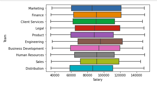
Boxplot of Salary and team column
Scatter Plot For Data Visualization
# importing packages
import seaborn as sns
import matplotlib.pyplot as plt


sns.scatterplot( x="Salary", y='Team', data=df,
                hue='Gender', size='Bonus %')

# Placing Legend outside the Figure
plt.legend(bbox_to_anchor=(1, 1), loc=2)

plt.show()
Output:
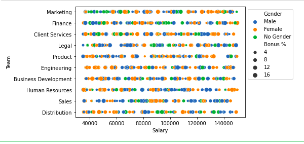
Scatter plot of salary and Team column
Multivariate Analysis
Multivariate analysis involves examining the relationships among three or more variables. Some common methods include:
- Pair Plots: To visualize pairwise relationships across several variables at once.
- Heatmaps: Particularly useful for showing the correlation matrix between numerical variables.
- Faceted Grids: Allow you to explore data across many dimensions and are particularly useful for understanding the interaction effects among variables.
For Now, we will use pairplot()method of the seaborn module. We can also use it for the multiple pairwise bivariate distributions in a dataset.
# importing packages
import seaborn as sns
import matplotlib.pyplot as plt


sns.pairplot(df, hue='Gender', height=2)
Output:
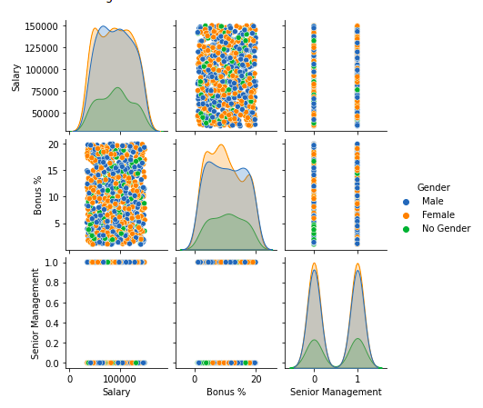
Pairplot of columns of dataframe
Step 7: Handling Outliers
An Outlier is a data item/object that deviates significantly from the rest of the (so-called normal)objects. They can be caused by measurement or execution errors. The analysis for outlier detection is referred to as outlier mining. There are many ways to detect outliers, and the removal process of these outliers from the dataframe is the same as removing a data item from the panda’s dataframe.
To handle outliers effectively, we need to identify them in key numerical variables that could significantly impact our analysis. For this dataset, we'll focus on 'Salary' and 'Bonus %' as these are critical financial metrics.
We'll use the Interquartile Range (IQR) method to identify outliers in these variables. The IQR method is robust as it defines outliers based on the statistical spread of the data.
import seaborn as sns
import matplotlib.pyplot as plt

# Calculate IQR for Salary and Bonus %
Q1_salary = df['Salary'].quantile(0.25)
Q3_salary = df['Salary'].quantile(0.75)
IQR_salary = Q3_salary - Q1_salary

Q1_bonus = df['Bonus %'].quantile(0.25)
Q3_bonus = df['Bonus %'].quantile(0.75)
IQR_bonus = Q3_bonus - Q1_bonus

# Define outliers
outliers_salary = df[(df['Salary'] < (Q1_salary - 1.5 * IQR_salary)) |
                                 (df['Salary'] > (Q3_salary + 1.5 * IQR_salary))]

outliers_bonus = df[(df['Bonus %'] < (Q1_bonus - 1.5 * IQR_bonus)) |
                                (df['Bonus %'] > (Q3_bonus + 1.5 * IQR_bonus))]

# Plotting boxplots
fig, axes = plt.subplots(1, 2, figsize=(18, 6))
sns.boxplot(x=df['Salary'], ax=axes[0])
axes[0].set_title('Boxplot of Salary')
sns.boxplot(x=df['Bonus %'], ax=axes[1])
axes[1].set_title('Boxplot of Bonus %')

# Show the plots
plt.show()

# Display the number of outliers detected
outliers_salary.shape[0], outliers_bonus.shape[0]
Output:

For removing the outlier, one must follow the same process of removing an entry from the dataset using its exact position in the dataset because in all the above methods of detecting the outliers end result is the list of all those data items that satisfy the outlier definition according to the method used.
For more information, refer Detect and Remove the Outliers using Python
Step 8: Communicate Findings and Insights
The final step in the EDA technique is effectively discussing your findings and insights. This includes summarizing your evaluation, highlighting fundamental discoveries, and imparting your outcomes cleanly and compellingly.
Here are a few hints for effective verbal exchange:
- Clearly state the targets and scope of your analysis
- Provide context and heritage data to assist others in apprehending your approach
- Use visualizations and photos to guide your findings and make them more reachable
- Highlight critical insights, patterns, or anomalies discovered for the duration of the EDA manner
- Discuss any barriers or caveats related to your analysis
- Suggest ability next steps or areas for additional investigation
Effective conversation is critical for ensuring that your EDA efforts have a meaningful impact and that your insights are understood and acted upon with the aid of stakeholders.
Conclusion
Exploratory Data Analysis is a powerful and vital technique for gaining deep information about your records earlier than venture formal modeling or speculation testing. By following the seven steps mentioned in this newsletter – knowing how the problem and information, uploading and inspecting the information, managing missing information, exploring data traits, appearing data transformation, visualizing data relationships, and communicating findings and insights – you may free up the whole potential of your records and extract valuable insights that could pressure informed decision-making.
Mastering EDA requires technical skills, analytical wandering, and powerful communique talents. As you exercise and refine your EDA abilities, you become more ready to tackle complicated facts and demanding situations and uncover insights that can offer an aggressive edge for your agency.
FAQ's
1. What are the critical steps of the EDA procedure?
The critical steps within the Exploratory Data Analysis (EDA) procedure consist of know-how of the hassle and information, uploading and analyzing the statistics, handling missing records, exploring statistics characteristics (distributions, vital tendency, variability), performing data variations, visualizing facts relationships, and communicating findings and insights.
2. How does EDA help in feature engineering?
EDA plays an important role in feature engineering by supplying insights into the relationships and styles between variables within the information.
Through visualizations and statistical summaries, analysts can become aware of new features or differences that would enhance the overall performance of machine studying fashions. EDA also enables detecting and addressing problems like multicollinearity, which may affect characteristic choice and model performance.
3. What are some unusual information visualization strategies utilized in EDA?
Some not-unusual data visualization techniques utilized in EDA consist of:
- Histograms and density plots for exploring variable distributions
- Scatter plots for visualizing relationships between numerical variables
- Box plots and violin plots for evaluating distributions throughout classes
- Heat maps and correlation matrices for assessing variable correlations
- Line plots for visualizing trends over time or sequences
Interactive visualizations and dashboards can also help explore facts from more than one view at some stage in EDA.
4. How do you manage imbalanced facts at some point in EDA?
Imbalanced data, in which one class or category is substantially underrepresented compared to others, can pose challenges in EDA and subsequent modeling.
During EDA, it's essential to discover and quantify the diploma of imbalance and explore the traits of minority and majority training. Techniques like oversampling, undersampling, or producing synthetic facts may address the imbalance. However, their effect should be cautiously evaluated during EDA.
5. What are a few unusual pitfalls to keep away from throughout EDA?
Some common pitfalls to keep away from at some point in EDA consist of the following:
- Making untimely assumptions about the records without thorough exploration
- Failing to cope with missing data or outliers correctly
- Overlooking crucial variable relationships or patterns
- Applying inappropriate modifications or encodings to the information
- Concluding visualizations or summaries without the proper statistical testing
- Neglecting to document the EDA method and choices made
Maintaining a curious and open-minded approach, being aware of obstacles, and frequently validating assumptions can assist in mitigating those pitfalls and ensure EDA manners.