Python is a great language for doing data analysis, primarily because of the fantastic ecosystem of data-centric Python packages. Pandas is one of those packages, and makes importing and analyzing data much easier. In this article, I have used Pandas to analyze data on Country Data.csv file from UN public Data Sets of a popular ‘statweb.stanford.edu’ website.
As I have analyzed the Indian Country Data, I have introduced Pandas key concepts as below. Before going through this article, have a rough idea of basics from matplotlib and csv.
Installation
Easiest way to install pandas is to use pip:
pip install pandas
or, Download it from here
Creating A DataFrame in Pandas
Creation of dataframe is done by passing multiple Series into the DataFrame class using pd.Series method. Here, it is passed in the two Series objects, s1 as the first row, and s2 as the second row.
Example:
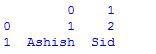
# assigning two series to s1 and s2 s1 = pd.Series([1,2])
s2 = pd.Series(["Ashish", "Sid"])
# framing series objects into data df = pd.DataFrame([s1,s2])
# show the data frame df # data framing in another way # taking index and column values dframe = pd.DataFrame([[1,2],["Ashish", "Sid"]],
index=["r1", "r2"],
columns=["c1", "c2"])
dframe # framing in another way # dict-like container dframe = pd.DataFrame({
"c1": [1, "Ashish"],
"c2": [2, "Sid"]})
dframe |
Output:
Importing Data with Pandas
The first step is to read the data. The data is stored as a comma-separated values, or csv, file, where each row is separated by a new line, and each column by a comma (,). In order to be able to work with the data in Python, it is needed to read the csv file into a Pandas DataFrame. A DataFrame is a way to represent and work with tabular data. Tabular data has rows and columns, just like this csv file(Click Download).
Example:
# Import the pandas library, renamed as pd import pandas as pd
# Read IND_data.csv into a DataFrame, assigned to df df = pd.read_csv("IND_data.csv")
# Prints the first 5 rows of a DataFrame as default df.head() # Prints no. of rows and columns of a DataFrame df.shape |
Output:
29,10
Indexing DataFrames with Pandas
Indexing can be possible using the pandas.DataFrame.iloc method. The iloc method allows to retrieve as many as rows and columns by position.
Examples:
# prints first 5 rows and every column which replicates df.head() df.iloc[0:5,:]
# prints entire rows and columns df.iloc[:,:] # prints from 5th rows and first 5 columns df.iloc[5:,:5]
|
Indexing Using Labels in Pandas
Indexing can be worked with labels using the pandas.DataFrame.loc method, which allows to index using labels instead of positions.
Examples:
# prints first five rows including 5th index and every columns of df df.loc[0:5,:]
# prints from 5th rows onwards and entire columns df = df.loc[5:,:]
|
The above doesn’t actually look much different from df.iloc[0:5,:]. This is because while row labels can take on any values, our row labels match the positions exactly. But column labels can make things much easier when working with data. Example:
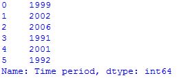
# Prints the first 5 rows of Time period # value df.loc[:5,"Time period"]
|
DataFrame Math with Pandas
Computation of data frames can be done by using Statistical Functions of pandas tools.
Examples:
# computes various summary statistics, excluding NaN values df.describe() # for computing correlations df.corr() # computes numerical data ranks df.rank() |
Pandas Plotting
Plots in these examples are made using standard convention for referencing the matplotlib API which provides the basics in pandas to easily create decent looking plots.
Examples:
# import the required module import matplotlib.pyplot as plt
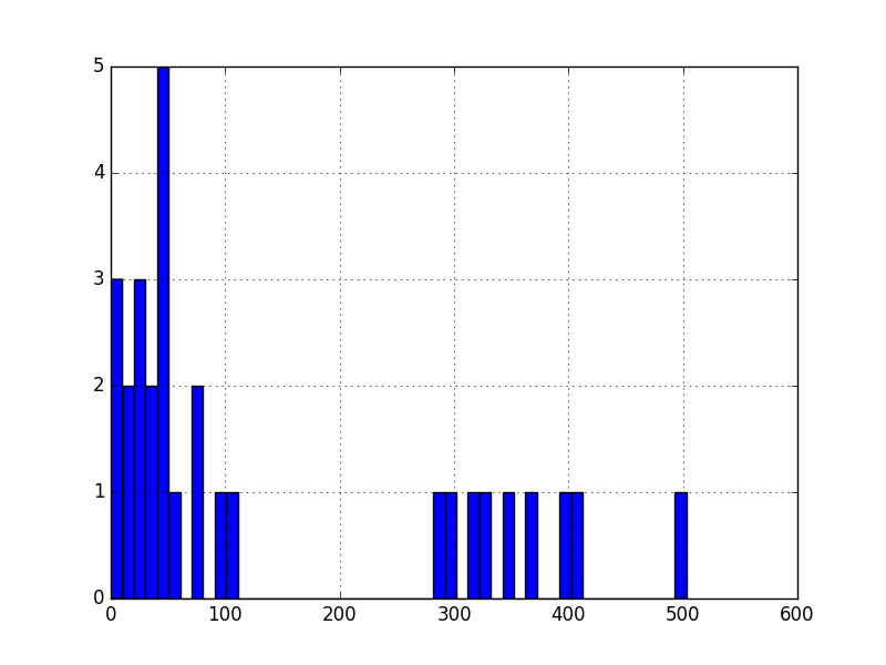
# plot a histogram df['Observation Value'].hist(bins=10)
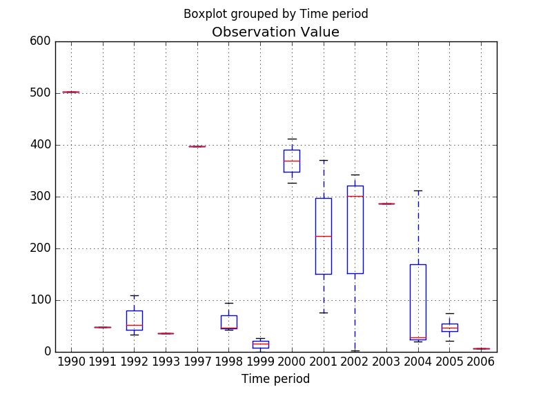
# shows presence of a lot of outliers/extreme values df.boxplot(column='Observation Value', by = 'Time period')
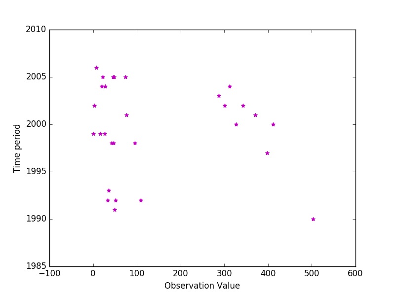
# plotting points as a scatter plot x = df["Observation Value"]
y = df["Time period"]
plt.scatter(x, y, label= "stars", color= "m",
marker= "*", s=30)
# x-axis label plt.xlabel('Observation Value')
# frequency label plt.ylabel('Time period')
# function to show the plot plt.show() |
Data Analysis and Visualization with Python | Set 2
Reference: