Chakra UI is the React component library for building attractive and responsive user interfaces. Chakra-UI common style props are UI styling props that are used to add or alter some styles, marks, formats, animations, behavior, and interactions with UI components.
Common Style props are used to style the component by simply passing props to it and saving time by providing shorthand ways to style components.
Prerequisites:
Common Style props:
- Margin and Padding: Margin and Padding utilities enable developers to easily add space around and inside elements. Margins create space outside elements, while paddings add space inside them.
- Color and background color: Color and background color help you choose colors and backgrounds for your app in a way that’s simple and makes sense. Chakra UI gives you a set of colors and backgrounds that are known to look good together.
- Gradient: Gradients allow you to add stylish and visually appealing backgrounds. Gradients are a blend of two or more colors that transition smoothly from one to another
- Typography: It is a feature of ReactJS for styling and formatting text content. It is used to create and organize customized style props that remain consistent without repeating text properties.
- Layout, width, height: Using the Layout component, we can align and structure the UI elements responsively. Width and height components are important aspects to control the overall responsive sizing of the element.
- Display: This style prop is for responsive element visibility control. Approaches include direct ‘none’ display, default hiding with ‘block’ from ‘md’, and shorthands for concise usage. These methods offer flexible solutions for managing element visibility across viewport sizes.
- Flexbox: It is used to create complex layout designs in React. With Chakra UI’s Flex and Box components, users can easily create responsive designs, achieving both versatility and visual appeal without the need for intricate CSS styling.
- Grid layout: Grid Layout is an incredibly powerful and flexible component designed to streamline the creation of responsive and aesthetically pleasing grid-based designs within web applications.
- Background: The property is responsible for setting the background color.
- Borders: There are some of the key props to modify the borders: border, borderWidth, borderStyle, borderColor, borderTop, borderRight, borderBottom, borderLeft, borderX, borderY and borderRadius.
- Border Radius: Each element of the UI can be customized with different Border radius values provided through border-radius props.
- Position: One essential aspect of building UI is positioning the elements at the right positions on the screen.
- Shadow: It consists of a Shadow component, which can be used to customize the elements and apply shadow effects to it. This shadow can be in various forms like dark, inner, outline, size-based, text-based, and more.
- Filter: Filter is the component that is used to apply filter and backdrop filters to the various elements. Using this component, we can adjust the grayscale, blur, brightness, contrast, and more properties of the elements
- Pseudo: It provides a way to style components dynamically using pseudo-classes. pseudo-classes are special styles that you can apply to elements based on their current state or where they are in the component structure.
- Other Props: All component will accept the following props like animation, appearance, content, transform, visibility, userSelect and so on.
- The as prop: The as props are UI styling props that are used to add or alter some styles, marks, formats, animations, behavior, and interactions with UI components.
Approach to implement Chakra UI Common style props:
We created the basic form having different components like Box, Flex, Text, Button with different custom style props that are mentioned above in the list. The second example shows width and height layout and other props like background and font size. The third example shows the usage of Grid component with some style props usage.
Steps to create React Application & Installing Module:
Step 1: Create a React application using the following command:
npx create-react-app chakra-style-propsStep 2: After creating your project folder(i.e. chakra-style-props), move to it by using the following command:
cd chakra-style-propsStep 3: After creating the React application, Install the required package using the following command:
npm i @chakra-ui/react @emotion/react@^11 @emotion/styled@^11 framer-motion@^6Project Structure:
The updated dependencies in the package.json file.
"dependencies": {
    "@chakra-ui/react": "^2.8.2",
    "@emotion/react": "^11.11.1",
    "@emotion/styled": "^11.11.0",
    "@testing-library/jest-dom": "^5.17.0",
    "@testing-library/react": "^13.4.0",
    "@testing-library/user-event": "^13.5.0",
    "framer-motion": "^6.5.1",
    "react": "^18.2.0",
    "react-dom": "^18.2.0",
    "react-scripts": "5.0.1",
    "web-vitals": "^2.1.4"
}
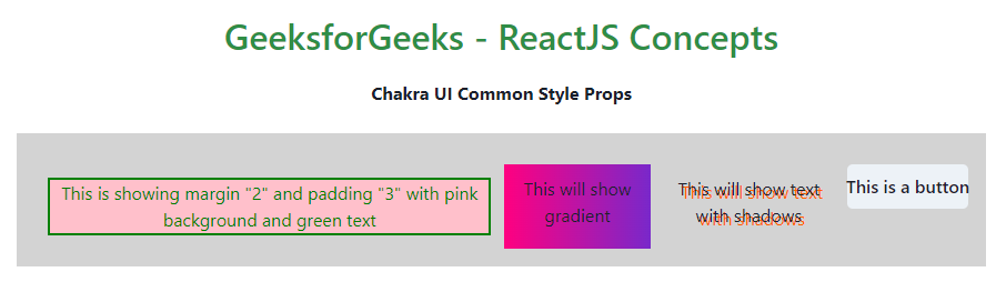
Example 1: Write down the code in respective files.
                    // App.js
import { useState } from 'react'
import {
    ChakraProvider, Text
} from "@chakra-ui/react";
import StyleProp from "./Style1";

function App() {

    return (
        <ChakraProvider>
            <Text
                color="#2F8D46"
                fontSize="2rem"
                textAlign="center"
                fontWeight="600"
                my="1rem"
            >
                GeeksforGeeks - ReactJS Concepts
            </Text>
            <h3><b>Chakra UI Common Style Props</b></h3>
            <br />
            <StyleProp />
        </ChakraProvider>
    )
}

export default App
                    // Style1.jsx

import {
    Flex, Box, Text, Button
} from "@chakra-ui/react";

function StyleProp() {

    return (
        <Box bg="lightgrey"
            w="100%" h="100%" p={4}>

            <Flex flexWrap='wrap' mt='3'
                justifyContent="center">
                <Flex direction="row"
                    alignItems="left"
                >
                    <Box border="2px" m={[2, 3]}
                        color='green' bg='pink'>
                        This is showing margin "2" and
                        padding "3" with pink
                        background and green text
                    </Box><br />
                    <Text p="10px"
                        bgGradient="linear(to-l, #7928CA, #FF0080)">
                        This will show gradient
                    </Text>
                    <Text textShadow='3px 3px #ff6200' p="10px">
                        This will show text with shadows
                    </Text><br />
                    <Button as="a" href=
                        "https://www.geeksforgeeks.org/tag/chakra-ui/"
                        borderTopRadius="5px"
                        borderLeftRadius="5px"
                        borderRightRadius="5px">
                        This is a button
                    </Button>
                </Flex>
            </Flex>
        </Box>
    )
}

export default StyleProp;
Step to run the application: Run the application using the following command:
npm run start Output: Now go to http://localhost:3000 in your browser:
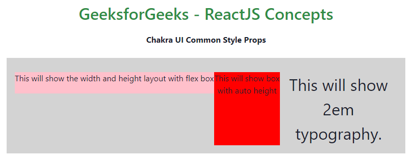
Example 2: The following code shows usage of props like typography fontSize, height and width layout with flex box and auto height.
                    // App.js

import { useState } from 'react'
import {
    ChakraProvider, Text
} from "@chakra-ui/react";

import MyStyleProp from "./Style2";


function App() {

    return (
        <ChakraProvider>
            <Text
                color="#2F8D46"
                fontSize="2rem"
                textAlign="center"
                fontWeight="600"
                my="1rem"
            >
                GeeksforGeeks - ReactJS Concepts
            </Text>
            <h3><b>Chakra UI Common Style Props</b></h3>
            <br />
            <MyStyleProp />
        </ChakraProvider>
    )
}

export default App
                    // Style2.js

import {
    Flex, Box, Text,
} from "@chakra-ui/react";

import './App.css'

function MyStyleProp() {

    return (
        <Box bg="lightgrey" w="100%" h="100%" p={4}>

            <Flex mt='3' justifyContent="space-between">
                <Flex direction="row"
                    alignItems="left">
                    <Box display="flex" bg="pink" boxSize="sm"
                        width="100%" height={42}>
                        This will show the width and height
                        layout with flex box
                    </Box>
                    <Box bg="red" display={{ md: "block" }}
                        height="auto">
                        This will show box with auto height
                    </Box><br />
                    <Text fontSize='2em' >
                        This will show 2em typography.
                    </Text>

                </Flex>
            </Flex>
        </Box>
    )
}

export default MyStyleProp;
Output:
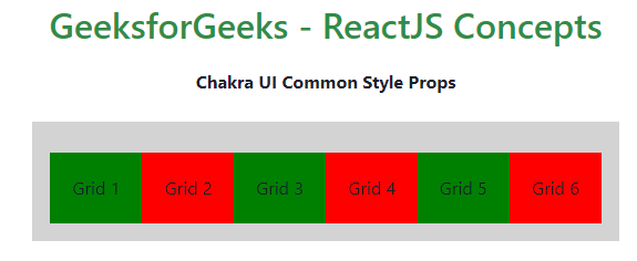
Example 3: The following code shows building grid layouts. The key components include Grid, and Box, each contributing to the overall flexibility and responsiveness of your application’s grid structure.
                    //App.js

import { useState } from 'react'
import {
    ChakraProvider, Text
} from "@chakra-ui/react";

import GridStyleProp from "./Style3";


function App() {

    return (
        <ChakraProvider>
            <Text
                color="#2F8D46"
                fontSize="2rem"
                textAlign="center"
                fontWeight="600"
                my="1rem"
            >
                GeeksforGeeks - ReactJS Concepts
            </Text>
            <h3><b>Chakra UI Common Style Props</b></h3>
            <br />
            <GridStyleProp />
        </ChakraProvider>
    )
}

export default App
                    //Style3.js

import {
    Flex, Box, Text, Grid, Button
} from "@chakra-ui/react";

function GridStyleProp() {

    return (
        <Box bg="lightgrey" w="100%" h="100%" p={4}>

            <Flex mt='3' justifyContent="space-between">
                <Flex direction="row" alignItems="left">
                    <Grid bg="green" p="20px">
                        Grid 1
                    </Grid><br />
                    <Grid bg="red" p="20px">
                        Grid 2
                    </Grid><br />
                    <Grid bg="green" p="20px">
                        Grid 3
                    </Grid><br />
                    <Grid bg="red" p="20px">
                        Grid 4
                    </Grid><br />
                    <Grid bg="green" p="20px">
                        Grid 5
                    </Grid><br />
                    <Grid bg="red" p="20px">
                        Grid 6
                    </Grid><br />
                </Flex>
            </Flex>
        </Box>
    )
}

export default GridStyleProp;
Output: