In web development, visual design is crucial in grabbing users' attention and improving their experience. CSS and SVG (Scalable Vector Graphics) provide many ways to change and improve how things look on websites. Among these methods, clipping and masking are standout tools for creating detailed designs and effects.
These are the following approaches to Use CSS and SVG Clipping and Masking Techniques:
Using CSS clip-path Property
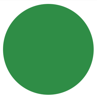
In this approach, the clip-path property in CSS is used to define a circular clipping region for an element. The element has a width and height of 200 pixels, with a background color of #2f8d46. The clip-path property is set to circle(50% at 50% 50%), creating a circular clipping region centered within the element.
Example: The code below shows the clipping technique using CSS clip-path Property.
<!DOCTYPE html>
<html lang="en">

<head>
    <meta charset="UTF-8">
    <meta name="viewport"
          content="width=device-width, initial-scale=1.0">
    <title>CSS clip-path Property Example</title>
    <style>
        .element {
            width: 200px;
            height: 200px;
            background-color: #2f8d46;
            clip-path: circle(50% at 50% 50%);
        }
    </style>
</head>

<body>
    <div class="element"></div>
</body>

</html>
Output:
Using SVG clip-path Element
In this approach, The usage of the SVG clip-path element to define a circular clipping path for an SVG rectangle element. Within the SVG markup, a clipPath element with the id "clipPath" is defined, containing a circle element representing the clipping path. The rectangle element has a fill color of #2f8d46 and is clipped using the clip-path attribute referencing the "clipPath" id, resulting in a circular clipping effect.
Example: The code below shows the clipping technique using SVG clip-path Element.
<!DOCTYPE html>
<html lang="en">

<head>
    <meta charset="UTF-8">
    <meta name="viewport"
          content="width=device-width, initial-scale=1.0">
    <title>SVG clip-path Element Example</title>
</head>

<body>
    <svg width="200" height="200">
        <defs>
            <clipPath id="clipPath">
                <circle cx="100" cy="100" r="100" />
            </clipPath>
        </defs>
        <rect width="200" height="200"
              fill="#2f8d46" clip-path="url(#clipPath)" />
    </svg>
</body>

</html>
Output:
Using SVG mask Element
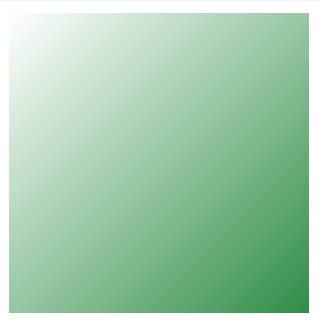
In this approach, The mask element in SVG is used to define a mask for an element. It applies transparency to portions of an element based on the alpha channel values of the mask image. This technique is useful for creating gradient fades, soft edges, and complex graphical effects.
Example: The below example shows masking in SVG using the SVG mask Element.
<!DOCTYPE html>
<html lang="en">

<head>
    <meta charset="UTF-8">
    <meta name="viewport"
          content="width=device-width, initial-scale=1.0">
    <title>SVG mask Element Example</title>
</head>

<body>
    <svg width="200" height="200">
        <defs>
            <mask id="mask">
                <linearGradient id="gradient" x1="0"
                                y1="0" x2="1" y2="1">
                    <stop offset="0" stop-color="white"
                          stop-opacity="0" />
                    <stop offset="1" stop-color="white"
                          stop-opacity="1" />
                </linearGradient>
                <rect x="0" y="0" width="100%"
                      height="100%" fill="url(#gradient)" />
            </mask>
        </defs>
        <rect width="200" height="200"
              fill="#2f8d46" mask="url(#mask)" />
    </svg>
</body>

</html>
Output: