Tooltips are generally used for showing extra information to user when user moves the mouse pointer on this particular element. Tooltips are small pop-up boxes that appear when you hover over an element. In this article we will see few examples of creating tooltips using HTML and CSS only.
Table of Content
Different types of Tooltips
We can add Tooltips in different position of the element , like - top, bottom, left & right. And we can also customize the position of Tooltips, it depends on the particular scenario like- left corner ,right corner, bottom-left, center and many more positions.

Toolkit on top
- Create an HTML file with a "Tooltip on Top" title, and link it to a "style.css" CSS file.
- In the body, include a div with class "box."
- Style the box in CSS with centered text, margin, font properties, and a pointer cursor.
- Add a pseudo-element "::before" for hidden text with styling, positioned above the box. Use "hover" to make it visible. Include a "::after" pseudo-element for a triangular arrow initially hidden, revealed on hover.
- Position the tooltip so that it appears on top of the target div.
Example: Illustration of top position tooltip on hover using CSS.
HTML
<!DOCTYPE html>
<html>
<head>
    <title>Tooltip on Top</title>
    <link rel="stylesheet" href="style.css">
</head>
<body>
    <div class="box">Hover Me</div>
</body>
</html>
CSS
.box {
    text-align: center;
    margin-top: 200px;
    font-size: 26px;
    font-weight: 600;
    cursor: pointer;
    position: relative;
    padding: 5px;
}

.box::before {
    content: 'Text';
    text-align: center;
    background-color: grey;
    color: rgb(238, 237, 237);
    width: fit-content;
    padding: 10px;
    border-radius: 5px;
    position: absolute;
    bottom: 100%;
    margin-left: 20px;
    visibility: hidden;
}

.box:hover::before {
    visibility: visible;
}

.box::after {
    content: '';
    border-left: 6px solid transparent;
    border-right: 6px solid transparent;
    border-top: 7px solid #555;
    position: absolute;
    top: 0%;
    margin-left: -60px;
    visibility: hidden;
}

.box:hover::after {
    visibility: visible;
}
Output: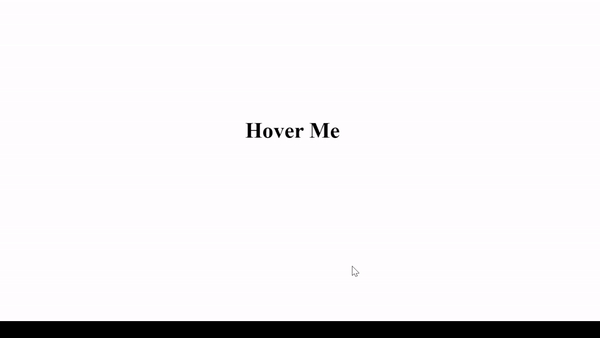
Toolkit on bottom
- Create an HTML file with a "Tooltip on Bottom" title, and link it to a "style.css" CSS file.
- In the body, include a div with class "box."
- Style the box in CSS with centered text, margin, font properties, and a pointer cursor.
- Add a pseudo-element "::before" for hidden text with styling, positioned above the box. Use "hover" to make it visible. Include a "::after" pseudo-element for a triangular arrow initially hidden, revealed on hover.
- Position the tooltip so that it appears on the bottom of the target div.
Example: Illustration of bottom position tooltip on hover using CSS.
HTML
<!DOCTYPE html>
<html>
<head>
    <title>Tooltip on Bottom</title>
<link rel="stylesheet" href="style.css">
</head>
<body>
    <div class="box">Hover Me</div>
</body>
</html>
CSS
.box {
    text-align: center;
    margin-top: 200px;
    font-size: 26px;
    font-weight: 600;
    cursor: pointer;
    position: relative;
    padding: 5px;
}

.box::before {
    content: 'Text';
    text-align: center;
    background-color: grey;
    color: rgb(238, 237, 237);
    width: fit-content;
    padding: 10px;
    border-radius: 5px;
    position: absolute;
    top: 100%;
    margin-left: 20px;
    visibility: hidden;
}

.box:hover::before {
    visibility: visible;
}

.box::after {
    content: '';
    border-left: 7px solid transparent;
    border-right: 7px solid transparent;
    border-bottom: 10px solid #555;
    position: absolute;
    bottom: 0%;
    margin-left: -63px;
    visibility: hidden;
}

.box:hover::after {
    visibility: visible;
}
Output:

Recommended Articles