Making text responsive in Bootstrap involves using responsive typography utilities like .text-sm, .text-md, etc., to ensure text adapts to different screen sizes. This ensures readability and maintains visual hierarchy across devices.
Below are the approaches to making text responsive in Bootstrap:
Table of Content
Using fs class
Bootstrap's fs classes, such as fs-1 and fs-2, facilitate responsive text sizing by adjusting font sizes at screen breakpoints. This offers a straightforward method to ensure text adapts to various device sizes without custom CSS.
Example: This example describes the implementation of making the text responsive using display fs of Bootstrap.
<!DOCTYPE html>
<html>

<head>
    <title>Responsive Text</title>
    <link href=
"https://cdn.jsdelivr.net/npm/bootstrap@5.3.0/dist/css/bootstrap.min.css"
          rel="stylesheet" />
</head>

<body>
    <div class="container">
        <h1 class="text-center text-success">
            GeeksforGeeks
        </h1>
        <div class="container">
            <p>Small text</p>
            <p class="fs-5">Medium text</p>
            <p class="fs-4">Medium text</p>
            <p class="fs-3">Large text</p>
            <p class="fs-2">Large text</p>
            <p class="fs-1">Very Large text</p>
        </div>
    </div>
</body>

</html>
Output:

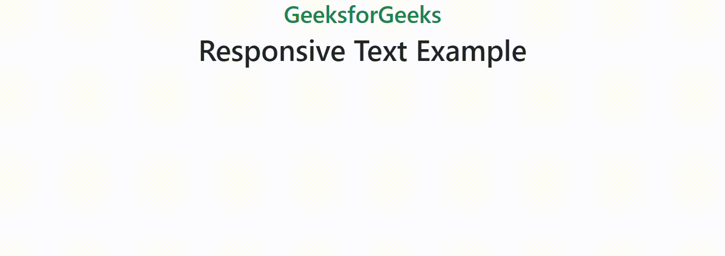
Using display class
Bootstrap's display class is used when you need a responsive heading. These display classes offer a quick way to style headings making them useful for creating visually appealing and hierarchy-aware responsive typography in a Bootstrap-based project.
Example: This example describes the implementation of making the text responsive using display class of Bootstrap.
<!DOCTYPE html>
<html>

<head>
    <title>Responsive Text</title>
    <link href=
"https://cdn.jsdelivr.net/npm/bootstrap@5.3.0/dist/css/bootstrap.min.css"
          rel="stylesheet" />
</head>

<body>
    <div class="container">
        <h1 class="text-center text-success">
            GeeksforGeeks
        </h1>
        <div class="container">
            <h1 class="display-6 text-center">
                Responsive Text Example
            </h1>
        </div>
    </div>
</body>

</html>
Output:
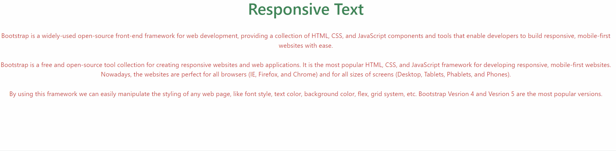
Using text-wrap class
Bootstrap provides utility classes that we can use to make text responsive. These classes include text-wrap for preventing text wrapping, text-truncate for truncating long text, and text-break for breaking long words.
Example: This example describes the implementation of making the text responsive using text-wrap class of Bootstrap.
<!DOCTYPE html>
<html>

<head>
    <title>Responsive Text</title>
    <link href=
"https://cdn.jsdelivr.net/npm/bootstrap@5.3.0/dist/css/bootstrap.min.css"
          rel="stylesheet" />
</head>

<body>
    <h1 class="text-center text-success">
        Responsive Text
    </h1>
    <br />
    <div class="text-center">
        <p class="text-wrap text-danger">
            Bootstrap is a widely-used open-source front-end framework
            for web development, providing a collection of HTML, CSS, and
            JavaScript components and tools that enable developers to build
            responsive, mobile-first websites with ease.
            <br />
            <br />
            Bootstrap is a free and open-source tool collection for
            creating responsive websites and web applications. It is the
            most popular HTML, CSS, and JavaScript framework for developing
            responsive, mobile-first websites. Nowadays, the websites are
            perfect for all browsers (IE, Firefox, and Chrome) and for
            all sizes of screens (Desktop, Tablets, Phablets, and Phones).
            <br />
            <br />
            By using this framework we can easily manipulate the styling
            of any web page, like font style, text color, background color,
            flex, grid system, etc. Bootstrap Vesrion 4 and Vesrion 5 are
            the most popular versions.
        </p>
    </div>
</body>

</html>
Output: