To display an image only on mobile view in Bootstrap, you can utilize Bootstrap's responsive utility classes along with a combination of CSS media queries. So one common requirement is to display an image only on small screen devices while hiding it on larger screen devices.
Approach: Using Bootstrap responsive utility Classes
Bootstrap provides a set of responsive utility classes that allow you to show or hide elements based on the screen size. By applying these classes directly to the HTML elements, you can easily control their visibility on different devices without writing custom CSS. This method offers simplicity and convenience, especially when working within the Bootstrap framework.
Example: The below code will explain the use of Bootstrap responsive utility classes to display images on mobile devices.
<!DOCTYPE html>
<html lang="en">

<head>
    <meta charset="UTF-8">
    <meta name="viewport" content=
"width=device-width, initial-scale=1.0">
    <title>
        Display Image Only on Mobile View -
        Bootstrap Utility Classes
    </title>
    <!-- Bootstrap CSS CDN -->
    <link rel="stylesheet" href=
"https://cdn.jsdelivr.net/npm/bootstrap@4.6.0/dist/css/bootstrap.min.css">
</head>

<body>

    <div class="container">
        <div class="d-block d-sm-none">
            <img src=
"https://media.geeksforgeeks.org/wp-content/uploads/20231004184219/gfglogo0.jpg"
            class="img-fluid" alt="Mobile Image">
        </div>
        <h1>
            Content for All Views
        </h1>
        <p>
            This content will be displayed
            on all screen sizes.
        </p>
    </div>
    <!-- Bootstrap JS CDN -->
    <script src=
"https://cdn.jsdelivr.net/npm/bootstrap@4.6.0/dist/js/bootstrap.bundle.min.js">
    </script>

</body>

</html>
Output:

Example 2: The below code also implements the Bootstrap classes to accomplish the task.
<!DOCTYPE html>
<html lang="en">
<head>
<meta charset="UTF-8">
<meta name="viewport" content=
"width=device-width, initial-scale=1.0">
<title>
Mobile-only Image - Advanced
Bootstrap Project
</title>
<!-- Bootstrap CSS -->
<link rel="stylesheet" href=
"https://cdn.jsdelivr.net/npm/bootstrap@4.6.0/dist/css/bootstrap.min.css">
</head>
<body>
<nav class="navbar navbar-expand-lg
navbar-dark bg-dark">
<div class="container">
<a class="navbar-brand" href="#">
Geeksforgeek
</a>
<button class="navbar-toggler" type="button"
data-toggle="collapse" data-target="#navbarNav"
aria-controls="navbarNav" aria-expanded="false"
aria-label="Toggle navigation">
<span class="navbar-toggler-icon"></span>
</button>
<div class="collapse navbar-collapse" id="navbarNav">
<ul class="navbar-nav ml-auto">
<li class="nav-item">
<a class="nav-link" href="#about">
About
</a>
</li>
<li class="nav-item">
<a class="nav-link" href="#services">
Services
</a>
</li>
<li class="nav-item">
<a class="nav-link" href="#contact">
Contact
</a>
</li>
</ul>
</div>
</div>
</nav>
<!-- Banner Section -->
<section id="banner" class="bg-light py-5">
<div class="container">
<div class="row">
<div class="col-md-6">
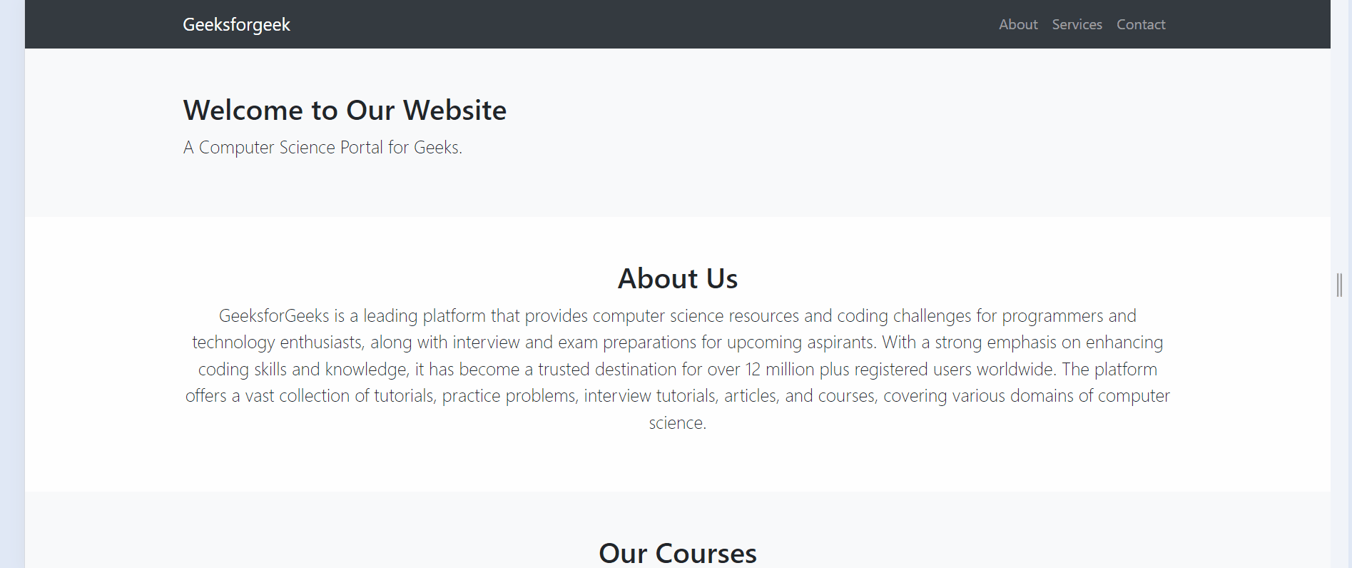
<h2>
Welcome to Our Website
</h2>
<p class="lead">
A Computer Science Portal for Geeks.
</p>
</div>
<div class="col-md-6">
<img src=
"https://media.geeksforgeeks.org/wp-content/uploads/20231004184219/gfglogo0.jpg"
class="img-fluid d-block d-md-none mobile-image"
alt="Mobile Image">
</div>
</div>
</div>
</section>
<!-- About Section -->
<section id="about" class="py-5">
<div class="container">
<h2 class="text-center">
About Us
</h2>
<p class="lead text-center">
GeeksforGeeks is a leading platform that provides
computer science resources and coding challenges
for programmers and technology enthusiasts, along
with interview and exam preparations for upcoming
aspirants. With a strong emphasis on enhancing coding
skills and knowledge, it has become a trusted destination
for over 12 million plus registered users worldwide. The
platform offers a vast collection of tutorials, practice
problems, interview tutorials, articles, and courses,
covering various domains of computer science.
</p>
</div>
</section>
<!-- Services Section -->
<section id="services" class="bg-light py-5">
<div class="container">
<h2 class="text-center">
Our Courses
</h2>
<div class="row">
<div class="col-md-4">
<div class="card">
<div class="card-body">
<h5 class="card-title">
DSA Self-Paced
</h5>
<p class="card-text">
Master DSA from basic to advanced
Master the basics of DSA.
</p>
</div>
</div>
</div>
<div class="col-md-4">
<div class="card">
<div class="card-body">
<h5 class="card-title">
Data Science Course
</h5>
<p class="card-text">
Data Analysis with Python
Machine Learning & AI.
</p>
</div>
</div>
</div>
<div class="col-md-4">
<div class="card">
<div class="card-body">
<h5 class="card-title">
DSA to Development
</h5>
<p class="card-text">
Comprehensive DSA Mastery
Versatility in Tech Stacks.
</p>
</div>
</div>
</div>
</div>
</div>
</section>
<!-- Contact Section -->
<section id="contact" class="py-5">
<div class="container">
<h2 class="text-center">
Contact Us
</h2>
<p class="lead text-center">
A-143, 9th Floor, Sovereign Corporate Tower,
Sector-136, Noida, Uttar Pradesh - 201305
</p>
</div>
</section>
<!-- Footer -->
<footer class="bg-dark text-white text-center py-4">
<p>
© 2024 Mobile Image.
All rights reserved.
</p>
</footer>
<!-- Bootstrap JS -->
<script src=
"https://cdn.jsdelivr.net/npm/bootstrap@4.6.0/dist/js/bootstrap.bundle.min.js">
</script>
</body>
</html>
Output: