To create responsive divs in Bootstrap, utilize the grid system with container and row classes. Define columns using col classes and specify breakpoints for different screen sizes. This ensures divs adjust their layout and size responsively across devices.
Below are the approaches to creating responsive div in Bootstrap:
Using Bootstrap's Grid System
Bootstrap's grid system organizes content into rows and columns, offering flexibility for responsive layouts. Dividing content into these structures enables designs to adapt seamlessly to different screen sizes.
| Class | Description |
|---|---|
| container | Defines a container element to hold the content. |
| row | Creates a row to contain the columns. |
| col-sm-6 | Defines a co |
Example: In this example we are using Bootstrap to create responsive divs with two equal-width columns, each having distinct background colors. The grid system ensures proper layout adjustment on different screen sizes.
<!DOCTYPE html>
<html>

<head>
    <title>Responsive divs using Bootstrap</title>
    <meta name="viewport"
          content="width=device-width, initial-scale=1">
    <link rel="stylesheet"
          href=
"https://maxcdn.bootstrapcdn.com/bootstrap/3.4.1/css/bootstrap.min.css">
    <script src=
"https://ajax.googleapis.com/ajax/libs/jquery/3.6.0/jquery.min.js">
      </script>
    <script src=
"https://maxcdn.bootstrapcdn.com/bootstrap/3.4.1/js/bootstrap.min.js">
      </script>
</head>

<body>
    <div class="container">
        <div class="row">
            <div class="col-sm-6 bg-primary">
                  Half Width Content 1
              </div>
            <div class="col-sm-6 bg-danger">
                  Half Width Content 2
              </div>
        </div>
    </div>
</body>

</html>
Output:
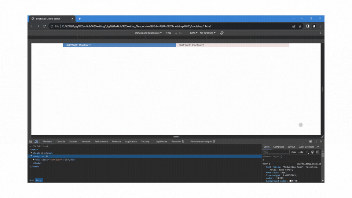
Bootstrp Responsive divs Using Bootstrap's Grid System
Using Bootstrap's Responsive Utility classes
In addition to the grid system, Bootstrap provides a set of responsive utility classes that allow you to control the visibility and alignment of content based on the screen size.
| Class | Description |
|---|---|
| d-none | Hides the element. |
| d-md-block | Shows the element on medium and larger devices. |
| d-sm-block | Shows the element on small devices. |
| d-md-none | Hides the element on medium and larger devices. |
| d-sm-none | Hides the element on small devices. |
Example: In this example we are using Bootstrap to create responsive divs with different visibility based on device size. Using responsive display utilities, content is shown or hidden accordingly on various screen sizes.
<!DOCTYPE html>
<html>

<head>
    <title>Responsive divs using Bootstrap </title>
    <meta name="viewport" content="width=device-width, initial-scale=1">
    <link href=
"https://cdn.jsdelivr.net/npm/bootstrap@5.3.3/dist/css/bootstrap.min.css"
          rel="stylesheet"
          integrity=
"sha384-QWTKZyjpPEjISv5WaRU9OFeRpok6YctnYmDr5pNlyT2bRjXh0JMhjY6hW+ALEwIH"
          crossorigin="anonymous">
    <script src=
"https://cdn.jsdelivr.net/npm/bootstrap@5.3.3/dist/js/bootstrap.bundle.min.js"
        integrity=
"sha384-YvpcrYf0tY3lHB60NNkmXc5s9fDVZLESaAA55NDzOxhy9GkcIdslK1eN7N6jIeHz"
        crossorigin="anonymous">
      </script>
</head>

<body>
    <div class="d-block d-sm-none bg-danger">
          Visible on Extra Small devices
      </div>
    <div class="d-none d-sm-block d-md-none bg-info">
          Visible on Small devices
      </div>
    <div class="d-none d-md-block bg-success ">
          Visible on Medium and larger devices
      </div>
</body>

</html>
Output:
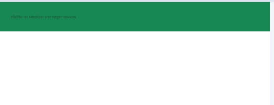
Using Bootstrap's Responsive Utility classes Example Output