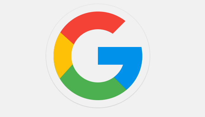
The Google logo is a globally recognized symbol of the tech giant, known for its colourful and playful design. It consists of the word "Google" in a unique font, with each letter in a different colour, representing the company's diverse range of products and services. In this article, we will design the Google logo with the help of HTML and CSS.
Approach to create Google Logo:
- Create a HTML structure consists of a container
<div>with an ID of 'container' and a logo<div>with an ID of 'logo'. Inside the logo<div>, there is a<div>with a class of 'g-line' and four<span>elements with classes of 'red', 'yellow', 'green', and 'blue'. - The CSS file (style.css) contains the styles for the Google logo. The 'g-line' class is used to create the letter 'G' in the logo, and the 'red', 'yellow', 'green', and 'blue' classes are used to create the colors of the logo.
- The colors of the logo are created using the 'red', 'yellow', 'green', and 'blue' classes. Each
<span>element represents a color, and the background color of each<span>is set to the corresponding color. - The 'g-line' class is used to style the letter 'G' in the logo. It sets the width, height, and background color of the 'G' to create the shape of the letter.
- The logo is designed to be responsive and work well on different screen sizes. The CSS styles are applied using relative units such as percentages and ems to ensure that the logo scales appropriately on different devices and screen resolutions.
Example: Implementation to design the logo of Google.
HTML
<!DOCTYPE html>
<html lang="en">

<head>
    <title>Google Logo</title>
    <meta charset="UTF-8">
    <meta name="viewport"
          content="width=device-width, initial-scale=1.0">
    <link rel="stylesheet" href="style.css">
</head>

<body>
    <div id="container">
        <div id="logo">
            <div class="g-line"></div>
            <span class="red"></span>
            <span class="yellow"></span>
            <span class="green"></span>
            <span class="blue"></span>
        </div>
    </div>
</body>

</html>