An alert box is a dialogue box that pops up on the screen to provide information to the user. It contains a message and an OK button, which allow users to acknowledge the message and close the box. Alert boxes are commonly used in web development to display important messages, warnings, or notifications to users.
There are several approaches to changing the color of the alert box in JavaScript which are as follows:
Table of Content
Using DOM manipulation
An alert box is a crucial element in web development for delivering important messages to users. Through DOM manipulation, we can enhance the appearance of alert boxes dynamically. By selecting specific elements and applying styles, we can customize the alert box's colour scheme to better the website's design.
Steps to achieve it:
- First, create a basic html structure and provide a good style for that.
- After that use document.querySelector to select the button and the container where the custom alert will be appended.
- Then handle the click event listener to the button using addEventListener.
- When the button is clicked, create a div element for the overlay and add the necessary CSS classes for styling.
- And inside the overlay, create another div element for the alert box.
- After that use Math. Firstrandom() to generate a random number between 1 and 3. Here use the switch statement and match the number which is generated by the function and for different numbers provide a different color.
Example: This example shows the implementation of the above-explained approach.
<!DOCTYPE html>
<html lang="en">
<head>
<meta charset="UTF-8">
<meta name="viewport"
content="width=device-width, initial-scale=1.0">
<title>Custom Alert Box</title>
<style>
.overlay {
display: none;
position: fixed;
top: 0;
left: 0;
width: 100%;
height: 100%;
background-color: rgba(0, 0, 0, 0.5);
z-index: 1;
}
body {
display: flex;
justify-content: center;
align-items: center;
height: 100vh;
margin: 0;
background-color: #f8f9fa;
}
.container {
text-align: center;
}
.alert-box {
width: 300px;
padding: 20px;
border-radius: 10px;
box-shadow: 0 0 10px rgba(0, 0, 0, 0.5);
background-color: #fff;
position: relative;
margin: 0 auto;
}
.button {
background-color: #007bff;
color: #fff;
border: none;
padding: 10px 20px;
font-size: 16px;
border-radius: 5px;
cursor: pointer;
transition: background-color 0.3s;
}
.button:hover {
background-color: #0056b3;
}
.close-button {
position: absolute;
top: 10px;
right: 10px;
cursor: pointer;
font-size: 20px;
color: #040202;
}
</style>
</head>
<body>
<div class="container">
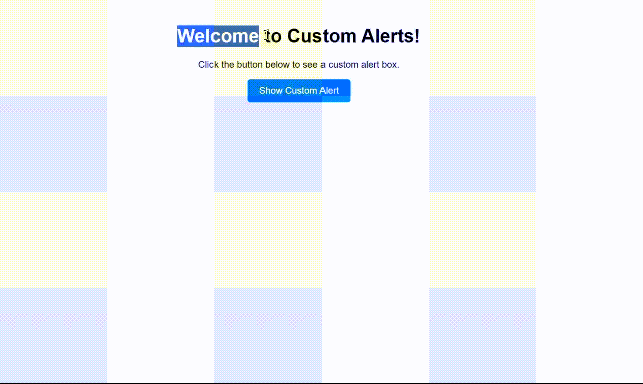
<h1>Welcome to Custom Alerts!</h1>
<p>Click the button below to see a custom alert box.</p>
<button class="button">Show Custom Alert</button>
</div>
<span class="custom_alert"></span>
<script>
let button = document
.querySelector(".button");
let customAlertContainer = document
.querySelector(".custom_alert");
button.addEventListener("click", function () {
let overlay = document
.createElement('div');
overlay
.classList.add('overlay');
let alertBox = document
.createElement('div');
alertBox
.classList
.add('alert-box');
let randomNumber = Math
.floor(Math.random() * 3) + 1;
switch (randomNumber) {
case 1:
alertBox
.style
.backgroundColor = '#ff0000';
alertBox
.style
.color = "#fff";
alertBox
.innerHTML = 'You are in a danger zone';
break;
case 2:
alertBox
.style
.backgroundColor = '#00ff00';
alertBox
.style
.color = "#fff";
alertBox
.innerHTML = 'You are in a safe zone';
break;
case 3:
alertBox
.style
.backgroundColor = '#0000ff';
alertBox
.style
.color = "#fff";
alertBox
.innerHTML = 'You are in the middle of the safe and danger zone';
break;
default:
alertBox
.style
.backgroundColor = '#fff';
break;
}
let closeButton = document
.createElement('span');
closeButton
.classList
.add('close-button');
closeButton
.innerHTML = '×';
closeButton
.addEventListener('click', function () {
overlay.remove();
});
alertBox
.appendChild(closeButton);
overlay
.appendChild(alertBox);
customAlertContainer
.appendChild(overlay);
overlay
.style
.display = "block";
closeButton
.addEventListener('click', function () {
overlay
.remove();
});
});
</script>
</body>
</html>
Output:
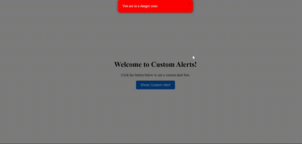
Output
Using SweetAlert2 Library
SweetAlert2 offers an easy solution for creating visually appealing alert boxes with minimal effort. By linking the SweetAlert2 CSS file, developers can easily implement custom alert dialogues with various styles and themes.
Steps:
- At first linked the SweetAlert2 CSS file for styling.
- Then create a container with a headline, description, and a button to trigger the custom alert.
- After that deselected the button element using document.querySelector().
- Use SweetAlert2's Swal.fire() method to display the custom alert with a title, text, icon, and a confirm button text.
Example: This example shows the implementation of the ve-explained approach.
<!DOCTYPE html>
<html lang="en">
<head>
<meta charset="UTF-8">
<meta name="viewport"
      content="width=device-width, initial-scale=1.0">
<title>Custom Alert Box</title>
<link rel=
        "stylesheet"
      href=
"https://cdn.jsdelivr.net/npm/sweetalert2@11/dist/sweetalert2.min.css">
<style>
    body {
        font-family: Arial, sans-serif;
        background-color: #f8f9fa;
    }

    .container {
        text-align: center;
        margin-top: 50px;
    }

    .button {
        background-color: #007bff;
        color: #fff;
        border: none;
        padding: 10px 20px;
        font-size: 16px;
        border-radius: 5px;
        cursor: pointer;
        transition: background-color 0.3s;
    }

    .button:hover {
        background-color: #0056b3;
    }
</style>
</head>
<body>

<div class="container">
    <h1>Welcome to Custom Alerts!</h1>
    <p>Click the button below to see a custom alert box.</p>
    <button class="button">Show Custom Alert</button>
</div>

<script src=
        "https://cdn.jsdelivr.net/npm/sweetalert2@11"></script>
<script>
    let button = document
    .querySelector(".button");

    button.addEventListener("click", function(){
        let randomNumber = Math
        .floor(Math.random() * 3) + 1;
        let alertText = '';

        switch (randomNumber) {
            case 1:
                alertText =
                        'You are in a danger zone';
                break;
            case 2:
                alertText =
                        'You are in a safe zone';
                break;
            case 3:
                alertText =
                        'You are in the middle of the safe and danger zone';
                break;
            default:
                alertText = 'Unknown zone';
                break;
        }

        Swal.fire({
            title: 'Custom Alert!',
            text: alertText,
            icon: 'info',
            confirmButtonText: 'Close',
            customClass: {
                popup: 'custom-alert-popup',
                title: 'custom-alert-title',
                content: 'custom-alert-content',
                confirmButton: 'custom-alert-confirm-button'
            }
        });
    });
</script>

</body>
</html>
Output:
Output :Using SweetAlert2 Library