Web application designers can create creative and eye-catching designs with Tailwind CSS's flexibility in applying clip paths to images. Developers can create complex shapes by using clip paths, which define an element's visible region.
Custom Clip Paths using Tailwind
Tailwind CSS's custom clip paths allow developers to define unique shapes with CSS properties like `clip-path`. This method provides flexibility in producing complex designs that are suitable for particular project requirements.
Syntax:
<img src="image.jpg" alt="Sample Image" class="w-full h-auto clip-custom">
.clip-custom {
    clip-path: polygon(50% 0%, 100% 50%, 50% 100%, 0% 50%);
}
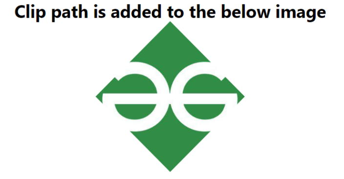
Example 1: Using Tailwind CSS, apply a custom clip-path to an image to create interesting shapes, like clipping the image into a diamond shape.
<!DOCTYPE html>
<html lang="en">

<head>
    <meta charset="UTF-8">
    <meta name="viewport" content=
"width=device-width, initial-scale=1.0">
    <title>Document</title>
    <link rel="stylesheet" href=
"https://cdn.jsdelivr.net/npm/tailwindcss@2.2.19/dist/tailwind.min.css">
    <style>
        .clip-custom {
            clip-path:
                polygon(50% 0%, 100% 50%, 50% 100%, 0% 50%);
        }
    </style>
</head>

<body>
    <h1 class="text-3xl font-bold text-center">
        Clip path is added to the below image
    </h1>
    <img alt="Sample Image" class="m-auto w-64 h-auto clip-custom"
         src=
'https://media.geeksforgeeks.org/wp-content/uploads/20231004184219/gfglogo0.jpg'>
</body>

</html>
Output:
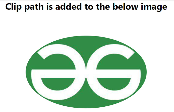
Example 2: The below example demonstrates the use of the clip-path property with an ellipse shape to clip an image, creating an elliptical clipping effect.
<!DOCTYPE html>
<html lang="en">

<head>
    <meta charset="UTF-8">
    <meta name="viewport" content=
"width=device-width, initial-scale=1.0">
    <title>Document</title>
    <link rel="stylesheet" href=
"https://cdn.jsdelivr.net/npm/tailwindcss@2.2.19/dist/tailwind.min.css">
    <style>
        .clip-ellipse {
            clip-path: ellipse(50% 30% at center);
        }
    </style>
</head>

<body>
    <h1 class="text-3xl font-bold text-center">
        Clip path is added to the below image
    </h1>
    <img alt="Sample Image" class="clip-ellipse m-auto"
         src=
'https://media.geeksforgeeks.org/wp-content/uploads/20231004184219/gfglogo0.jpg'>
</body>

</html>
Output: