Time series data is a valuable resource in numerous fields, offering insights into trends, patterns, and fluctuations over time. Visualizing this data is crucial for understanding its underlying characteristics effectively. Here, we'll check the process of creating time series visualizations in R Programming Language.
What are Time Series Visualizations?
Time series visualization is a way to show how data changes over time. Imagine plotting points on a graph where the horizontal axis represents time (like days, months, or years) and the vertical axis shows the values of something you're interested in (like sales, temperature, or stock prices). By connecting these points, you can see trends, patterns, and changes in the data over different time periods.
Time Series Visualization Techniques
- Line Plot: This is the most basic and common type of time series visualization, where data points are connected with lines. It shows the overall trend and patterns in the data over time. Use a line plot when you want to visualize the overall trend and fluctuations in your data over time.
- Seasonal Plot: This type of plot focuses on identifying seasonal patterns or cycles within the data. It helps in understanding repeating patterns that occur at regular intervals, such as monthly sales fluctuations or seasonal temperature changes.
- Decomposition Plot: Decomposition plots separate the time series data into its individual components, including trend, seasonality, and residual (random fluctuations). This helps in understanding the underlying patterns and irregularities in the data.
- Autocorrelation Plot: Autocorrelation plots show the correlation between a time series and its lagged values. They help in identifying any repeating patterns or dependencies within the data at different time lags.
- Histogram and Density Plots: These plots are used to visualize the distribution of values in a time series. They provide insights into the variability and spread of data over time.
- Box Plot: Box plots are useful for visualizing the distribution of data across different time periods, particularly in identifying outliers, median values, and quartiles.
- Heatmap: Heatmaps are effective for displaying temporal patterns across multiple variables or categories over time. They use color gradients to represent changes in values over time, making it easier to identify trends and anomalies.
Features of Time Series Visualizations
- Flexible Plotting Options: R provides various libraries like ggplot2, plotly, and dygraphs for creating customizable time series visualizations.
- Statistical Analysis: Time series plots in R can include statistical analysis such as trend lines, seasonal decomposition, and forecasting.
- Interactive Visualizations: Libraries like plotly allow for interactive time series plots, enhancing user engagement and exploration.
- Integration with Data Processing: R seamlessly integrates with data manipulation libraries like dplyr and data.table, streamlining the data preprocessing pipeline.
Step 1: Load required libaries and dataset
# Load required libraries
library(ggplot2)
library(tsibble)
# Load the AirPassengers dataset
data("AirPassengers")
Step 2: Convert the dataset to a tsibble format
# Convert the dataset to a tsibble format with index as "Month"
ts_data <- as_tsibble(AirPassengers, key = Month)
ts_data
Output:
# A tsibble: 144 x 2 [1M]
      index value
      <mth> <dbl>
 1 1949 Jan   112
 2 1949 Feb   118
 3 1949 Mar   132
 4 1949 Apr   129
 5 1949 May   121
 6 1949 Jun   135
 7 1949 Jul   148
 8 1949 Aug   148
 9 1949 Sep   136
10 1949 Oct   119
Step 3: Visualization of Time Series
# Create a line plot
ggplot(data = ts_data, aes(x = index, y = value)) +
  geom_line() +
  labs(title = "Monthly Airline Passenger Numbers", x = "Month", y = "Passengers")
Output:

Creating Time Series Visualizations
Overall, there is an increasing trend in the monthly airline passenger numbers over time.
- The plot shows a consistent rise in passenger numbers, indicating a potential growth pattern in air travel.
- There are noticeable peaks and troughs in passenger numbers throughout the months, suggesting seasonal fluctuations.
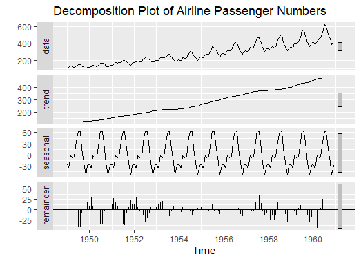
Decomposition Plot
# Load required libraries
library(forecast)

# Load the AirPassengers dataset
data("AirPassengers")

# Convert the AirPassengers dataset to a ts object
ts_data <- ts(AirPassengers, start = c(1949, 1), frequency = 12)

# Decompose the time series data
decomp <- decompose(ts_data)

# Create a decomposition plot
autoplot(decomp) +
  labs(title = "Decomposition Plot of Airline Passenger Numbers")
Output:
Creating Time Series Visualizations
The decomposition plot shows the trend component of the time series data, which represents the long-term movement or direction of airline passenger numbers.
- A rising trend indicates a consistent increase in passenger numbers over the years, suggesting a growth pattern in air travel demand.
- The plot also displays the seasonal component, highlighting the seasonal variations in passenger numbers.
- Peaks and troughs in the seasonal component indicate periods of higher and lower passenger volumes, reflecting seasonal patterns such as holiday travel spikes or off-peak periods.
- The residual component represents the random fluctuations or irregularities in the data that are not explained by the trend or seasonality.
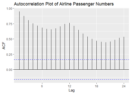
Autocorrelation Plot
# Load required libraries
library(ggplot2)

# Load the AirPassengers dataset
data("AirPassengers")

# Convert the AirPassengers dataset to a ts object
ts_data <- ts(AirPassengers, start = c(1949, 1), frequency = 12)

# Create an autocorrelation plot
ggAcf(ts_data) +
  labs(title = "Autocorrelation Plot of Airline Passenger Numbers")
Output:
Creating Time Series Visualizations
The autocorrelation plot shows the correlation between the airline passenger numbers at different time lags.
- Peaks or spikes in the autocorrelation function indicate strong correlations between the current passenger numbers and past values at specific lags.
- Look for significant peaks at multiples of the seasonal frequency (in this case, 12 months) in the autocorrelation plot.
- These peaks indicate seasonal patterns or cycles in the passenger numbers, suggesting that passenger volumes follow a repeating pattern over time.
- The x-axis of the plot represents the lag or time interval between current and past observations.
Histogram with Density Plots
# Load required libraries
library(ggplot2)

# Load the AirPassengers dataset
data("AirPassengers")
AirPassengers_ts <- ts(AirPassengers, start = c(1949, 1), end = c(1960, 12),
                       frequency = 12)
df <- as.data.frame(AirPassengers_ts)

# Create a combined histogram with density plot
combined_plot <- ggplot(df, aes(x = AirPassengers_ts)) +
  geom_histogram(aes(y = ..density..), binwidth = 10, fill = "blue", color = "black") +
  geom_density(alpha = 0.5, fill = "red") +
  labs(title = "Histogram with Density Plot of Airline Passenger Numbers",
       x = "Passengers", y = "Density")

# Print the combined plot
print(combined_plot)
Output:

Creating Time Series Visualizations
The histogram component of the plot shows the distribution of airline passenger numbers.
- Each bar represents a range of passenger counts (binwidth = 10), and the height of the bar represents the density of passenger counts falling within that range.
- The density plot is overlaid on top of the histogram, providing a smoothed representation of the distribution.
- The red area under the curve indicates the density of passenger counts at different levels, with higher peaks indicating areas of higher concentration.
- The combined plot allows for a visual comparison between the discrete distribution (histogram) and the continuous density estimation (density plot).
- Areas of high density in the density plot correspond to taller bars in the histogram, indicating where passenger counts are more concentrated.
Advantages
- Insightful Analysis: Time series visualizations in R enable analysts to gain deep insights into trends, patterns, and anomalies within the data.
- Effective Communication: Visualizations are powerful tools for communicating complex time series data and findings to stakeholders.
- Customization: R offers extensive customization options for visualizations, allowing users to tailor plots to specific needs and preferences.
- Integration with Statistical Models: R's integration with statistical modeling libraries facilitates advanced time series analysis and forecasting.
Disadvantages
- Learning Curve: R may have a steeper learning curve for beginners compared to other tools due to its syntax and functional programming paradigm.
- Resource Intensive: Creating complex visualizations and performing intensive computations in R may require significant computational resources.
- Limited GUI Support: R primarily relies on scripting and lacks extensive graphical user interface (GUI) support, which may be challenging for some users.
- Package Compatibility: Ensuring compatibility and version management of R packages across different environments can be a concern.
Conclusion
Time series visualization in R offers a robust platform for in-depth analysis, effective communication, and customization. While it may have a learning curve and resource considerations, the benefits of insightful analysis, integration with statistical models, and extensive customization options make R a valuable tool for time series data exploration and visualization.