Creating sunburst charts for hierarchical data in R Programming Language involves utilizing the plotly package, which provides the necessary tools for generating interactive visualizations. In this tutorial, we'll cover the theory behind sunburst charts, multiple examples, and explanations.
Sunburst Charts for Hierarchical Data
A sunburst chart is a type of circular visualization that displays hierarchical data in a radial layout. It is particularly effective for illustrating proportions and relationships within hierarchical structures. Here's a breakdown of the key concepts:
- Hierarchy: Sunburst charts represent hierarchical data structures, where each level of the hierarchy is visualized as a ring in the chart.
- Nodes: Nodes represent individual elements within the hierarchy. These can be categorized into parent nodes and child nodes, forming a tree-like structure.
- Proportional Representation: The size of each arc segment in the chart is proportional to the value it represents within the hierarchy.
- Color Encoding: Colors can be used to encode additional information, such as categories or attributes.
Basic Sunburst Chart
The plotly package provides functions for creating interactive visualizations, including sunburst charts. Let's create a basic sunburst chart using this package.
# Install and load the plotly package
install.packages("plotly")
library(plotly)
# Create data
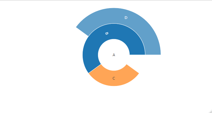
data <- list(
label = c("A", "B", "C", "D"),
parent = c("", "A", "A", "B"),
value = c(10, 20, 30, 40)
)
data<-data.frame(data)
# Create sunburst chart
fig <- plot_ly(data, ids = ~label, labels = ~label, parents = ~parent, values = ~value,
type = 'sunburst')
fig
Output:
Creating Sunburst Charts for Hierarchical Data
We first install and load the plotly package, which enables us to create interactive visualizations.
- Next, we create sample hierarchical data, where each data point has a label, parent, and value.
- We use the plot_ly() function to create the sunburst chart, specifying the hierarchical structure with the ids, labels, parents, and values parameters.
- Sunburst charts are hierarchical visualizations that represent data in a radial layout. They are useful for visualizing hierarchical structures or categorical data with multiple levels. In R, sunburst charts can be created using various packages, including plotly, ggplot2, and d3treeR. In this article, we'll explore how to create sunburst charts in R using different packages, along with explanations and examples.
Sunburst Charts for Hierarchical Data
Imagine you're in charge of a company, and you want to understand how it's organized. Who reports to whom? Which departments are bigger or smaller? To visualize this, you decide to use a sunburst chart, a cool way to represent hierarchical structures.
# Load necessary libraries
library(plotly)
# Sample hierarchical data (Organization Structure)
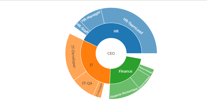
data <- list(
id = c("CEO", "HR", "HR-Manager", "HR-TeamLead", "HR-Staff", "Finance",
"Finance-Manager", "Finance-Accountant", "Finance-Analyst", "IT", "IT-Manager",
"IT-Developer", "IT-QA"),
parent = c("", "CEO", "HR", "HR", "HR", "CEO", "Finance", "Finance", "Finance", "CEO",
"IT", "IT", "IT"),
value = c(1, 1, 3, 10, 1, 1, 1, 4, 2, 1, 1, 6, 3)
)
data<-data.frame(data)
# Create sunburst chart for organization structure
organization_sunburst <- plot_ly(data, ids = ~id, labels = ~id, parents = ~parent,
values = ~value, type = "sunburst")
# Display the chart
organization_sunburst
Output:
Sunburst Charts for Hierarchical Data
First, we need a tool to create this visualization. We're using a special toolkit called plotly in R, which helps us make interactive charts.
- Data Definition: Next, we need data. Think of it like building blocks for our chart. Our company data is organized like a family tree, where each person (or department) has a name (
id), a parent (who they report to), and a value (like how many people are in the department or their budget). - Creating the Chart: Now, let's put those building blocks together! We use the
plot_ly()function to tell our toolkit how to build the chart. We give it our company data and tell it what each part represents – names, relationships, and sizes. We also say we want a sunburst chart. - Displaying the Chart: Voilà! The
plot_ly()function creates the chart, and we can see it right there in our R environment. It's like a colorful, interactive family tree, showing who's who and how big each department is.
Sunburst Charts for File System Usage
We want to visualize how space is used in your computer's file system, like seeing which folders take up the most space and how they're organized. We'll use a special chart called a "sunburst chart" to do this.
# Load necessary libraries
library(plotly)
# Sample hierarchical data (File System Usage)
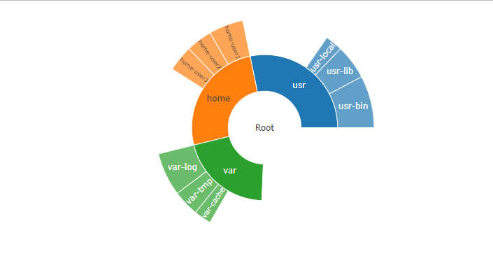
data <- list(
id = c("Root", "usr", "usr-bin", "usr-lib", "usr-local", "home", "home-user1",
"home-user2", "home-user3", "var", "var-log", "var-tmp", "var-cache"),
parent = c("", "Root", "usr", "usr", "usr", "Root", "home", "home", "home", "Root",
"var", "var", "var"),
value = c(100, 50, 30, 20, 10, 50, 20, 15, 15, 30, 25, 15, 10)
)
data<-data.frame(data)
# Create sunburst chart for file system usage
file_system_sunburst <- plot_ly(data, ids = ~id, labels = ~id, parents = ~parent,
values = ~value, type = "sunburst")
# Display the chart
file_system_sunburst
Output:
Sunburst Charts for Hierarchical Data
We're going to use a tool called plotly in R, which helps us make cool charts.
- We need data to make our chart. Our data looks like a map of our computer's folders. Each folder has a name (
id), a parent folder it's in (parent), and how much space it takes up (value). - We tell
plotlyhow to use our data to make the chart. We say each folder's name is itsid, its parent folder is itsparent, and its size is itsvalue. We also say we want a sunburst chart.
The tool creates our chart, and we can see it right here in our R environment. It's like a colorful, interactive map of our computer's folders, showing which ones are big and how they're nested inside each other.
Conclusion
In this article, we explored how to create sunburst charts in R using different packages. Sunburst charts are effective for visualizing hierarchical data structures or categorical data with multiple levels. Depending on your requirements and preferences, you can choose the appropriate package (plotly, d3treeR, etc.) to create static or interactive sunburst charts and customize their appearance. With these tools, you can effectively visualize and communicate hierarchical data in your analysis.