Doughnut and Pie Charts are used to visually represent data distribution in a circular format, where doughnut charts have a central hole, while pie charts do not. They are commonly used in data visualization to showcase proportions and percentages.
Prerequisites:
Steps to Create React Application And Installing Modules
Step 1: Create a React application using the following command.
npx create-react-app foldernameStep 2: After creating your project folder i.e. foldername, move to it using the following command.
cd foldernameStep 3: After creating the ReactJS application, Install the required modules using the following command.
npm i --save rechartsStep 4: Run the application using the following command from the root directory of the project:
npm startStep 5: Now, open your browser and go to http://localhost:3000/ to see the output.
Project Structure:

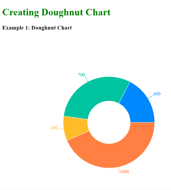
Example 1: In this example, we are displaying data related to GeeksforGeeks using a doughnut chart in React, with a color-coded legend, tooltips for interactive visualization.
import React from 'react';
import {
    ResponsiveContainer,
    PieChart, Pie, Cell,
    Tooltip
} from 'recharts';
const data = [
    {
        name: "Geeksforgeeks",
        students: 400
    },
    {
        name: "GPL2023",
        students: 700
    },
    {
        name: "Job-A-Thon",
        students: 200
    },
    {
        name: "Dev Scripter 2024",
        students: 1000
    },
];
const COLORS =
    ['#0088FE', '#00C49F',
        '#FFBB28', '#FF8042'];
const App = () => (
    <div>
        <h1 style={{ color: 'green' }}>
            Creating Doughnut Chart
        </h1>
        <h3 style={{ marginBottom: '0' }}>
            Example 1: Doughnut Chart
        </h3>
        <div style=
            {{
                width: '700px',
                height: '700px',
                marginTop: '-50px'
            }}>
            <ResponsiveContainer>
                <PieChart>
                    <Pie dataKey="students" data={data} cx="50%"
                        cy="50%" outerRadius={150}
                        innerRadius={70} fill="#8884d8"
                        label>
                        {data.map((entry, index) => (
                            <Cell key={`cell-${index}`}
                                fill={COLORS[index % COLORS.length]} />
                        ))}
                    </Pie>
                    <Tooltip />
                </PieChart>
            </ResponsiveContainer>
        </div>
    </div>
);

export default App;
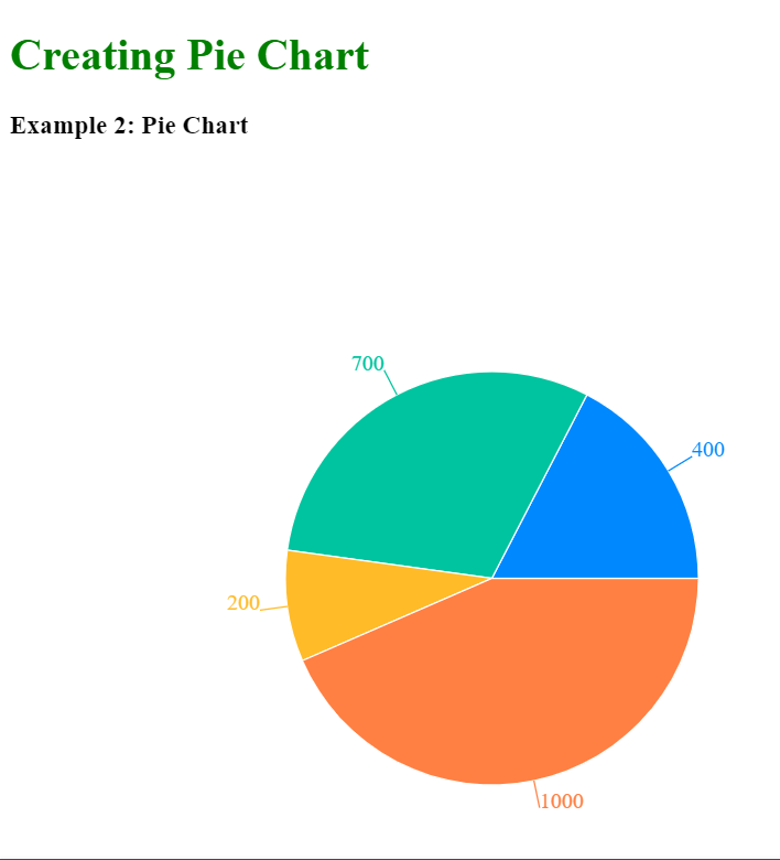
Output:
Example 2: In this example, we are displaying data related to GeeksforGeeks using a pie chart in React using the recharts library, with a color-coded legend and tooltips for interactive visualization.
import React from 'react';
import {
    ResponsiveContainer,
    PieChart, Pie, Cell,
    Tooltip
} from 'recharts';
const data = [
    {
        name: "Geeksforgeeks",
        students: 400
    },
    {
        name: "GPL2023",
        students: 700
    },
    {
        name: "Job-A-Thon",
        students: 200
    },
    {
        name: "Dev Scripter 2024",
        students: 1000
    },
];
const COLORS =
    ['#0088FE', '#00C49F',
        '#FFBB28', '#FF8042'];
const App = () => (
    <div>
        <h1 style={{ color: 'green' }}>
            Creating Pie Chart
        </h1>
        <h3>
            Example 2: Pie Chart
        </h3>
        <div style=
            {{
                width: '700px',
                height: '700px',
                marginTop: '-50px'
            }}>
            <ResponsiveContainer>
                <PieChart>
                    <Pie dataKey="students" data={data}
                        cx="50%" cy="50%" outerRadius={150}
                        fill="#8884d8" label>
                        {data.map((entry, index) => (
                            <Cell key={`cell-${index}`}
                                fill={COLORS[index % COLORS.length]} />
                        ))}
                    </Pie>
                    <Tooltip />
                </PieChart>
            </ResponsiveContainer>
        </div>
    </div>
);
export default App;
Output: