Bootstrap modal box is a UI component that displays content overlaid on the main page. Create it by defining a trigger button with data attributes and structuring the modal in HTML with a unique ID, allowing customization of content and functionality.
Syntax:
<div class="modal"> Contents... <div>The following approaches will be used to build the basic modal, which is described below:
Approach 1: Using JavaScript
This approach involves using JavaScript to control the modal dynamically. You can create an instance of the Modal class and use its methods to display or hide the modal. You can also attach event listeners to buttons or elements to activate the modal upon user interactions.
Syntax:
// Create an instance of the Modal class
let myModal = new bootstrap.Modal(document.getElementById('myModal'));
myModal.show();
myModal.hide();
Example: In this example, we will use javascript for creating a modal.
<!DOCTYPE html>
<html lang="en">

<head>
    <meta charset="UTF-8">
    <meta http-equiv="X-UA-Compatible"
          content="IE=edge">
    <meta name="viewport"
          content="width=device-width,
                   initial-scale=1.0">

    <link href=
"https://cdn.jsdelivr.net/npm/bootstrap@5.2.2/dist/css/bootstrap.min.css"
          rel="stylesheet">
    <script src=
"https://cdn.jsdelivr.net/npm/bootstrap@5.2.2/dist/js/bootstrap.min.js">
    </script>
</head>

<body>
    <div class="container">
        <div class="header">
            <h5>
                  Bootstrap Modal Via JavaScript
              </h5>
        </div>

        <button class="btn btn-success"
                onclick="showModal()">
            Show Modal
        </button>

        <div id="gfg" class="modal" tabindex="-1">
            <div class="modal-dialog">
                <div class="modal-content">
                    <div class="modal-header">
                        <h5 class="modal-title">
                            GeeksforGeeks
                        </h5>
                        <button type="button"
                                class="btn-close"
                                data-bs-dismiss="modal"
                                aria-label="Close">
                        </button>
                    </div>
                    <div class="modal-body">
                        <p>
                            It is a dialog box/popup window that is
                            displayed on top of the current page.
                        </p>
                    </div>
                    <div class="modal-footer">
                        <button type="button"
                                class="btn btn-secondary"
                                data-bs-dismiss="modal">
                            Close
                        </button>
                    </div>
                </div>
            </div>
        </div>
    </div>
    <script>
        let modal =
            new bootstrap.Modal(document.getElementById('gfg'));
        function showModal() {
            modal.show();
        }
    </script>
</body>

</html>
Output:
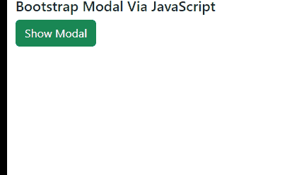
Modal using Bootstrap Example Output
Approach 2: By implementing the Data Attribute
Bootstrap provides the option to trigger a modal using data attributes directly in the HTML. You can add the data-bs-toggle attribute with the value modal to an element that should trigger the modal. Additionally, the data-bs-target attribute is used to specify the target modal's id. This allows for seamless integration without the need for explicit JavaScript code.
Syntax:
<button data-bs-toggle="modal"
        data-bs-target="#myModal">
        Open Modal
</button>
Example: In this example, we will use data attributes for creating the modal.
<!DOCTYPE html>
<html>

<head>
    <!-- Bootstrap CDN -->
    <link href=
"https://cdn.jsdelivr.net/npm/bootstrap@5.0.2/dist/css/bootstrap.min.css"
          rel="stylesheet"
          integrity=
"sha384-EVSTQN3/azprG1Anm3QDgpJLIm9Nao0Yz1ztcQTwFspd3yD65VohhpuuCOmLASjC"
          crossorigin="anonymous">
    <script src=
"https://cdn.jsdelivr.net/npm/bootstrap@5.0.2/dist/js/bootstrap.bundle.min.js"
        integrity=
"sha384-MrcW6ZMFYlzcLA8Nl+NtUVF0sA7MsXsP1UyJoMp4YLEuNSfAP+JcXn/tWtIaxVXM"
        crossorigin="anonymous">
        </script>
</head>

<body class="w-80 p-3">
    <div>
        <h3>
            Bootstrap Modal Via Data Attributes
        </h3>

        <button type="button"
                class="btn btn-primary"
                data-bs-toggle="modal"
                data-bs-target="#GFG">
            Show Modal
        </button>

        <div class="modal fade" id="GFG">
            <div class="modal-dialog modal-lg">
                <div class="modal-content">
                    <div class="modal-header">
                        <h5 class="modal-title">
                            Modal
                        </h5>
                        <button type="button"
                                class="btn-close"
                                data-bs-dismiss="modal">
                        </button>
                    </div>
                    <div class="modal-body">
                        <p>I am a Modal</p>
                        <p>
                            Bootstrap Modal Via Data Attributes
                        </p>
                    </div>
                </div>
            </div>
        </div>
    </div>
</body>

</html>
Output:
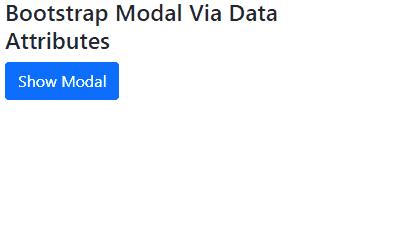
Modal using Bootstrap Example Output
Approach 3: Using Bootstrap Modal Component
Bootstrap's Modal Component allows direct definition of modal markup in HTML, providing flexibility and customization options. Simply add the modal structure within your HTML, including modal header, body, and footer sections, for easy integration and styling.
Example: In this example we demonstrates a Bootstrap modal. A button triggers the modal, revealing a title, content, and buttons for interaction. It's styled using Bootstrap's CSS and JavaScript.
<!DOCTYPE html>
<html lang="en">

<head>
    <meta charset="UTF-8">
    <meta name="viewport" content="width=device-width, initial-scale=1.0">
    <title>Bootstrap Modal Example</title>
    <link href=
"https://cdn.jsdelivr.net/npm/bootstrap@5.3.0-alpha1/dist/css/bootstrap.min.css"
          rel="stylesheet">
</head>

<body>

    <!-- Button to trigger the modal -->
    <button type="button"
            class="btn btn-primary"
            data-bs-toggle="modal"
            data-bs-target="#exampleModal">
        Launch Modal
    </button>

    <!-- Modal -->
    <div class="modal fade"
         id="exampleModal"
         tabindex="-1"
         aria-labelledby="exampleModalLabel"
         aria-hidden="true">
        <div class="modal-dialog">
            <div class="modal-content">
                <div class="modal-header">
                    <h5 class="modal-title"
                        id="exampleModalLabel">
                        Modal Title
                    </h5>
                    <button type="button"
                            class="btn-close"
                            data-bs-dismiss="modal"
                            aria-label="Close">

                    </button>
                </div>
                <div class="modal-body">
                    <p>This is the content of the modal. You can add any HTML content here.</p>
                </div>
                <div class="modal-footer">
                    <button type="button"
                            class="btn btn-secondary"
                            data-bs-dismiss="modal">
                        Close
                    </button>
                    <button type="button"
                            class="btn btn-primary">
                        Save changes
                    </button>
                </div>
            </div>
        </div>
    </div>

    <script src=
"https://cdn.jsdelivr.net/npm/bootstrap@5.3.0-alpha1/dist/js/bootstrap.bundle.min.js"
    ></script>
</body>

</html>
Output:
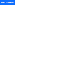
Modal using Bootstrap Example Output