Accordions are popular UI components used to present collapsible content sections on websites, enhancing user experience by organizing information in a compact and accessible manner. While traditionally implemented with JavaScript, a CSS-only approach offers a lightweight and efficient alternative, eliminating the need for additional scripting.
Below are the methods to create an accordion using CSS:
Table of Content
Using CSS
This approach focuses on creating an accordion solely with CSS, offering benefits such as lightweight implementation, improved performance, and broader browser compatibility compared to JavaScript-based solutions. By leveraging CSS selectors and properties, developers can achieve the desired accordion functionality without relying on additional scripting.
Syntax:
   .accordion {
       /* Styles for the accordion container */
   }

   .accordion-item {
       /* Styles for accordion items */
   }

   .accordion-header {
       /* Styles for accordion headers */
   }

   .accordion-content {
       /* Styles for accordion content */
   }
Example:
- The HTML structure defines the accordion with headers and content panels, each wrapped in a container.
- CSS styles are applied to the accordion components, including border radius, box shadow, and transitions for a modern look and feel.
- JavaScript is used to toggle the active state of accordion items when clicked, enhancing interactivity without compromising the CSS-only approach.
<!DOCTYPE html>
<html lang="en">
<head>
<meta charset="UTF-8">
<meta name="viewport"
content="width=device-width, initial-scale=1.0">
<title>CSS-only Accordion</title>
<style>
/* Styles for the accordion */
.accordion {
border-radius: 8px;
overflow: hidden;
box-shadow: 0 2px 5px rgba(0, 0, 0, 0.1);
}
.accordion-item {
border-bottom: 1px solid #e0e0e0;
}
.accordion-header {
background-color: #f5f5f5;
padding: 16px;
font-size: 18px;
cursor: pointer;
transition: background-color 0.3s ease;
}
.accordion-header:hover {
background-color: #e0e0e0;
}
.accordion-content {
padding: 16px;
display: none;
background-color: #fafafa;
font-size: 16px;
line-height: 1.6;
}
.accordion-item.active .accordion-content {
display: block;
}
</style>
</head>
<body>
<div class="accordion">
<!-- Accordion item 1 -->
<div class="accordion-item">
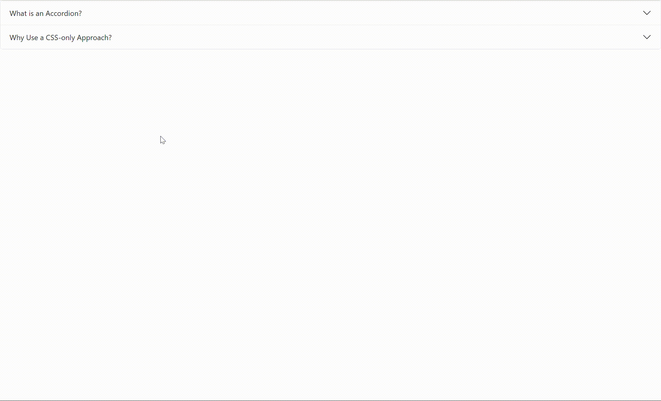
<div class="accordion-header">What is an Accordion?</div>
<div class="accordion-content">
<p>An accordion is a user interface pattern used to hide or
reveal content sections on a webpage. It consists of a list
of headers (usually clickable) and associated content
panels.</p>
</div>
</div>
<!-- Accordion item 2 -->
<div class="accordion-item">
<div class="accordion-header">Why Use a CSS-only Approach?</div>
<div class="accordion-content">
<p>Using CSS to create an accordion offers several advantages,
including faster loading times, reduced code complexity, and
better performance. It also ensures compatibility across a
wide range of devices and browsers without relying on
JavaScript.</p>
</div>
</div>
<!-- Add more accordion items as needed -->
</div>
<script>
// JavaScript to toggle accordion content
const accordionItems = document.querySelectorAll('.accordion-item');
accordionItems.forEach(item => {
item.addEventListener('click', () => {
item.classList.toggle('active');
});
});
</script>
</body>
</html>
Output:
Using CSS Frameworks for Accordion Styling
In this approach, we utilize CSS frameworks like Bootstrap to swiftly implement accordions with pre-styled components. Leveraging frameworks streamlines development, offering ready-made solutions for common UI patterns such as accordions, saving time and effort in styling.
Syntax:
<div class="accordion">  <div class="accordion-item">
    <h2 class="accordion-header">  <button class="accordion-button collapsed" type="button">  Section 1
      </button>
    </h2>
    <div class="accordion-collapse collapse">  <p>Content</p>
    </div>
  </div>
</div>
Example: The provided code exemplifies the utilization of Bootstrap framework to construct an accordion. Each accordion item is structured with headers and collapsible content panels, styled using Bootstrap's predefined classes. Bootstrap's JavaScript library is integrated to enable accordion functionality, facilitating smooth interaction.
<!DOCTYPE html>
<html lang="en">
<head>
<meta charset="UTF-8">
<meta name="viewport" content="width=device-width, initial-scale=1.0">
<title>Accordion with Bootstrap</title>
<link
href=
"https://cdn.jsdelivr.net/npm/bootstrap@5.3.0-alpha1/dist/css/bootstrap.min.css"
rel="stylesheet">
</head>
<body>
<div class="accordion" id="accordionExample">
<!-- Accordion item 1 -->
<div class="accordion-item">
<h2 class="accordion-header" id="headingOne">
<button class="accordion-button" type="button"
data-bs-toggle="collapse" data-bs-target="#collapseOne"
aria-expanded="true" aria-controls="collapseOne">
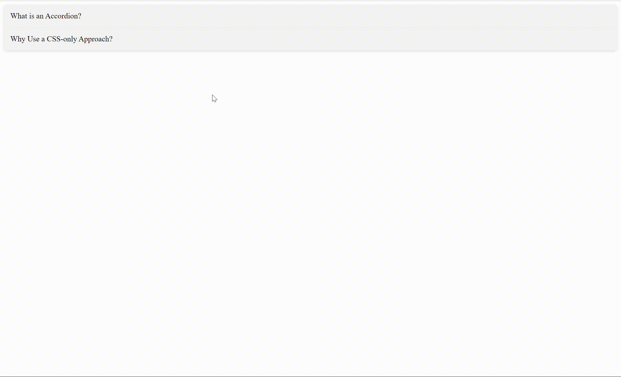
What is an Accordion?
</button>
</h2>
<div id="collapseOne" class="accordion-collapse collapse show"
aria-labelledby="headingOne" data-bs-parent="#accordionExample">
<div class="accordion-body">
An accordion is a user interface pattern used to hide or
reveal content sections on a webpage. It consists of a list
of headers (usually clickable) and associated content
panels.
</div>
</div>
</div>
<!-- Accordion item 2 -->
<div class="accordion-item">
<h2 class="accordion-header" id="headingTwo">
<button class="accordion-button collapsed" type="button"
data-bs-toggle="collapse" data-bs-target="#collapseTwo"
aria-expanded="false" aria-controls="collapseTwo">
Why Use a CSS-only Approach?
</button>
</h2>
<div id="collapseTwo" class="accordion-collapse collapse"
aria-labelledby="headingTwo" data-bs-parent="#accordionExample">
<div class="accordion-body">
Using CSS to create an accordion offers several advantages,
including faster loading times, reduced code complexity, and
better performance. It also ensures compatibility across a
wide range of devices and browsers without relying on
JavaScript.
</div>
</div>
</div>
<!-- Add more accordion items as needed -->
</div>
<script src=
"https://cdn.jsdelivr.net/npm/bootstrap@5.3.0-alpha1/dist/js/bootstrap.bundle.min.js">
</script>
</body>
</html>
Output: