React Portals offer a powerful mechanism for rendering elements outside of the typical DOM hierarchy in React applications. They provide a way to render content at a different place in the DOM tree from where it is defined in the component hierarchy. This capability opens up various possibilities, such as modals, tooltips, and overlays, that require rendering outside the root DOM node. In this article, we'll see React Portals, discussing what they are, how they work, and their practical applications.
Real-Life Example: Think of your React app as a pizza shop, and the root DOM node (the <div> with an id like "root") is the front counter where customers place their orders. Now, sometimes you need to deliver pizzas to different locations, like a party room or a school classroom. But React usually only lets you serve pizzas at the front counter (the root DOM node).That's where React Portals come in. They're like secret pizza delivery tunnels that allow you to send pizzas to different locations without going through the front counter.
Prerequisites:
What are React Portals?
React Portals are a feature introduced in React 16 that enable developers to render children components into a DOM node that exists outside of the parent component's DOM hierarchy. In other words, they allow you to render elements into a different part of the DOM tree, which can be useful for scenarios like modals, tooltips, or any UI element that needs to break out of its parent's layout constraints.
How do React Portals work?
React Portals work by creating a portal between a parent component and a target DOM node. This portal bridges the gap between the React component tree and the actual DOM tree. When you render a child component using a portal, React ensures that the component's subtree is appended to a specified DOM node, which could be anywhere in the document. This decouples the component's rendering from its position in the component hierarchy.
Syntax:
import ReactDOM from 'react-dom';

// Create a portal
const Portal = ({ children }) => {
  const portalRoot = document.getElementById('portal-root');
  return ReactDOM.createPortal(children, portalRoot);
};

// Use the portal in your component
const MyComponent = () => (
  <Portal>
    <div>Content rendered outside the root DOM node!</div>
  </Portal>
);
Explanation: In this example, <Portal> is a component that creates a portal, and whatever you put inside it will magically appear outside the root DOM node, in an element with the id "portal-root". This allows you to render elements in different parts of your app without breaking the rules of React.
Benefits of React Portals
- Encapsulation: Portals allow you to encapsulate complex UI elements within their own components while rendering them in a different part of the DOM.
- Improved Accessibility: Elements rendered via portals can be easily managed for accessibility purposes, ensuring they are properly announced to screen readers.
- Separation of Concerns: Portals help maintain a clean separation of concerns by separating the UI logic from the layout constraints of parent components.
- Flexibility: They provide flexibility in terms of positioning UI elements, making it easier to create overlays, modals, and other components that need to break out of their parent containers.
Steps to Create React Application And Installing Module
Step 1: Create a React application using the following command:
npx create-react-app foldernameStep 2: After creating your project folder i.e. foldername, move to it using the following command:
cd foldernameStep 3: After setting up react environment on your system, we can start by creating an App.js file and create a directory by the name of components in which we will write our desired function.
Project Structure:
The updated dependencies in package.json file will look like.
  "dependencies": {
    "react": "^18.2.0",
    "react-dom": "^18.2.0",
    "react-scripts": "5.0.1",
    "web-vitals": "^2.1.4",
  }
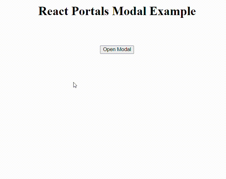
Example 1: The example showcases a React application with a modal that appears outside the main content area using React Portals. When the "Open Modal" button is clicked, the modal is rendered outside the root DOM node, allowing it to overlay the page content. The modal contains a title, content, and a button to close it. This demonstrates how React Portals enable the creation of modal dialogs that are separate from the main DOM hierarchy.
<!-- index.html -->

<!doctype html>
<html lang="en">

<head>
  <meta charset="UTF-8" />
  <link rel="icon" type="image/svg+xml"
        href="/vite.svg" />
  <meta name="viewport"
        content="width=device-width, initial-scale=1.0" />
  <title>React</title>
</head>

<body>
  <div id="root"></div>
  <div id="modal-root"></div>
  <script type="module" src="/src/main.jsx"></script>
</body>

</html>
/*App.css*/

#root {
    max-width: 1280px;
    margin: 0 auto;
    padding: 2rem;
    text-align: center;
}

/* Modal CSS */
.modal {
    position: absolute;
    top: 50%;
    left: 50%;
    transform: translate(-50%, -50%);
    background-color: rgba(0, 0, 0, 0.5);
    width: 300px;
    padding: 20px;
}

.modal-content {
    background-color: #fff;
    padding: 20px;
    border-radius: 8px;
    box-shadow: 0 2px 10px rgba(0, 0, 0, 0.2);
}

/* Adjusting button position */
button {
    margin-top: 50px;
}
// App.js

import React, { useState } from 'react';
import ReactDOM from 'react-dom';
import "./App.css"

const App = () => {
    const [modalOpen, setModalOpen] = useState(false);

    const toggleModal = () => {
        setModalOpen(!modalOpen);
    };

    return (
        <div>
            <h1>React Portals Modal Example</h1>
            <button onClick={toggleModal}>
                Open Modal
            </button>

            {/* The modal will be rendered
                inside the portal container */}
            {modalOpen && (
                ReactDOM.createPortal(
                    <div className="modal">
                        <div className="modal-content">
                            <h2>Modal Title</h2>
                            <p>
                                This is the content
                                of the modal.
                            </p>
                            <button onClick={toggleModal}>
                                Close Modal
                            </button>
                        </div>
                    </div>,
                    document.getElementById('modal-root')
                )
            )}
        </div>
    );
};

export default App;
Output:
Example 2: This code demonstrates a React application with a tooltip and popover feature using React Portals. When the "Show Popover" button is clicked, a popover appears at the mouse pointer's position, thanks to the handlePopoverClick function. The popover renders outside the main content area, ensuring it doesn't interfere with the page layout.
/* App.css */

.popover {
    position: absolute;
    background-color: #fff;
    border: 1px solid #ccc;
    padding: 12px;
    border-radius: 8px;
    box-shadow: 0 2px 5px rgba(0, 0, 0, 0.1);
}
//App.jsx

import React, { useState, useEffect } from 'react';
import ReactDOM from 'react-dom';
import './App.css'; // Import CSS file for styling

const App = () => {
    const [popoverPosition, setPopoverPosition] = useState(null);

    const handlePopoverClick = (event) => {
        setPopoverPosition({
            top: event.clientY + 10,
            left: event.clientX + 10
        });
    };

    const closePopover = () => {
        setPopoverPosition(null);
    };

    useEffect(() => {
        const handleOutsideClick = (event) => {
            // Close popover if click
            // target is not within the popover
            if (popoverPosition &&
                !event.target.closest('.popover')) {
                closePopover();
            }
        };

        document.addEventListener(
            'mousedown', handleOutsideClick);

        return () => {
            document.removeEventListener(
                'mousedown', handleOutsideClick);
        };
    }, [popoverPosition]);

    return (
        <div>
            <h1>
                React Portals Tooltip
                and Popover Example
            </h1>
            <button onClick={handlePopoverClick}>
                Show Popover
            </button>

            {/* Popover */}
            {popoverPosition && (
                ReactDOM.createPortal(
                    <div className="popover"
                        style={popoverPosition}
                        onClick={closePopover}>
                        <h3>Popover Title</h3>
                        <p>This is a popover content.</p>
                    </div>,
                    document.body
                )
            )}
        </div>
    );
};

export default App;
Output:
