Foundation CSS is an open-source & responsive front-end framework built by ZURB foundation in September 2011, that makes it easy to design beautiful responsive websites, apps, and emails that look amazing & can be accessible to any device. It is used by many companies such as Facebook, eBay, Mozilla, Adobe, and even Disney. The framework is built on SaaS-like bootstrap. It is more sophisticated, flexible, and easily customizable. It also comes with CLI, so it’s easy to use it with module bundlers. It offers the Fastclick.js tool for faster rendering on mobile devices.
The Visibility Class helps us to make different elements of a website to be visible or hidden based on the screen size or device orientation. It can also control which elements user sees based on their browsing environment. There are various components of the Visibility Class, which are described below:
- Show by screen size: This class shows a particular component based on the screen size. The element will only show if the browser screen size meets the class’s condition, else it will be hidden.
- Hide by screen size: This class can be used to hide a particular element based on the screen size. The element will be hidden if the browser screen meets the class’s condition else it will be shown.
- Orientation Detection: This class can be used to display the different elements based on their orientation. These classes are very useful when we rotate the mobile screen while using the website. In the Desktop, the orientation is set to landscape.
Syntax:
<p class="Visibility Classes"> Content </p>
Accessibility: We can hide the elements by specifying the display property, whose value is set to none, but it will also hide it from the screen reader. However, there are other ways of hiding elements while it is readable by the screen readers.
Show for Screen reader only: We can make an element readable to the screen reader only by adding the “.show-for-sr” class to the element.
Syntax:
<p class="show-for-sr"> Content </p>
Hide for Screen reader: We can make an element hidden to the screen reader by adding the attribute “aria-hidden= true”. This will not affect how the elements look but it will be skipped by the screen reader.
Syntax:
<p aria-hidden="true"> Content </p>
Sticky Mode detection: While using a sticky component, we can use the visibility classes to hide or show an element when the sticky component is stuck.
Used Classes:
- hide-for-sticky: This class is used to hide elements inside a sticky component.
- show-for-sticky: This class is used to show elements inside a sticky component.
Syntax:
<p class="Class"> Content </p>
Creating Skip Lines: If the webpage contains a lot of navigation and links, the screen reader has to read through every navigation before getting through other content. This makes it slower and takes a lot of time to load the website. This problem can be solved by adding a skip link to the website.
IE+ Detection: The demise of Internet Explorer will not come soon. So, the visibility classes help us to show or hide elements inside all the IE10+ browsers.
Used Class:
- show-for-ie: This helps us to show the element for the IE browsers.
- hide-for-ie: This helps us to hide the element for the IE browsers.
Syntax:
<p class="Class"> Content </p>
Dark Mode Detection: The dark mode has become very common in modern websites. The visibility classes help us to show or hide elements in dark mode very easily with the help of its classes.
Used Class:
- show-for-dark-mode: This class helps us to show an element only in dark mode.
- hide-for-dark-mode: This class helps us to hide an element in dark mode.
Syntax:
<p class="Class">Content</p>
We will explore & understand all these concepts & implement them through the examples.
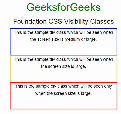
Example 1: This example describes the Foundation CSS Visibility Classes. Here, we have displayed the different <div> according to the screen size of the browser.
<!DOCTYPE html> <html lang="en">
<head>
<meta charset="UTF-8">
<meta name="viewport"
content="width=device-width,
initial-scale=1.0">
<link rel="stylesheet" href=
crossorigin="anonymous">
<script src=
crossorigin="anonymous"></script>
<title>
Foundation CSS Visibility Classes
</title>
</head>
<body>
<center>
<h2 style="color: green;">GeeksforGeeks</h2>
<h4>Foundation CSS Visibility Classes</h4>
<div class="show-for-medium"
style="border: blue 2px solid;
height: 100px;
width: 400px;">
<p>
This is the sample div class which
will be seen when the screen size
is medium or large.
</p>
</div>
<div class="show-for-large" style="border: orange 2px solid;
height: 100px;
width: 400px;">
<p>
This is the sample div class
which will be seen when the
screen size is large.
</p>
</div>
<div class="show-for-large-only" style="border: red 2px solid;
height: 100px;
width: 400px;">
<p>
This is the sample div class
which will be seen only when the
screen size is large.
</p>
</div>
<div class="show-for-small-only" style="border: green 2px solid;
height: 100px;
width: 400px;">
<p>
This is the sample div class which
will be seen only when the screen
size is small.
</p>
</div>
<div class="show-for-medium-only" style="border: deeppink 2px solid;
height: 100px;
width: 400px;">
<p>
This is the sample div class which
will be seen only when the screen
size is medium.
</p>
</div>
</center>
<script>
$(document).foundation();
</script>
</body>
</html>
|
Output:
Example 2: This example describes the Foundation CSS Visibility Classes. Here, we have displayed the different <div> according to the screen sizes.
<!DOCTYPE html> <html lang="en">
<head>
<meta charset="UTF-8">
<meta name="viewport"
content="width=device-width,
initial-scale=1.0">
<link rel="stylesheet" href=
crossorigin="anonymous">
<script src=
crossorigin="anonymous"></script>
<title>Foundation CSS Visibility Classes</title>
</head>
<body>
<center>
<h2 style="color: green;">
GeeksforGeeks
</h2>
<h4>
Foundation CSS Visibility Classes
</h4>
<div class="hide" style="border: salmon 2px solid;
height: 100px;
width: 400px;">
<p> This sample text will be hidden. </p>
</div>
<div class="hide-for-medium" style="border: blue 2px solid;
height: 100px;
width: 400px;">
<p>
This is the sample div class which will
be seen when the screen size not medium
or large.
</p>
</div>
<div class="hide-for-large" style="border: orange 2px solid;
height: 100px;
width: 400px;">
<p>
This is the sample div class which will
be seen when the screen size is not large.
</p>
</div>
<div class="hide-for-large-only" style="border: red 2px solid;
height: 100px;
width: 400px;">
<p>
This is the sample div class which will be
hidden only when the screen size will be large.
</p>
</div>
<div class="hide-for-small-only" style="border: green 2px solid;
height: 100px;
width: 400px;">
<p>
This is the sample div class which will be hidden
only when the screen size will be small.
</p>
</div>
<div class="hide-for-medium-only" style="border: deeppink 2px solid;
height: 100px;
width: 400px;">
<p>
This is the sample div class which will be hidden only
when the screen size will be medium.
</p>
</div>
</center>
<script>
$(document).foundation();
</script>
</body>
</html>
|
Output:
Reference: https://get.foundation/sites/docs/visibility.html