The CSS place-items property is the shorthand of align-items and justify-items property. The shorthand properties mean in CSS, that you can set the multiple properties values in a single property. So here the place-items property can hold the value of the align-items and justify-items property values.
Syntax:
place-items: align-items property value justify-items property value
Property Values: This property accepts all the possible combination values that can make by the align-items and justify-items property values.
- auto: If the items have no parents then this property is used that defines the absolute positioned.
- normal: This property dependent on the layout mode we are in.
- start: This property used to align flex items from the start of the container.
- end: This property used to align flex items from the end of the container.
- flex-start: This property displays the lines at the start of the flex container.
- flex-end: This property displays the flex lines at the end of the flex container.
- center: This property aligns flex items at the center of the container.
- self-start: This property will be packed flush to the edge of the alignment container of the start side of the item.
- self-end: This property will be packed flush to the edge of the alignment container of the end side of the item.
- space-evenly: This property defines that the positioned with equal spacing between them but the spacing from corners differ.
- stretch: This property defines that the line stretched to take the remaining space of the flex container. It is the default value.
Below examples illustrate the CSS place-items property:
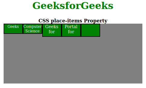
Example 1: In this example, we will use star place-items: flex-start property value.
HTML
<!DOCTYPE html><html>
<head>
<title>CSS place-items Property</title>
<style>
h1 {
color: green;
}
#container {
display: flex;
height: 200px;
width: 460px;
flex-wrap: wrap;
background-color: gray;
/* place-items can be changed in the live sample */
place-items: flex-start;
}
div>div {
border: 2px solid black;
width: 60px;
background-color: green;
color: white;
}
.short {
font-size: 12px;
height: 30px;
}
.tall {
font-size: 14px;
height: 40px;
}
</style>
</head>
<body>
<center>
<h1>GeeksforGeeks</h1>
<b>CSS place-items Property</b>
<div id="container">
<div class="short">Geeks</div>
<div class="short">
Computer<br />
Science
</div>
<div class="tall">
Geeks<br />
for
</div>
<div class="tall">
Portal<br />
for
</div>
<div class="tall"></div>
</div>
</center>
</body>
</html>
|
Output:
Example 2: Here we will use place-items: flex-end property value.
HTML
<!DOCTYPE html><html>
<head>
<title>CSS place-content Property</title>
<style>
h1 {
color: green;
}
#container {
display: flex;
height: 200px;
width: 460px;
flex-wrap: wrap;
background-color: gray;
/* place-items can be changed in the live sample */
place-items: flex-end;
}
div>div {
border: 2px solid black;
width: 60px;
background-color: green;
color: white;
}
.short {
font-size: 12px;
height: 30px;
}
.tall {
font-size: 14px;
height: 40px;
}
</style>
</head>
<body>
<center>
<h1>GeeksforGeeks</h1>
<b>CSS place-items Property</b>
<div id="container">
<div class="short">Geeks</div>
<div class="short">
Computer<br />
Science
</div>
<div class="tall">
Geeks<br />
for
</div>
<div class="tall">
Portal<br />
for
</div>
<div class="tall"></div>
</div>
</center>
</body>
</html>
|
Output:
Browser Versions:
- Google Chrome 59
- Edge 79
- Firefox 45
- Opera 46
- Safari 11