In this article, we will learn how to create a Scanning Animation. This can be used to add interactivity to the loader page. This is approached
by simple HTML & CSS.
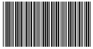
Glimpse of the Project:
Approach:
- We will first create an HTML file in which we are going to add a div for adding a span in it.
- We will then create a CSS style to give animation effects to the scanning animation.
We will start by defining the HTML and CSS sections of the page as given below.
HTML Section: In this section, the structure of the page is defined.
- We will first create an HTML file.
- We are then going to write out the boilerplate code required for an HTML page.
- We will next link the CSS file or directly add the required CSS that provides all the animation effects.
- In the body section, we will add a span to add our text.
index.html
<!DOCTYPE html> <html lang="en">
<head>
<link rel="stylesheet" href="style.css" />
</head>
<body>
<div class="scan">
<img
src=
alt="barcode"
/>
</div>
</body>
</html>
|
CSS Section: In this section, we will define the CSS of the page. Using CSS we will give different types of animations
and effects to our HTML page so that it looks interactive to all users.
- We will first reset all the browser effects so that everything is consistent on all browsers.
- Then we will define the styling to be given to the elements which include the size and position.
- We will use @keyframe and pseudo-class to add animation effects to the specific classes.
style.css
.scan { width: 10em;
text-align: center;
padding: 6px 2px;
position: absolute;
left: 0;
right: 0;
top: 50%;
margin: auto;
border: dashed .25em rgb(90, 85, 85);
transform: translate(-50%);
} .scan::after { content: '';
background: rgb(23, 162, 74);
width: 0.25em;
height: 3.5em;
display: block;
position: absolute;
top: 0;
right: 0;
left: 0;
bottom: 0;
margin: auto;
opacity: 7;
z-index: 2;
animation: 2s infinite ease-in-out roll;
} .scan img { height: 30px;
width: 98%;
} @keyframes roll { 0% {
transform: translateX(-50px);
}
50% {
transform: translateX(50px);
}
100% {
transform: translateX(-50px);
}
} |
Output:
Article Tags :
Recommended Articles