In this guide, we'll dive into the world of circular bar plots in Python. We'll explore what they are, why they're useful, and how you can create them to add a stylish touch to your data visualization projects.
What is a Circular Bar Plot?
Circular bar plots, also known as radial bar charts or circular stacked bar plots, are a variation of traditional bar plots. Instead of representing data along a horizontal or vertical axis, circular bar plots display data along a circular or radial axis. Each bar extends from the center of the plot outward, with the length of the bar representing the value of the corresponding data point.
Step to Create Circular Bar Plot in Python
Creating a circular bar plot in Python is easier than you might think. Here are the steps you need to follow:
- Step 1: Import libraries: Import the necessary libraries, such as matplotlib, which is a popular plotting library in Python.
- Step 2: Prepare your data: Organize your data into categories and corresponding values that you want to visualize.
- Step 3: Create the plot: Use matplotlib to create a polar plot (subplot_kw=dict(polar=True)) and add bars using the bar() function. Make sure to adjust the angles of the bars appropriately to create a circular layout.
- Step 4: Customize the plot (optional): You can further customize the plot by adding labels, legends, and titles, or changing the color scheme to suit your preferences.
And that's it! With just a few lines of code, you can create stunning circular bar plots to showcase your data in a visually appealing manner.
Circular Bar Plot in Python
Below, are the code examples, of a circular ar plot in Python.
Example 1: Circular Bar Plot Creation Using Matplotlib
In this example, below Python code uses the Matplotlib library to generate a circular bar plot. It imports necessary modules, defines sample data with categories and values, and then creates a subplot with polar projection. Finally, it generates bars on the polar axes corresponding to each category's value, resulting in a circular bar plot visualization.
import matplotlib.pyplot as plt
import numpy as np

# Sample data
categories = ['Category 1', 'Category 2', 'Category 3', 'Category 4']
values = [20, 35, 30, 25]

# Create a circular bar plot
fig, ax = plt.subplots(subplot_kw=dict(polar=True))
bars = ax.bar(np.arange(len(categories)) * 2 * np.pi / len(categories), values)

plt.show()
Output
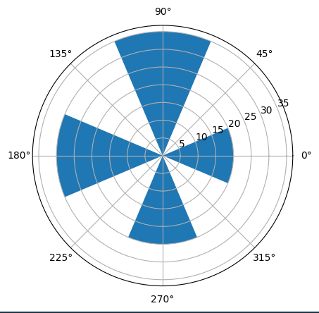
fig 1. Output of the above code.
Example 2: Customizing a Circular Bar Plot in Matplotlib
In this example, below code uses Matplotlib to create a circular bar plot with customizations. It includes sample data, custom colors, and adds labels to each bar. Additional plot adjustments such as starting angle, direction, and axis limits are applied for improved visualization before displaying the final circular bar plot.
import matplotlib.pyplot as plt
import numpy as np

# Sample data
categories = ['Category 1', 'Category 2', 'Category 3', 'Category 4']
values = [20, 35, 30, 25]
colors = ['#1f77b4', '#ff7f0e', '#2ca02c', '#d62728']  # Custom colors for bars

# Create a circular bar plot
fig, ax = plt.subplots(subplot_kw=dict(polar=True))
bars = ax.bar(np.arange(len(categories)) * 2 * np.pi /
              len(categories), values, color=colors, alpha=1)

# Add labels to each bar
for i, (label, angle) in enumerate(zip(categories, np.arange(len(categories)) * 2 * np.pi / len(categories))):
    x = angle
    y = values[i] + 1  # Adjust height for label placement
    ax.text(x, y, label, ha='center', va='center', fontsize=8, color='black')

# Customizing the plot
ax.set_theta_offset(np.pi / 2)  # Offset to start the bars from the top
ax.set_theta_direction(-1)  # Clockwise direction for bars
# Adjust the y-axis limit for better visualization
ax.set_ylim(0, max(values) + 5)
ax.set_yticks([])  # Hide the y-axis ticks
ax.spines['polar'].set_visible(False)  # Hide the polar axis line

plt.show()
Output
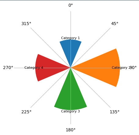
fig 2. Creative way of circular bar