Heatmaps serve as powerful tools for visualizing complex data patterns, making them invaluable assets in various fields such as data science, biology, and finance. However, while heatmaps effectively display relative intensities or frequencies of data, they often lack a direct representation of the underlying values, limiting their interpretability. In this article, we delve into the techniques of augmenting heatmaps in R with explicit value annotations, thus enriching the visualizations with precise information.
Add value to Heatmap
Adding values to a heatmap refers to the process of displaying the numeric values associated with each cell of the heatmap directly on the visualization. Heatmaps in R Programming Language are often used to represent data where values are encoded as colors, but sometimes it's helpful to also display the actual numerical values for clarity or precision.
Heatmap using the geom_text()
# Load required libraries
library(ggplot2)

# Example data
# Let's assume 'data' is your matrix of values for the heatmap
data <- matrix(1:25, nrow = 5)

# Convert matrix to dataframe
data_df <- as.data.frame(as.table(data))

# Plot heatmap
heatmap_plot <- ggplot(data_df, aes(x = Var1, y = Var2, fill = Freq)) +
  geom_tile(color = "white") + # Create heatmap
  scale_fill_gradient(low = "white", high = "steelblue") + # Set color gradient
  theme_minimal() + # Set theme
  labs(x = "X Axis", y = "Y Axis", title = "Heatmap with Values") + # Labels
  theme(axis.text.x = element_text(angle = 45, hjust = 1)) # Rotate x-axis labels

# Add values to the heatmap
heatmap_plot_with_values <- heatmap_plot +
  geom_text(aes(label = Freq), color = "black", size = 3)

# Print the heatmap with values
print(heatmap_plot_with_values)
Output:

Add Values to Heatmap in R
We use geom_tile() to create the heatmap itself, with each tile representing a cell in the heatmap.
- Then, we use geom_text() to overlay text labels on each cell of the heatmap. These labels typically represent the numeric values corresponding to each cell.
- The label aesthetic inside geom_text() specifies which column in the dataset contains the text labels to be displayed.
- This method provides flexibility in customizing the appearance of the heatmap and the text labels, such as font size, color, and positioning.
Heatmap using the geom_tile()
# Load required libraries
library(ggplot2)

# Example data
# Let's create a sample matrix
data <- matrix(1:18, nrow = 3)

# Convert matrix to dataframe
data_df <- as.data.frame(as.table(data))

# Plot heatmap with values
heatmap_plot <- ggplot(data_df, aes(x = Var1, y = Var2, fill = Freq, label = Freq)) +
  geom_tile(color = "white") + # Create heatmap
  geom_text(color = "black", size = 4) + # Add text labels
  scale_fill_gradient(low = "lightblue", high = "darkblue") + # Set color gradient
  theme_minimal() + # Set theme
  labs(x = "X Axis", y = "Y Axis", title = "Sample Heatmap with Values") + # Labels
  theme(axis.text.x = element_text(angle = 45, hjust = 1)) # Rotate x-axis labels

# Print the heatmap with values
print(heatmap_plot)
Output:
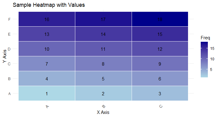
Add Values to Heatmap in R
Instead of overlaying text labels separately using geom_text(), we incorporate the labels directly into the tiles of the heatmap using the label aesthetic inside geom_tile().
- Each tile of the heatmap now includes both the color representation and the numeric value label.
- This method simplifies the code by combining the creation of the heatmap and the addition of numeric values into a single step.
- Adjustments to the appearance of the heatmap and the labels can still be made within geom_tile().
Conclusion
Adding numbers to R heatmaps makes them easier to understand. It helps people compare data, communicate ideas clearly, and ensures everyone can access the information. This simple tweak boosts the usefulness of heatmaps, making data analysis simpler and more effective for everyone involved.