How to Add Transition on Hover Using CSS?
Last Updated :
31 Jul, 2024
Transitions are the CSS technique used to create smooth changes between property values over a specified duration. By defining a transition, you can animate properties such as color, size, or position, making changes appear gradual rather than abrupt. For hover effects, transitions can enhance user experience by smoothly altering styles when a user interacts with an element.
These are the following approaches to add transition on hover with CSS:
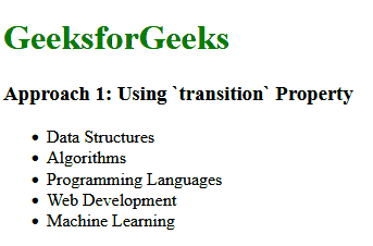
Using transition Property
In this approach, we are using the transition property to create a smooth hover effect on list items. The .list-item class specifies that the color and transform properties should transition over 0.3 seconds with an ease timing function. When a list item is hovered over, its color changes to red and it scales up by 1.2 times, creating a visually appealing effect.
Example: The below example uses the transition Property to add transition on hover with CSS.
HTML
<!DOCTYPE html>
<html lang="en">

<head>
    <title>Example 1</title>
    <style>
        h1 {
            color: green;
        }

        .list-item {
            transition: color 0.3s ease, transform 0.3s ease;
        }

        .list-item:hover {
            color: red;
            transform: scale(1.2);
        }
    </style>
</head>

<body>
    <div>
        <h1>GeeksforGeeks</h1>
        <h3>Approach 1: Using `transition` Property</h3>
        <ul>
            <li class="list-item">Data Structures</li>
            <li class="list-item">Algorithms</li>
            <li class="list-item">Programming Languages</li>
            <li class="list-item">Web Development</li>
            <li class="list-item">Machine Learning</li>
        </ul>
    </div>
</body>

</html>
Output:
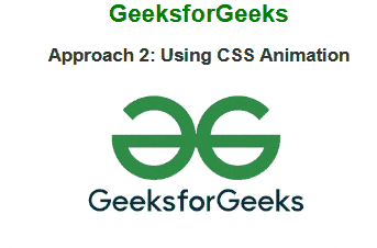
Using CSS Animations
In this approach, we are using CSS animations to create a hover effect on the image. The scale-up and scale-down keyframe animations control the scaling of the image. When the image container is hovered over, the scale-down animation reduces the image size, giving the appearance of a smooth scaling effect. The scale-up animation is used as a placeholder to ensure the initial state of the image is preserved.
Example: The below example uses the CSS Animations to add transition on hover with CSS.
HTML
<!DOCTYPE html>
<html lang="en">

<head>
    <title>Example 2</title>
    <style>
        body {
            font-family: Arial, sans-serif;
            text-align: center;
            margin-top: 50px;
        }

        h1 {
            color: green;
        }

        h2 {
            color: #333;
        }

        .image-container {
            display: inline-block;
            overflow: hidden;
        }

        .image-container img {
            width: 300px;
            height: auto;
            animation: scale-up 0.5s forwards;
        }

        .image-container:hover img {
            animation: scale-down 0.5s forwards;
        }

        @keyframes scale-up {
            from {
                transform: scale(1);
            }

            to {
                transform: scale(1);
            }
        }

        @keyframes scale-down {
            from {
                transform: scale(1);
            }

            to {
                transform: scale(0.8);
            }
        }
    </style>
</head>

<body>
    <h1>GeeksforGeeks</h1>
    <h2>Approach 2: Using CSS Animation</h2>
    <div class="image-container">
        <img src=
"https://media.geeksforgeeks.org/wp-content/uploads/20240305215328/gfglogo.png"
            alt="GeeksforGeeks Logo">
    </div>
</body>

</html>
Output: