Removing the Color Bar in Seaborn Heatmaps
Last Updated :
23 Jul, 2025
Seaborn is a powerful Python visualization library based on Matplotlib that provides a high-level interface for drawing attractive and informative statistical graphics. One of the most commonly used plots in Seaborn is the heatmap, which is used to visualize matrix-like data. By default, Seaborn adds a color bar to the heatmap to indicate the mapping of data values to colors. However, there are scenarios where you might want to remove this color bar for a cleaner presentation. This article will guide you through the process of removing the color bar in a Seaborn heatmap and provide additional customization tips.
Understanding Seaborn Heatmaps
Before diving into the removal of the color bar, it is essential to understand the basics of Seaborn heatmaps. Heatmaps are graphical representations of data that use colors to visualize the value of a matrix. They are particularly useful for identifying patterns and correlations within datasets.
Seaborn heatmaps can be plotted using the seaborn.heatmap() function, which takes a 2D dataset as input and offers various parameters to customize the visualization. These parameters include cmap for specifying the colormap, annot for annotating cell values, linewidths and linecolor for customizing cell divisions, and cbar for controlling the color bar.
The cbar Parameter: The Key to Removing the Color Bar
The cbar parameter is the primary method for removing the color bar from a Seaborn heatmap. By setting cbar=False, you can prevent the color bar from being displayed. This is particularly useful when the color bar is not necessary for understanding the data or when it is taking up valuable space in the visualization. Let's implement the problem statement step by step
1. Import Necessary Libraries
First, make sure you have Seaborn and Matplotlib installed. You can install them using pip if you haven't already:
pip install seaborn matplotlib
Then, import the necessary libraries in your Python script or Jupyter Notebook:
Python
import seaborn as sns
import matplotlib.pyplot as plt
import numpy as np
2. Create Sample Data
For demonstration purposes, let's create a sample dataset using NumPy:
Python
data = np.random.rand(10, 12)
This generates a 10x12 matrix of random numbers between 0 and 1.
3. Create a Heatmap
Next, create a heatmap using Seaborn's heatmap function:
Python
sns.heatmap(data)
plt.show()
Output:
.png) Heatmap
HeatmapThis will display a heatmap with a color bar.
4. Remove the Color Bar
To remove the color bar, you can set the cbar parameter to False in the heatmap function:
Python
sns.heatmap(data, cbar=False)
plt.show()
Output:
.png) Remove the Color Bar
Remove the Color BarThis code will produce a heatmap without the color bar.
Complete Example: Here is the complete code to generate a heatmap without a color bar:
Python
import seaborn as sns
import matplotlib.pyplot as plt
import numpy as np

# Generate sample data
data = np.random.rand(10, 12)

# Create a heatmap without the color bar
sns.heatmap(data, cbar=False)

# Show the plot
plt.show()
Output:
.png) Heatmap without a color bar
Heatmap without a color barWhy Remove the Color Bar?
While the color bar is useful for interpreting the values represented by the colors in the heatmap, there are situations where you might want to remove it:
- Space Constraints: When embedding the heatmap in a small area, the color bar might take up valuable space.
- Aesthetic Reasons: For a cleaner look, especially when the audience is already familiar with the data range.
- Multiple Heatmaps: When displaying multiple heatmaps side by side, you might want to remove the color bar from some of them to avoid redundancy.
Practical Examples : Removing Color Bar in Seaborn Heatmap
1. Removing the Color Bar in Subplots
When dealing with multiple subplots, you might want to remove the color bar from specific heatmaps. Here’s how you can do it:
Python
import seaborn as sns
import numpy as np
import matplotlib.pyplot as plt

data = np.random.rand(12,10)
fig, axs = plt.subplots(1, 2, figsize=(8,3))

# Heatmap with color bar
sns.heatmap(data, ax=axs[0], cbar=True)
axs[0].set_title('With Color Bar')

# Heatmap without color bar
sns.heatmap(data, ax=axs[1], cbar=False)
axs[1].set_title('Without Color Bar')

plt.show()
Output:
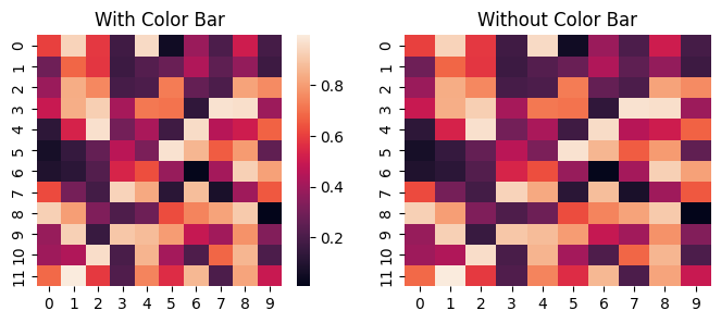 Removing the Color Bar in Subplots
2. Removing Color Bar from Correlation Matrices for Two Different Datasets
Let's see a practical example where we create two heatmaps side by side, one with a color bar and one without. We'll use data representing correlation matrices for two different datasets, and we'll customize the plot accordingly.
Python
import matplotlib.pyplot as plt
import seaborn as sns
import numpy as np
import pandas as pd

np.random.seed(0)
data1 = pd.DataFrame(np.random.rand(10, 10), columns=[f'Var{i}' for i in range(10)])
data2 = pd.DataFrame(np.random.rand(10, 10), columns=[f'Var{i}' for i in range(10)])
corr1 = data1.corr()
corr2 = data2.corr()

# Create a figure with subplots
fig, (ax1, ax2) = plt.subplots(1, 2, figsize=(12,5))

# Create the first heatmap with a color bar
sns.heatmap(corr1, cmap='coolwarm', ax=ax1, annot=True, fmt=".2f", cbar=True, cbar_kws={'label': 'Correlation'})

# Create the second heatmap without a color bar
sns.heatmap(corr2, cmap='coolwarm', ax=ax2, annot=True, fmt=".2f", cbar=False)

# Customize the plots
ax1.set_title('Correlation Matrix with Color Bar')
ax1.set_xticklabels(ax1.get_xticklabels(), rotation=45, horizontalalignment='right')
ax1.set_yticklabels(ax1.get_yticklabels(), rotation=0)

ax2.set_title('Correlation Matrix without Color Bar')
ax2.set_xticklabels(ax2.get_xticklabels(), rotation=45, horizontalalignment='right')
ax2.set_yticklabels(ax2.get_yticklabels(), rotation=0)

# Adjust layout to prevent overlapping
plt.tight_layout()
plt.show()
Output:
.webp) Removing Color Bar from Correlation Matrices for Two Different Datasets
Removing Color Bar from Correlation Matrices for Two Different DatasetsConclusion
Removing the color bar from a Seaborn heatmap is a straightforward process that can be achieved by setting the cbar parameter to False. However, advanced techniques such as customizing the color bar, removing it from specific subplots, or adjusting the layout post-removal can significantly enhance your visualizations. By following the examples and techniques provided in this article, you should be able to effectively manage the color bar in your Seaborn heatmaps to suit your specific needs.