Working with Axes in R using ggplot2
Last Updated :
19 Dec, 2023
The ggplot2 package is a powerful and widely used package for graphic visualization. It can be used to provide a lot of aesthetic mappings to the plotted graphs. This package is widely available in the R Programming Language. The package can be downloaded and installed into the working space using the following command.
install.packages("ggplot2")
The ggplot method can be used to create a ggplot object. The graphical object is used to create plots by providing the data and its respective points. The data can be plotted using both points as well as lines.
Syntax : ggplot(data, aes = )
Arguments :
data – The data to be plotted
aes – The aesthetic mappings
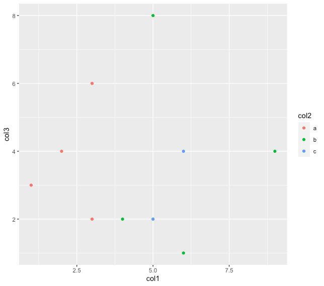
The geom_point method can be used to plot the data points on the existing visualization that has been created. The color has been assigned based on the grouping values assigned in the col2 of the data plane in the following code snippet.
That is since there are three groups a, b, and c three different colors are used to denote the values contained in these three groups. These parameters are specified in the aesthetic mappings, as discussed above in the ggplot method.
R
library("ggplot2")
data_frame = data.frame(col1 = c(1,4,2,5,6,9,5,3,6,3),
col2 = c("a","b","a","c","b","b","b","a","c","a"),
col3 = c(3,2,4,2,1,4,8,6,4,2))
ggplot(data_frame, aes(col1, col3, colour=col2)) + geom_point()
|
Output
Working with Axes in R using ggplot2
Assigning labels to the axes
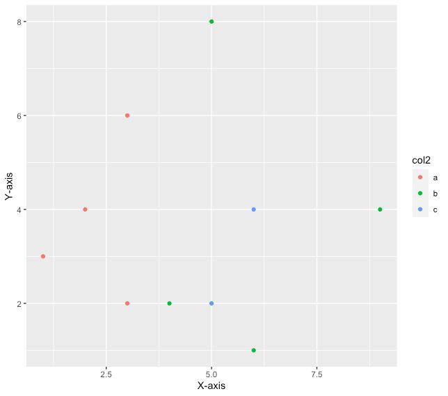
The labels of the x-axis and y-axis of the plotted graph can be changed or customized using the various methods available in the ggplot2 package. The xlab component, which can be added to the plot that is constructed is used to add a customized title to the x-axis and similarly, the ylab method can be used to add a customized text label to the y-axis respectively.
Syntax :
For x-axis : xlab(title of x-axis)
For y-axis : ylab(title of y-axis)
R
ggplot(data_frame, aes(col1, col3, colour=col2)) +
geom_point()+
xlab("X-axis") + ylab("Y-axis")
|
Output
Working with Axes in R using ggplot2
Annotate text on plot
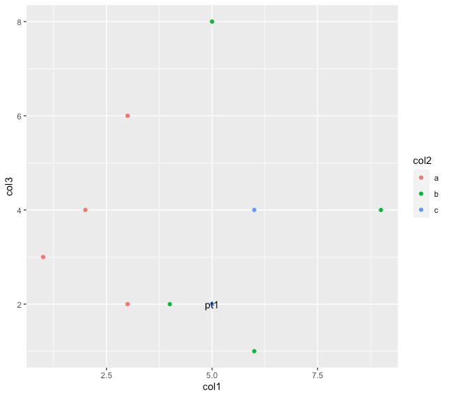
The plot that has been created using the ggplot2 method can also be annotated with various text items and their corresponding positions can be specified. For example, the text point at any respective coordinates of the x-cord and y-cord can be used to be labeled by a specific text value in the following code snippet the data point at the location 5,2 is labeled with the name “PT1”. The annotate method has the following syntax.
Syntax : annotate(text, x=,y=,label=)
Arguments:
x-the x coordinate where the x is annotated
y-the y coordinate of the annotated text
label-the label to be assigned at these coordinates
R
ggplot(data_frame, aes(col1, col3, colour=col2)) +
geom_point() +
annotate("text", x = 5, y = 2, label = "pt1")
|
Output
Working with Axes in R using ggplot2
Annotating the Graph with the plotted area
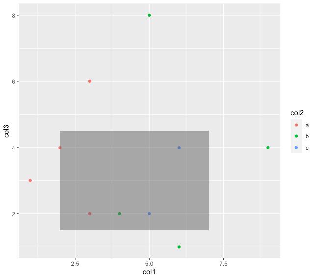
The graph can also be plotted with a rectangular area or a square area depending on the x-coordinates starting and ending as well as y-coordinates starting and ending. In order to construct a rectangle or a square over that area. Depending upon the respective area that is enclosed within it. The same annotate method can be used with the first parameter specifying “rect” instead of text. In order to plot a rectangle, we can use the following syntax
Syntax : annotate(“rect”, xmin, xmax, ymin, ymax, alpha)
Arguments:
xmin-the starting x coordinate
xmax-the ending x coordinate
ymin-the starting y coordinate
ymax-the ending y coordinate
In the following code snippet, a rectangle is plotted starting from the x coordinates to till the value of 7 and y coordinates between 1.5 to 4.5 respectively.
R
ggplot(data_frame, aes(col1, col3, colour=col2)) +
geom_point() +
annotate("rect", xmin = 2, xmax = 7, ymin = 1.5,
ymax = 4.5, alpha = .5)
|
Output
Working with Axes in R using ggplot2
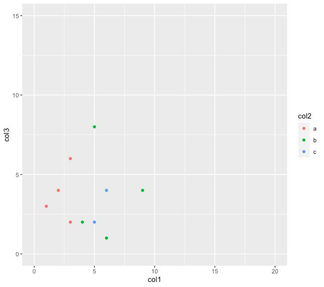
Setting axes limits
The graph can also be customized in order to plot within a particular scale that is desired. The data points are accordingly plotted depending on the scale that has been used for the graph. The xlim method is used to set the elements of the x-axis while the ylim method is used to the limits of the y-axis. They have the following
Syntax :
xlim(starting x value, ending x value_
ylim(starting y value, ending y value)
R
ggplot(data_frame, aes(col1, col3, colour=col2)) +
geom_point() +
xlim(0,20)+
ylim(0,15)
|
Output
Working with Axes in R using ggplot2
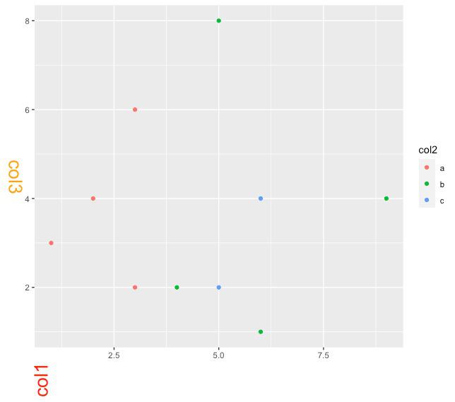
Modifying the axes titles’ appearance
The plot that has been plotted using the ggplot2 package can also be beautified and customized further in order to increase the readability and in order to make it more presentable. For example, the titles of the axis can be aligned to a particular angle and given a particular color for example, in the following code snippet we are using the color red to denote the axis title for the x-axis and orange to denote the y-axis title respectively. We’ve also increased the size in order to enhance the readability of the axis title and the angles at which these texts are written have also been changed. This can be done using the theme method. In R, the theme method takes various arguments in order to set up the appearance of the specified parameter. The theme method has the following
Syntax : theme(axis.title = element_text(angle, size, color))
Arguments :
axis.title – By default the parameter axis.title is used to modify the appearance of both axes. If we specify axis.title.x, the appearance of the x axis is modified. Otherwise, if we specify axis.title.y the appearance of the y axis is modified.
angle – angle of placing the text at
size – size of the text
color – color of the axis titles’ text
R
ggplot(data_frame, aes(col1, col3, colour=col2)) +
geom_point() +
theme(axis.title.x = element_text( angle = 90, size =20,
color="red"))+
theme(axis.title.y = element_text( angle = 270,
size =20, color="orange"))
|
Output
Working with Axes in R using ggplot2
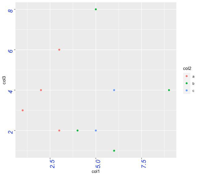
Modifying the appearance of axes labels
The theme method can also be modified to use to modify the appearance of the axis labels by just using axes.text as a parameter, as the first argument of this method. The parameters color and angle can be changed for axes labels also.
R
ggplot(data_frame, aes(col1, col3, colour=col2)) +
geom_point() +
theme(axis.text = element_text( color="blue", angle = 90))
|
Output :
Working with Axes in R using ggplot2
Creating an Enhanced Scatter Plot with ggplot2
Now we can Creating an Enhanced Scatter Plot with ggplot2 so we will make our plot more attrective.
R
library(ggplot2)
ggplot(data_frame, aes(x = col1, y = col3, color = col2)) +
geom_point(size = 2, alpha = 0.7) +
theme_minimal() +
labs(title = "Scatter Plot with Grouping",
x = "X-axis Label",
y = "Y-axis Label",
color = "Group") +
theme(axis.title.x = element_text(angle = 0, vjust = -0.5, size = 14, color = "blue"),
axis.title.y = element_text(angle = 90, vjust = 0.5, size = 14, color = "green"),
legend.title = element_text(size = 14, color = "purple"),
legend.text = element_text(size = 12),
plot.title = element_text(hjust = 0.5, size = 16, color = "brown"),
panel.grid.major = element_blank(),
panel.grid.minor = element_blank(),
panel.background = element_rect(fill = "lightgray"))
|
Output:
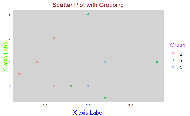
Working with Axes in R using ggplot2
Here we add extra parameters to adjusted point size and transparency for better visibility. used a minimal theme for a clean and simple appearance. added informative labels for the title, X-axis, Y-axis, and color legend.
- Adjusted the angle, size, and color of axis titles for better readability. removed major and minor gridlines for a cleaner look.
- Set a light gray background for the plot panel.
These are the some of the main functions and parameters that we used in Working with Axes in R using ggplot2.
Share your thoughts in the comments
Please Login to comment...