What are the differences between flex-basis and width in Flexbox ?
Last Updated :
05 Jun, 2020
This article describes the difference between the flex-basis and width property along with examples of usage. The flex-basis property defines the initial size of flex-items depending upon the flex-direction value. It has the following additional properties that can change its behaviour:
- The flex-direction value can be set to row or column. If its value is row, it defines the width and if its value is column, it defines the height.
- The flex-basis property can be applied only to flex-items and width property can be applied to all.
- When using flex property, all the three properties of flex-items i.e, flex-row, flex-shrink and flex-basis can be combined into one declaration, but using width, doing the same thing would require multiple lines of code.
- If flex-direction value is set to be column, then for sizing flex-items horizontally width property is used.
The below examples show the differences between flex-basis and the width and height property:
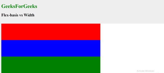
Example 1: Using flex-basis when flex-direction is set to row.
HTML
<!DOCTYPE html>
<html>
<head>
<title>FlexBox</title>
<style>
body {
background: #eee;
}
h1 {
color: green;
}
.wrapper {
width: 100%;
margin: 0 auto;
}
.flex-container {
display: flex;
background: #fff;
flex-wrap: wrap;
flex-direction: row;
}
.box {
/*
Since flex-direction is set to
row therefore flex-basis defines
the width. Either of the width
property or flex-basis property
can be used as both perform
a similar task in this case.
*/
height: 100px;
flex-basis: 600px;
}
.one {
background: red;
}
.two {
background: blue;
}
.three {
background: green;
}
</style>
</head>
<body>
<h1>GeeksForGeeks</h1>
<h2>Flex-basis vs Width </h2>
<br>
<div class="wrapper">
<div class="flex-container">
<div class="box one"></div>
<div class="box two"></div>
<div class="box three"></div>
</div>
</div>
</body>
</html>
|
Output:
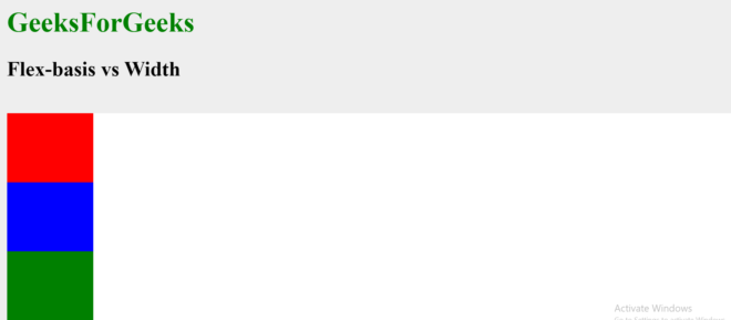
Example 2: Using flex-basis when flex-direction is set to column.
HTML
<!DOCTYPE html>
<html>
<head>
<title>FlexBox</title>
<style>
body {
background: #eee;
}
h1 {
color: green;
}
.wrapper {
width: 100%;
margin: 0 auto;
}
.flex-container {
display: flex;
background: #fff;
flex-wrap: wrap;
flex-direction: column;
}
.box {
/*
Since flex-direction is set to
column therefore flex-basis defines
the height and hence overrides the
height property. The height of
flex-item will therefore be 80px.
The width property has to be separately
assigned a horizontal width.
*/
height: 100px;
width: 100px;
flex-basis: 80px;
}
.one {
background: red;
}
.two {
background: blue;
}
.three {
background: green;
}
</style>
</head>
<body>
<h1>GeeksForGeeks</h1>
<h2>Flex-basis vs Width </h2>
<br>
<div class="wrapper">
<div class="flex-container">
<div class="box one"></div>
<div class="box two"></div>
<div class="box three"></div>
</div>
</div>
</body>
</html>
|
Output:
Like Article
Suggest improvement
Share your thoughts in the comments
Please Login to comment...