Visualization of a correlation matrix using ggplot2 in R
Last Updated :
21 Jul, 2021
In this article, we will discuss how to visualize a correlation matrix using ggplot2 package in R programming language.
In order to do this, we will install a package called ggcorrplot package. With the help of this package, we can easily visualize a correlation matrix. We can also compute a matrix of correlation p-values by using a function that is present in this package. The corr_pmat() is used for computing the correlation matrix of p-values and the ggcorrplot() is used for displaying the correlation matrix using ggplot.
Syntax :
corr_pmat(x,..)
Where x is the dataframe or the matrix
Syntax:
ggcorrplot(corr, method = c(“circle”, “square”), type = c(“full”, “lower”, “upper”), title = “”, ggtheme=ggplot2::theme_minimal, show.legend = TRUE, legend.title = “corr”, show.diag = FALSE, colors = c(“blue”, “white”, “red”), outline.color = “gray”, hc.order = FALSE, hc.method = “complete”, lab = FALSE, lab_col =”black”, p.mat = NULL,.. )
Getting Started
We will first install and load the ggcorrplot and ggplot2 package using the install.packages() to install and library() to load the package. We need a dataset to construct our correlation matrix and then visualize it. We will create our correlation matrix with the help of cor() function, which computes the correlation coefficient. After computing the correlation matrix, we will compute the matrix of correlation p-values using the corr_pmat() function. Next, we will visualize the correlation matrix with the help of ggcorrplot() function using ggplot2.
Creating a correlation matrix
We will take a sample dataset for explaining our approach better. We will take the inbuilt USArrests dataset, and we will visualize its correlation matrix following the above approach. We will read the data using the data() function, and we will create the correlation matrix with the help of cor() function to compute the correlation coefficient. The round() function is used to round off the values to a specific decimal value. We will use cor_pmat() function to compute the correlation matrix with p-values.
Syntax :
correlation_matrix <- round(cor(data),1)
Parameters :
- correlation_matrix : Variable for correlation matrix used to visualize.
- data : data is our dataset which we have taken for visualization.
Syntax:
corrp.mat <- cor_pmat(data)
Parameters :
- corrp.mat : Variable for correlation matrix with p-values.
- data : It is our dataset taken for creating correlation matrix with p-values.
Example: Creating a correlation matrix
R
install.packages("ggcorrplot")
library(ggcorrplot)
data(USArrests)
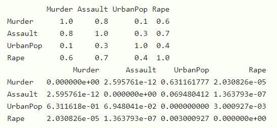
correlation_matrix <- round(cor(USArrests),1)
head(correlation_matrix[, 1:4])
corrp.mat <- cor_pmat(USArrests)
head(corrp.mat[, 1:4])
|
Output :
Visualizing correlation matrix
Now since we have a correlation matrix and the correlation matrix with p-values, we will now try to visualize this correlation matrix. The first visualization is to use the ggcorrplot() function and plot our correlation matrix in the form of the square and circle method.
Syntax :
ggcorrplot(correlation_matrix, method= c(“circle”,”square”))
Parameters :
- correlation_matrix : The correlation matrix for visualization.
- method : It is a character value used for visualization methods.
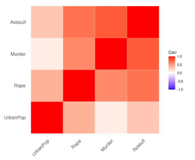
Example: Visualizing the correlation matrix using different methods
R
library(ggplot2)
library(ggcorrplot)
data(USArrests)
correlation_matrix <- round(cor(USArrests),1)
corrp.mat <- cor_pmat(USArrests)
ggcorrplot(correlation_matrix, method ="square")
ggcorrplot(correlation_matrix, method ="circle")
|
Output :
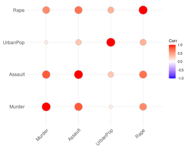
Correlation matrix with circular method
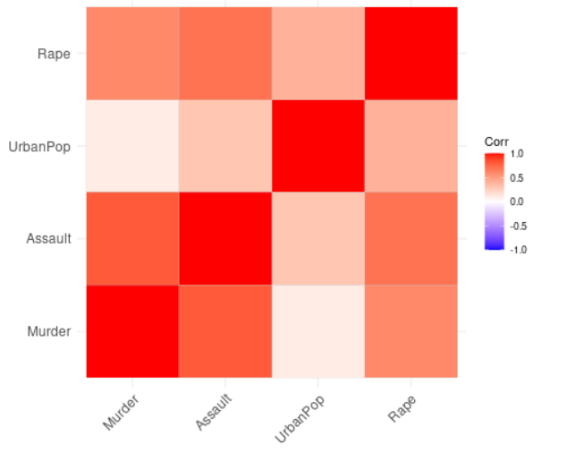
Correlation matrix with square method
Visualizing the correlation matrix using different layouts
- Next, we will visualize correlogram layout types in our correlation matrix and providing hc.order and type as lower for lower triangle layout and upper for upper triangle layout as parameters in ggcorrplot() function.
Syntax : ggcorrplot(correlation_matrix, hc.order = TRUE, type = c(“upper”, “lower”), outline.color = “white”)
Parameters :
- correlation_matrix : The correlation matrix used for visualization.
- hc.order : If it is true, then the correlation matrix will be ordered.
- type : It is the arrangement of the character to display.
- outline.color : It is the outline color of the square or circle.
Example: Visualizing correlation matrix using different layouts
R
library(ggplot2)
library(ggcorrplot)
data(USArrests)
correlation_matrix <- round(cor(USArrests),1)
corrp.mat <- cor_pmat(USArrests)
ggcorrplot(correlation_matrix, hc.order =TRUE, type ="lower",
outline.color ="white")
ggcorrplot(correlation_matrix, hc.order =TRUE, type ="upper",
outline.color ="white")
|
Output :
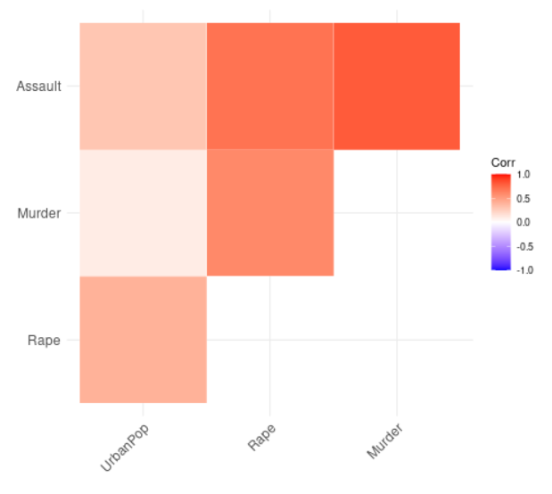
Correlation matrix with upper layout
Correlation matrix with lower layout
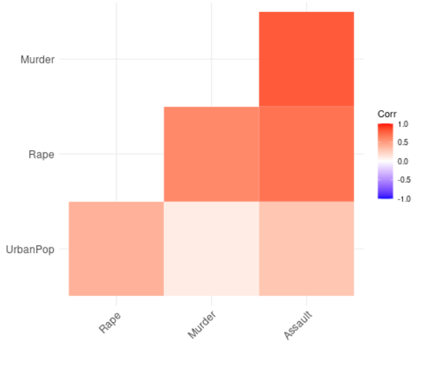
Reordering the correlation matrix
We will now visualize our correlation matrix by reordering the matrix using hierarchical clustering. We will do this using the ggcorrplot function with correlation matrix, hc.order, outline.color as arguments.
Syntax :
ggcorrplot(correlation_matrix, hc.order = TRUE, outline.color = “white”)
Parameters :
- correlation_matrix : The correlation matrix used for visualization.
- hc.order : If it is true, then the correlation matrix will be ordered.
- outline.color : It is the outline color of the square or circle.
Example: Reordering of the correlation matrix
R
library(ggplot2)
library(ggcorrplot)
data(USArrests)
correlation_matrix <- round(cor(USArrests),1)
corrp.mat <- cor_pmat(USArrests)
ggcorrplot(correlation_matrix, hc.order =TRUE,
outline.color ="white")
|
Output :
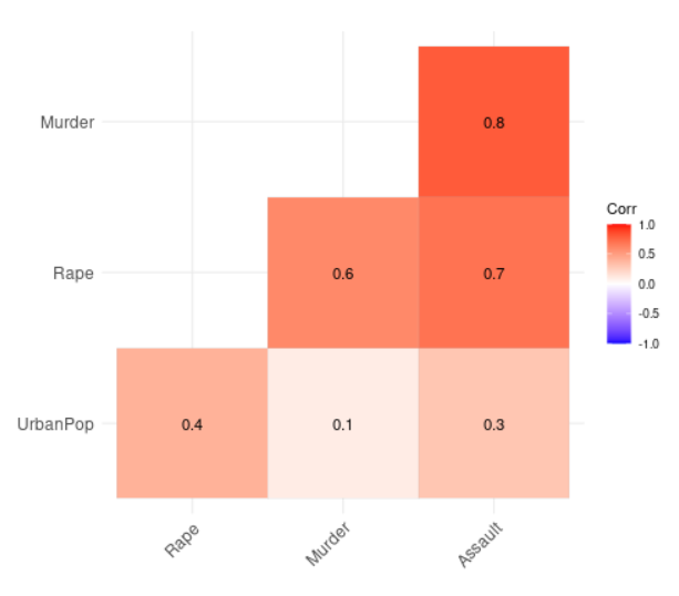
Introducing correlation coefficient
We will now visualize our correlation matrix by adding the correlation coefficient using the ggcorrplot function and providing correlation matrix, hc.order, type, and lower variables as arguments.
Syntax :
ggcorrplot(correlation_matrix, hc.order = TRUE, type = “lower”, lab = TRUE)
Parameters :
- correlation_matrix : The correlation matrix used for visualization.
- hc.order : If it is true, then the correlation matrix will be ordered.
- type : It is the arrangement of the character to display.
- lab : It is a logical value. If it is true, then we add the correlation coefficient to our matrix.
Example: Introducing correlation coefficient
R
library(ggplot2)
library(ggcorrplot)
data(USArrests)
correlation_matrix <- round(cor(USArrests),1)
corrp.mat <- cor_pmat(USArrests)
ggcorrplot(correlation_matrix, hc.order =TRUE,
type ="lower", lab =TRUE)
|
Output :
Adding significance level
Basically, the significance level is denoted by alpha. We compare the significance level to p-values to check whether the correlation between variables is significant or not. If p-value is less than equal to alpha, then the correlation is significant else, non-significant.
We will visualize our correlation matrix by adding significance level not taking any significant coefficient. We will do this using the ggcorrplot function and taking arguments as our correlation matrix, hc.order, type, and our correlation matrix with p-values.
Syntax :
ggcorrplot(correlation_matrix, hc.order=TRUE, type=”lower”, p.mat=corrp.mat)
Parameters :
- correlation_matrix : Our correlation matrix to visualize.
- hc.order : If its value is true, then the correlation matrix will be ordered.
- type : It is the arrangement of the character to display.
- p.mat : Correlation matrix with p-values.
Example: Adding coefficient significance level
R
library(ggplot2)
library(ggcorrplot)
data(USArrests)
correlation_matrix <- round(cor(USArrests),1)
corrp.mat <- cor_pmat(USArrests)
ggcorrplot(correlation_matrix, hc.order =TRUE, type ="lower",
p.mat = corrp.mat)
|
Output :
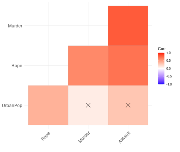
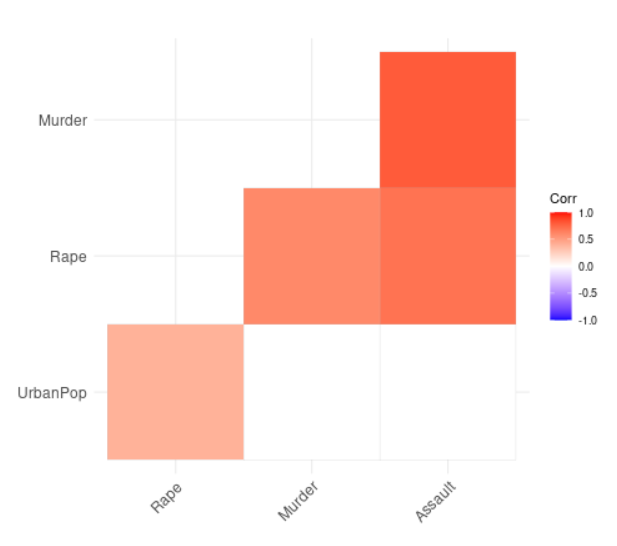
Leaving blank on no significance level
We will now visualize our correlation matrix by leaving a blank where there is no significance level. In the previous example, we added a significance level to our correlation matrix. Here, we will remove those parts of the correlation matrix where we did not find any significance level.
We will do this using the ggcorrplot function and take arguments like our correlation matrix, correlation matrix with p-values, hc.order, type and insig.
Syntax :
ggcorrplot(correlation_matrix, hc.order=TRUE, p.mat=corrp.mat, type=”lower”, insig=”blank”)
Parameters:
correlation_matrix : Our correlation matrix to visualize.
- hc.order : If it is true, then the correlation matrix will be ordered.
- p.mat : Correlation matrix with p-values.
- type : It is the arrangement of the character to display.
- insig : It is a character mostly containing insignificant correlation coefficients. The value is “pch” by default. If it is provided blank, then it wipes away the corresponding glyphs.
Example: Leaving blank on no significance level
R
library(ggplot2)
library(ggcorrplot)
data(USArrests)
correlation_matrix <- round(cor(USArrests),1)
corrp.mat <- cor_pmat(USArrests)
ggcorrplot(correlation_matrix, hc.order =TRUE,
type ="lower", p.mat = corrp.mat, insig="blank")
|
Output :
Like Article
Suggest improvement
Share your thoughts in the comments
Please Login to comment...