Visualising ML DataSet Through Seaborn Plots and Matplotlib
Last Updated :
08 Dec, 2021
Working on data can sometimes be a bit boring. Transforming a raw data into an understandable format is one of the most essential part of the whole process, then why to just stick around on numbers, when we can visualize our data into mind-blowing graphs which are up for grabs in python. This article will focus on exploring plots which could make your preprocessing journey, intriguing.
Seaborn and Matplotlib provide us with numerous alluring graphs through which one can easily analyze weak points, explore data with a deeper understanding and eventually end up getting a great insight into data and gaining the highest accuracy after training it through different algorithms.
Let’s Have A Glance Through Our Dataset : The Dataset (36 rows) contains 6 Features And 2 Classes (Survived = 1, Not Survived = 0 ) Based on which we’ll plot certain graphs. Link of the dataset – Click Here To Get Complete Dataset
1. KDE PLOT : Okay So after having a glance through the dataset we can have a question. Which Age Group Has Maximum No. Of People? To answer this question we need visuals where Our KDE Plot comes into the picture, it is simply a density plot. So let’s start with importing required libraries and use its functions to plot the graph.
Python3
import pandas as pd
import matplotlib.pyplot as plt
import seaborn as sns
dataset = pd.read_csv("Survival.csv")
sns.kdeplot(dataset["Age"], color = "green",
shade = True)
plt.show()
plt.figure()
|
Output :
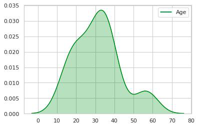
2. So now we have a clear picture of how the Count Of People vs Age-Group is distributed, here we can see that the age group 20-40 has maximum count so let’s check it.
Python3
import pandas as pd
import matplotlib.pyplot as plt
import seaborn as sns
dataset = pd.read_csv("Survival.csv")
dataset.Age[(dataset["Age"] >= 20) & (dataset["Age"] <= 40)].count()
|
Output :
26
3. Digging deeper into visuals, to know about the variation in Fair Vs Age, what is the relation between them, let’s have a look using a different kind of kdeplot simply now there’ll be bivariate densities, we will just add the Y Variable(Fair).
Python3
import pandas as pd
import matplotlib.pyplot as plt
import seaborn as sns
dataset = pd.read_csv("Survival.csv")
sns.kdeplot(dataset["Age"], dataset["Fare"], shade = True)
plt.show()
plt.figure()
|
Output :
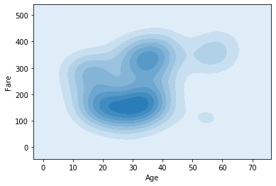
4. After Studying this plot a bit, we see that the intensity of the color is maximum between the age group 20-30 and precisely these have a fair between 100-200, let’s check it
Python3
import pandas as pd
import matplotlib.pyplot as plt
import seaborn as sns
dataset = pd.read_csv("Survival.csv")
dataset.Age[((dataset["Fare"] >= 100) &
(dataset["Fare"]<=200)) &
((dataset["Age"]>=20) &
dataset["Age"]<=40)].count()
|
Output :
16
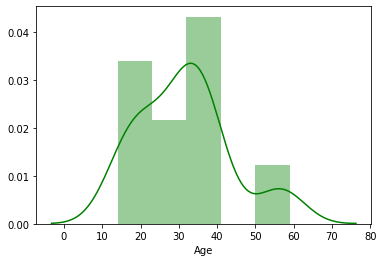
5. We can also add a histogram to kdeplot just by using distplot() module of seaborn :
Python3
import pandas as pd
import matplotlib.pyplot as plt
import seaborn as sns
dataset = pd.read_csv("Survival.csv")
sns.distplot(dataset["Age"], color = "green")
plt.show()
plt.figure()
|
Output :
6. Well. If one wants to know about the Male Vs Female Proportion, We can plot the same in KDE itself :
Python3
import pandas as pd
import matplotlib.pyplot as plt
import seaborn as sns
dataset = pd.read_csv("Survival.csv")
sns.kdeplot(dataset[dataset.Gender == 'Female']['Age'],
color = "blue")
sns.kdeplot(dataset[dataset.Gender == 'Male']['Age'],
color = "orange", shade = True)
plt.show()
plt.figure()
|
Output :
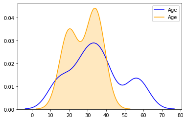
7. As We can see from the plot there is an increase in the count after Age 12 till Age 40, let’s check for the same
Python3
import pandas as pd
import matplotlib.pyplot as plt
import seaborn as sns
dataset = pd.read_csv("Survival.csv")
dataset.Gender[((dataset["Age"] >= 12) &
(dataset["Age"] <= 40)) &
(dataset["Gender"] == "Male")].count()
dataset.Gender[((dataset["Age"] >= 12) &
(dataset["Age"] <= 40)) &
(dataset["Gender"] == "Female")].count()
|
Output :
17
15
8. VIOLIN PLOT : We have talked much about the features, now let’s talk about Survival Rate Dependency On Features. For This, We will use a classic Violin Plot, as the name suggests it portrays the same visuals as that of the musical waves of a violin. Basically A Violin Plot is used to visualize the distribution of the data and its probability density.
What is the Relation Between Survival Rate And Age? Let’s Visually Analyze It :
Python3
import pandas as pd
import matplotlib.pyplot as plt
import seaborn as sns
dataset = pd.read_csv("Survival.csv")
sns.violinplot(x = 'Survived', y = 'Age', data = dataset,
palette = {0 : "yellow", 1 : "orange"});
plt.show()
plt.figure()
|
Output :
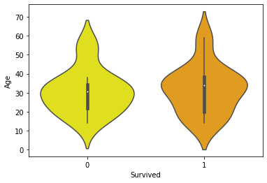
Explanation : The white dot we see in the plot is median and thick black bar in the center represents the interquartile
range.The thin black line extended from it represents the upper (max) and lower (min) adjacent values in the data.
A Quick glance show’s us that between Age[10-20] The Survival Rate is A bit higher(Survived==1).
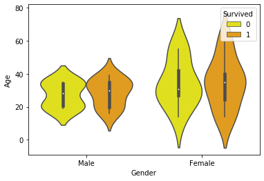
9. Let’s plot one more for the Survival Rate Vs Gender and Age
Python3
import pandas as pd
import matplotlib.pyplot as plt
import seaborn as sns
dataset = pd.read_csv("Survival.csv")
sns.violinplot(x = "Gender", y = "Age", hue = "Survived",
data = dataset,
palette = {0 : "yellow", 1 : "orange"})
plt.show()
plt.figure()
|
Here an additional attribute is hue, which refers to the binary value for Survived.
Output :
10. CATPLOT : In simple terms, catplot shows frequencies (or optionally fractions or percents) of the categories of one, two, or three categorical variables.
Python3
import pandas as pd
import matplotlib.pyplot as plt
import seaborn as sns
dataset = pd.read_csv("Survival.csv")
g = sns.catplot(x = "Siblings", y = "Survived", hue = "Gender", data = dataset,
height = 6, kind = "bar", palette = "muted")
g.despine(lef t= True)
g.set_ylabels("Survival Probability")
plt.show()
|
Here sns.despine is used to remove the top and right spines from the plot, let’s have a look at it.
Output :
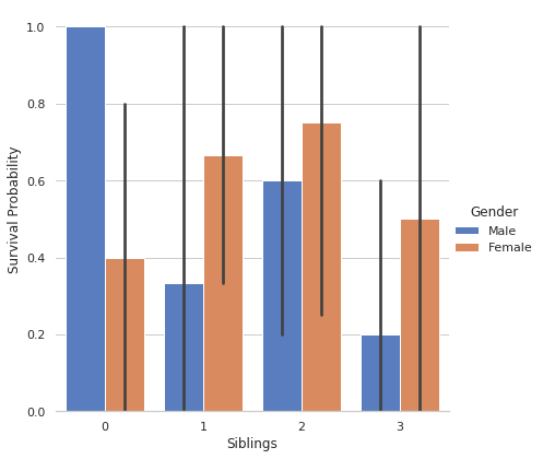
Here We get a clear picture of Gender Wise Survival Probability w.r.t No. Of Siblings.
11. Now, in The Dataset We See There Are Three Categories in Ticket, Which is based on Fare, Let’s Find About It (Referring This Plot I Added A Category Column For Tickets)
Python3
import pandas as pd
import matplotlib.pyplot as plt
import seaborn as sns
dataset = pd.read_csv("Survival.csv")
sns.catplot(x = "PassType", y = "Fare", data = dataset)
plt.show()
plt.figure()
|
Output :
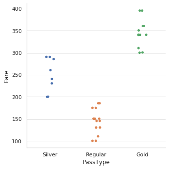
Using This we concluded that categories should be defined for tickets
12. Relation of the same with Survival Rate :
Python3
import pandas as pd
import matplotlib.pyplot as plt
import seaborn as sns
dataset = pd.read_csv("Survival.csv")
sns.catplot(x="PassType", y="Fare", hue="Survived",kind="swarm",data=dataset)
plt.show()
plt.figure()
|
Output :
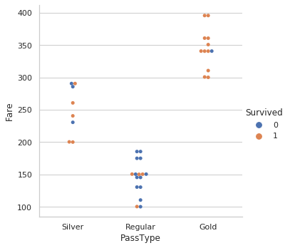
From this, we get a clear insight for Survival Rate Vs Fare w.r.t Category of Tickets.
Like Article
Suggest improvement
Share your thoughts in the comments
Please Login to comment...