Visualisation in Julia
Last Updated :
19 Jan, 2023
Data visualization is the process of representing the available data diagrammatically. There are packages that can be installed to visualize the data in languages like Python and Julia. Some of the reasons that make the visualization of data important are listed below:
- Larger data can be analyzed easily.
- Trends and patterns can be discovered.
- Interpretations can be done from the visualizations easily
Visualization Packages in Julia
The package that is used widely with Julia is Plots.jl. However, it is a meta-package that can be used for plotting. This package interprets the commands are given and plots are generated using some other libraries and these libraries are referred to as backend. The backend libraries available in Julia are :
- Plotly/PlotlyJS
- PyPlot
- PGFPlotsX
- UnicodePlots
- InspectDR
- HDF5
One can make plots using these Plots.jl alone. For that, the package has to be installed. Open the Julia terminal and type the following command :
Pkg.add(“Plots”)
The backend packages can also be installed in the same way. This article shows how to plot data using Plots.jl for two vectors of numerals and two different datasets. For using the datasets, packages like RDatasets and CSV has to be installed. The command used for installation is given below.
Pkg.add(“RDatasets”)
Pkg.add(“CSV”)
Line Plot
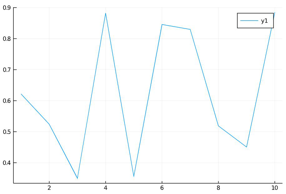
The single-dimensional vectors can be plotted using simple line plots. A Line plot needs two axes (x and y). For example consider a vector that has values from 1 to 10 which forms the x-axis. Using rand(), ten random values have been generated and that forms the y-axis. The plotting can be done using the plot() function as follows.
Julia
x = 1:10
y = rand(10)
plot(x, y)
|
Output:
The graphs can be stylized using various attributes. Some of the attributes are explained with the example below:
Julia
x = 1:10
y = rand(10)
plot(x, y, linecolor =:green,
bg_inside =:pink,
line =:solid, label = "Y")
|
Output:
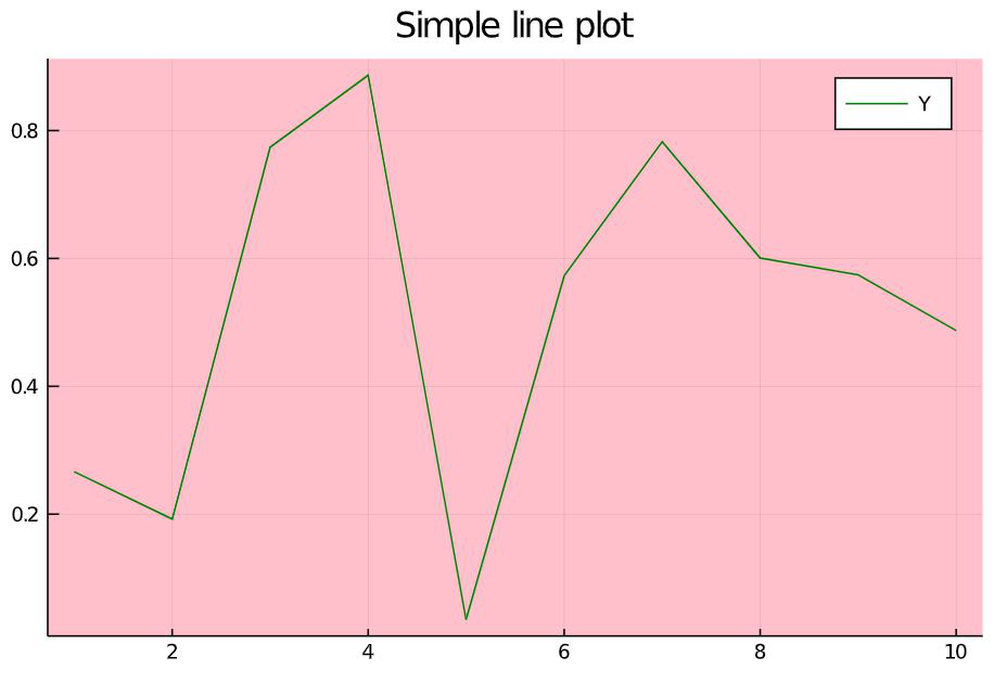
Attributes and explanation
- linecolor: to set the color of the line. The color name should be preceded by a colon (‘:’).
- bg_inside: to set the background color of the plot.
- line: to set the line type. The possible values are :solid, :dash, :dashsot, :dashdotdot
- label: to set the label name for the line plotted.
- title: to set the title of the plot.
In Julia, one can plot another vector on the previously plotted graph. The function that allows this plot!(). In Jupyter notebook, one has to write the code snippet of the previous example first and then can write the on given below even in a new cell.
Julia
z = rand(10)
plot!(z, linecolor =:red,
line =:dashdot,
labels = "Z")
|
Output :
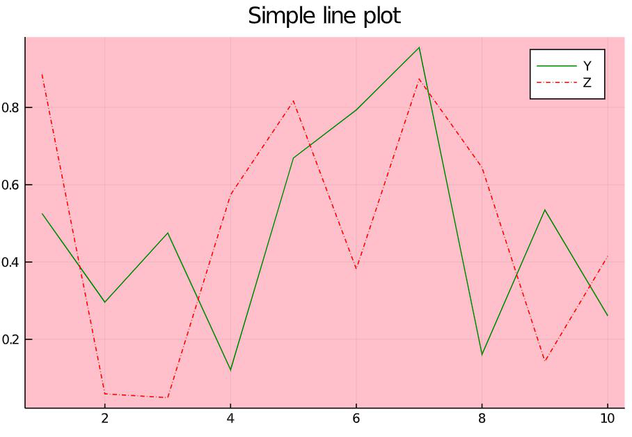
Here one can find the dashed line plotted on the previous graph. The styles written here are applied for the new line alone and it does not affect the line plotted previously.
Plotting datasets
The datasets used for example here are mtcars and Prisma-Indian Diabetes datasets. To understand each attribute, in each of the example new attribute will be added and explained below it. However, all the styling attributes can be used with any plotting. The mtcars dataset contains information on 32 automobiles models that were available in 1973-74. The attributes in this dataset are listed and explained below:
- mpg – Miles/Gallon(US).
- cyl – Number of cylinders.
- disp – Displacement (cu.in).
- hp – Gross HorsePower.
- drat – Rear axle Ratio.
- wt – Weight
- qsec – 1/4 mile time
- vs – Engine shape, where 0 denotes V-shaped and 1 denotes straight.
- am – Transmission. 0 indicates automatic and 1 indicates manual.
- gears – Number of forward gears
- carb – Number of carburetors.
First this dataset can be visualized.
Bar plot
A simple bar graph can be used to compare two things or represent changes over time or to represent the relationship between two items. Now in this dataset there are 32 unique models which are to be used as the x-axis for plotting the bar graph. The MPG (Miles Per Gallon) is taken in the y-axis for plotting. Look at the code snippet and its output below.
Julia
using RDatasets
cars = dataset("datasets", "mtcars")
bar(cars.Model,
cars.MPG,
label = "Miles/Gallon",
title = "Models and Miles/Gallon",
xticks =:all,
xrotation = 45,
size = [600, 400],
legend =:topleft)
|
Output :
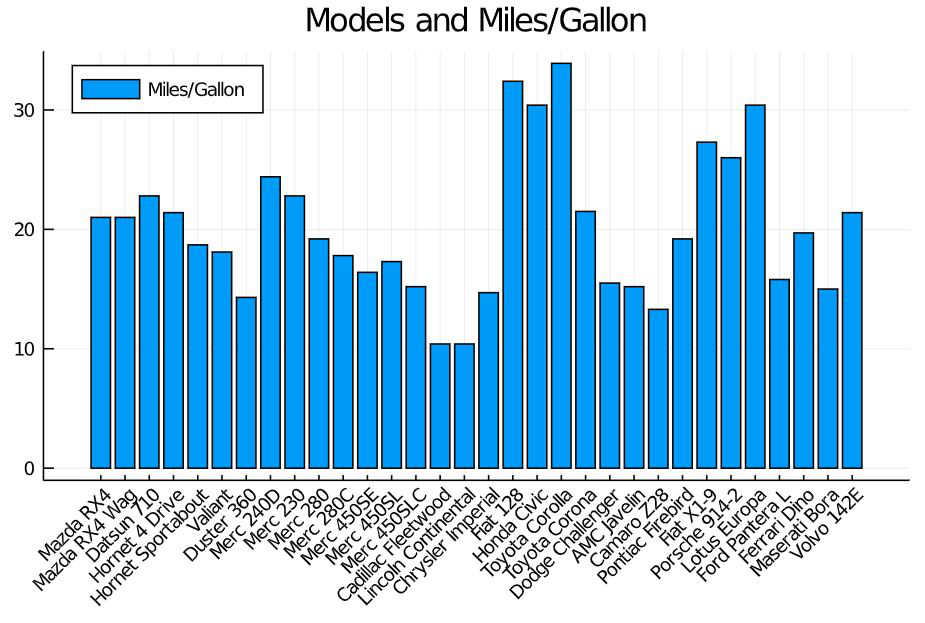
Attribute explanation:
- cars.Model – x-axis that contains the attribute car model names.
- cars.MPG – y-axis that contains the attribute miles per gallon.
- xticks=:all – This decides whether to show all values int the x-axis or not. For the example taken above, if xticks=:all is not given, then some of the values won’t appear in the x-axis but their values will be plotted then the output will be as follows.
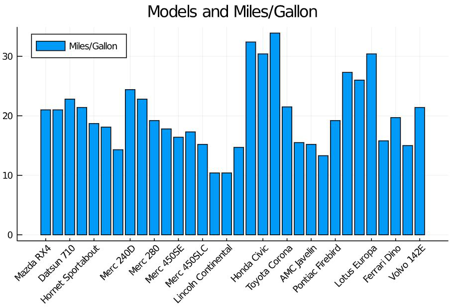
- xrotation : to specify the angle in which the values of the attribute in x-axis must be rotated. By default, the value is ‘0’ and they appear horizontally. the value 45 slightly tilts it and the value 90 rotates it vertically.
- size : to specify the height and width of the plotting.
- legend : to specify where the label of the plotted value must appear. Here the box containing Miles/Gallon and the blue shaded box is the legend.
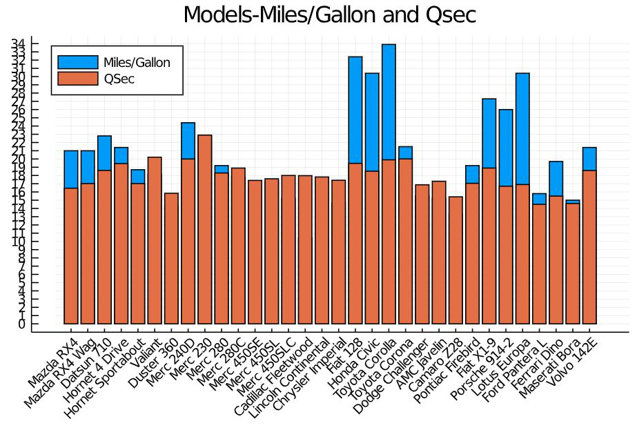
To plot two attributes of the dataset in the same graph
Julia
bar(cars.Model,
[cars.MPG,cars.QSec],
label = ["Miles/Gallon" "QSec"],
title = "Models-Miles/Gallon and Qsec",
xrotation = 45,
size = [600, 400],
legend =:topleft,
xticks =:all,
yticks =0:35)
|
Output:
3-dimensional Line Plot
The line plot which was previously explained with vectors can be used along with the datasets also. If three attributes were passed, then the graph will be plotted with 3 dimensions. For example: Plotting the Number of gears in the x-axis, displacement in the y-axis, and Horse Power in the z-axis.
Julia
using RDatasets
cars = dataset("datasets", "mtcars")
plot(cars.Gear,
cars.Disp,
cars.HP,
title = "3-dimensional plot",
xlabel = "no.of.gears",
ylabel = "displacement",
zlabel = "HP")
|
Output:
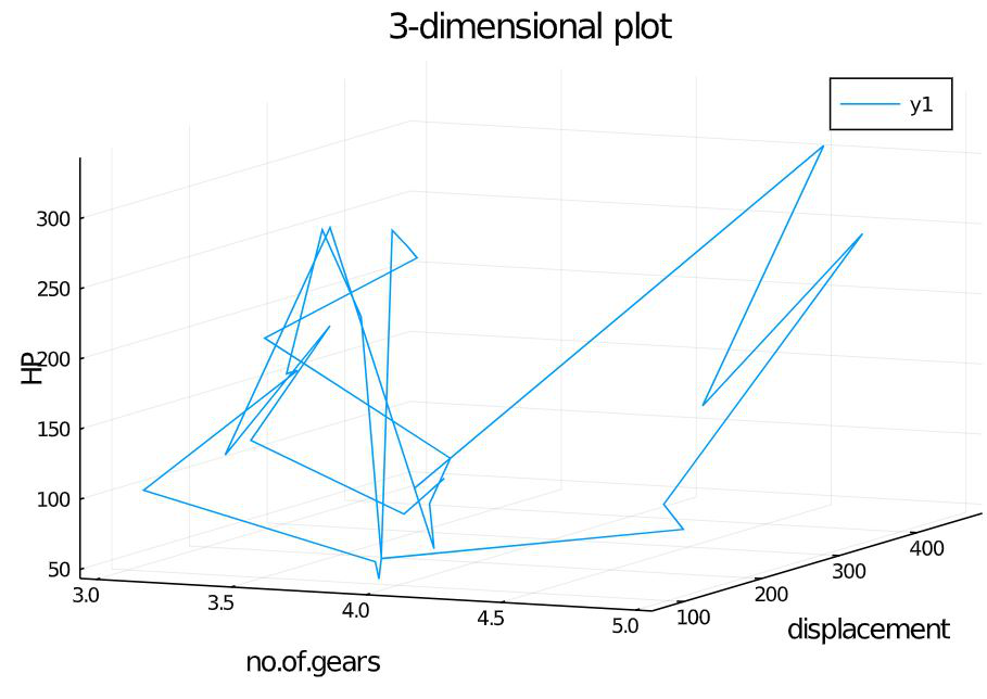
Attribute explanation:
The attributes xlabel, ylabel, zlabel contains the values that should be displayed as the label for each axis. Here the labels are no.of.gears, displacement and HP.
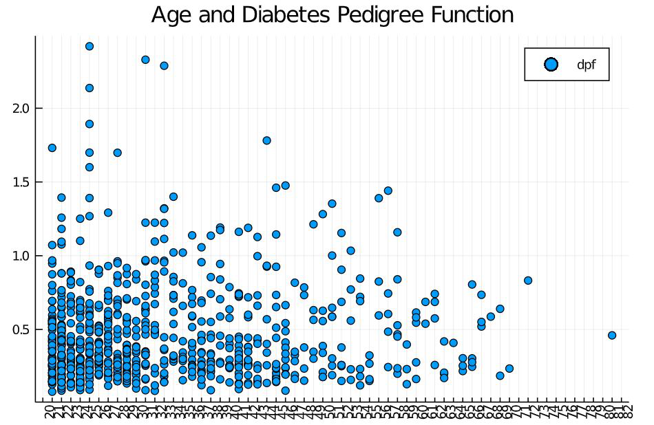
The dataset Prisma-Indian Diabetes dataset is shown here to give a understanding of how to read the dataset which is in the local storage. This dataset has the attributes namely, pregnancies (no.of.times pregnant), glucose, bp (blood pressure), skinThickness, insulin, bmi, dpf (diabetes pedigree function), age, outcome (0 – non diabetic, 1-diabetic). Download this dataset from internet initially.
Scatter plot
It is used to reveal a pattern in the plotted data. For example, we can use this plot to analyze the diabetes pedigree function form any pattern with age. Look at the code snippet below.
Julia
using DataFrames
using CSV
df = CSV.read("path\\pima-indians-diabetes.csv");
scatter(df.age,
df.dpf,
xticks = 20:90,
xrotation = 90,
label = "dpf",
title = "Age and Diabetes Pedigree Function")
|
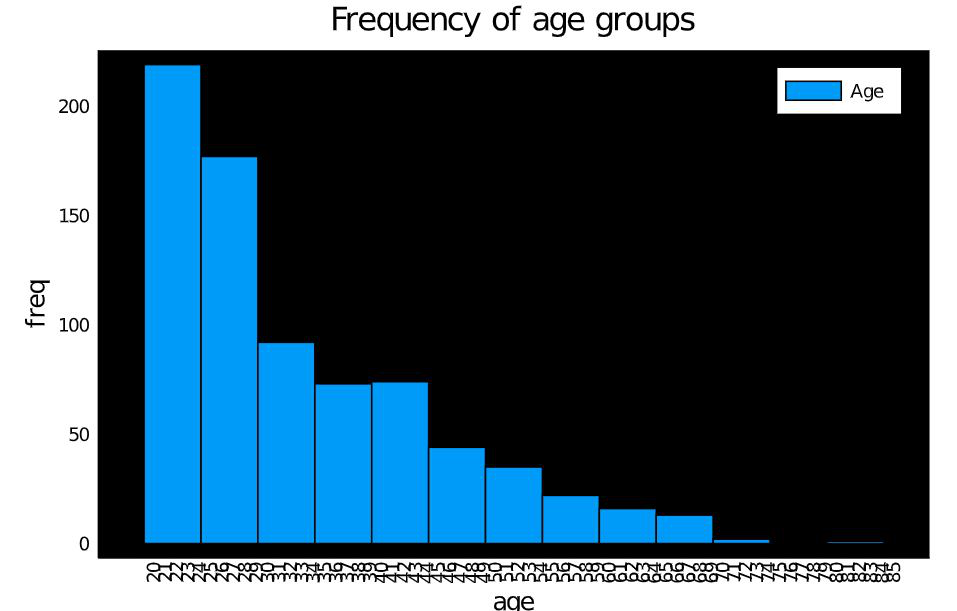
Histogram
Mostly used for displaying the frequency of data. The bars are called bins. Taller the bins, more number of data falls under that range. For example, let us check the number of people in each age group in the taken dataset using a histogram. Look at the code snippet below:
Julia
using DataFrames
using CSV
df = CSV.read("path\\pima-indians-diabetes.csv");
histogram(df.age,
bg_inside = "black",
title = "Frequency of age groups",
label = "Age"
xlabel = "age",
ylabel = "freq",
xticks = 20:85,
xrotation = 90)
|
Output:
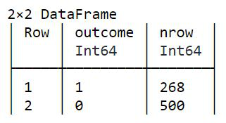
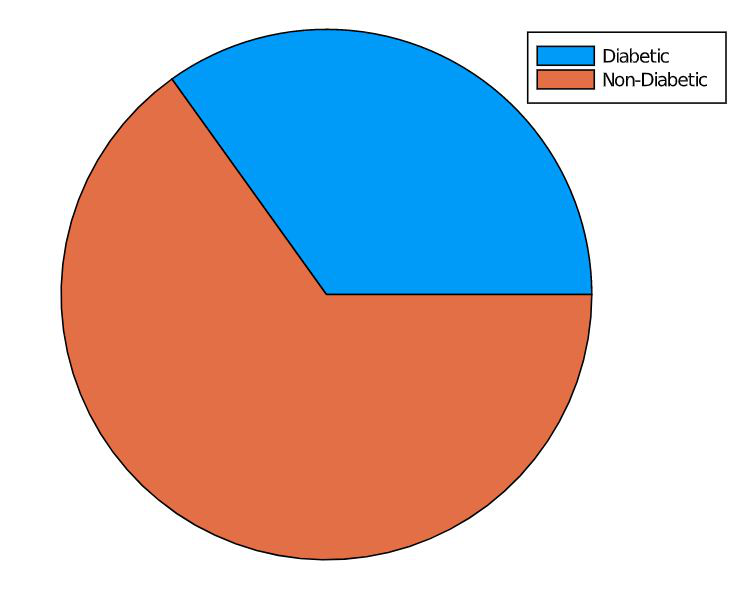
Pie chart
Pie chart is a statistical graph used to represent proportions. In this example let us represent the number of diabetic and non-diabetic people in the dataset. For this, the count has to be taken first and then plotted in the graph. Look at the code snippet below.
Julia
using DataFrames
using CSV
df = CSV.read("path\\pima-indians-diabetes.csv");
axis = DataFrame()
axis = by(df, :outcome, nrow)
println(axis)
items = DataFrame()
items[:x] = ["Diabetic", "Non-Diabetic"]
items[:y] = axis.nrow
pie(items.x, items.y)
|
Output:
Like Article
Suggest improvement
Share your thoughts in the comments
Please Login to comment...