Violin Plot for Data Analysis
Last Updated :
18 Feb, 2024
Data visualization is instrumental in understanding and interpreting data trends. Various visualization charts aid in comprehending data, with the violin plot standing out as a powerful tool for visualizing data distribution. This article aims to explore the fundamentals, implementation, and interpretation of violin plots.
Before applying any transformations to the features of a dataset, it is often necessary to seek answers to questions like the following:
- Are the values primarily clustered around the median?
- Alternatively, do they exhibit clustering at the extremes with a dearth of values in the middle range?
These inquiries go beyond median and mean values alone and are essential for obtaining a comprehensive understanding of the dataset. We can use a Violin plot for answering these questions.
What is a Violin Plot?
Violin Plot is a method to visualize the distribution of numerical data of different variables. It is quite similar to Box Plot but with a rotated plot on each side, giving more information about the density estimate on the y-axis. The density is mirrored and flipped over, and the resulting shape is filled in, creating an image resembling a violin. The advantage of a violin plot is that it can show nuances in the distribution that aren’t perceptible in a boxplot. On the other hand, the boxplot more clearly shows the outliers in the data. Violin Plots hold more information than box plots, they are less popular. Because of their unpopularity, their meaning can be harder to grasp for many readers not familiar with the violin plot representation.
Tools to create Violin Plot
There are many tools and libraries available to create Violin Plot:
- Alteryx: Alteryx is a data analytics platform that analyze the data to uncover insights and make data-driven decisions.
- Python Libraries:
- Matplotlib: Matplotlib is a widely used plotting library in Python that offers support for creating violin plots. It provides a high level of customization and flexibility in plot design.
- Seaborn: Seaborn is built on top of Matplotlib and offers a higher-level interface for creating statistical visualizations, including violin plots. It provides a simple and concise syntax for generating complex plots with minimal code.
- Plotly: Plotly is a versatile plotting library that supports interactive and dynamic visualizations. It offers an easy-to-use API for creating violin plots and allows for embedding plots in web applications and notebooks.
- ggplot2 (R): If you’re working with R, ggplot2 is a powerful plotting library that supports a wide range of visualization types, including violin plots. It follows a grammar of graphics approach, making it easy to create complex plots with simple commands.
How to read a Violin Plot?
The violin plot uses a kernel density estimation technique for deciding the boundary of the plot. A Kernel density estimation (KDE) is a statistical technique that is used to estimate the probability density function (PDF) of a random variable based on a set of observed data points. It provides a smooth and continuous estimate of the underlying distribution from which the data is assumed to be generated.

Violin plot Distribution Explanation
A violin plot consists of four components.
- A white Centered Dot at the middle of the graph – The white dot point at the middle is the median of the distribution.
- A thin gray bar inside the plot – The bar in the plot represents the Quartile range of the distribution.
- A long thin line coming outside from the bar – The thin line represents the rest of the distribution which is calculated by the formulae Q1-1.5 IQR for the lower range and Q3+1.5 IQR for the upper range. The point lying beyond this line are considered as outliers.
- A line boundary separating the plot- A KDE plot is used for defining the boundary of the violin plot it represents the distribution of data points.
Types of Violin Plot
Violin plots can be used for univariate and bivariate analysis.
Univariate Analysis
In univariate analysis, violin plots are used to visualize the distribution of a single continuous variable. The plot displays the density estimation of the variable’s values, typically with a combination of a kernel density plot and a mirrored histogram. The width of the violin represents the density of data points at different values, with wider sections indicating higher density.
Python3
import matplotlib.pyplot as plt
import numpy as np
np.random.seed(1)
data = np.random.randn(100)
plt.figure()
plt.violinplot(data, showmedians=True)
plt.xlabel('Variable')
plt.ylabel('Value')
plt.title('Univariate Violin Plot')
plt.show()
|
Output:
.png)
Univariate Violin plot
Bivariate Analysis
In bivariate analysis, violin plots are utilized to examine the relationship between a continuous variable and a categorical variable. The categorical variable is represented on the x-axis, while the y-axis represents the values of the continuous variable. By creating separate violins for each category, the plot visualizes the distribution of the continuous variable for different categories.
Python3
import matplotlib.pyplot as plt
import numpy as np
np.random.seed(2)
data1 = np.random.normal(0, 1, 100)
data2 = np.random.normal(2, 1.5, 100)
data3 = np.random.normal(-2, 0.5, 100)
categories = ['Category 1', 'Category 2', 'Category 3']
all_data = [data1, data2, data3]
plt.figure()
plt.violinplot(all_data, showmedians=True)
plt.xlabel('Category')
plt.ylabel('Value')
plt.title('Bivariate Violin Plot')
plt.xticks(np.arange(1, len(categories) + 1), categories)
plt.show()
|
Output:
.png)
Bivariate Violin plot
Python Implementation of Volin Plot on Custom Dataset
Importing required libraries
Python3
import numpy as np
import pandas as pd
import seaborn as sns
from matplotlib import pyplot
from sklearn.datasets import load_iris
|
Loading Data
Python3
iris = load_iris()
df = pd.DataFrame(data=iris.data,\
columns=iris.feature_names)
df['target'] = iris.target
print(df.head(5))
|
Output:
   sepal length (cm)  sepal width (cm)  petal length (cm)  petal width (cm)  target
0                5.1               3.5                1.4               0.2   0
1                4.9               3.0                1.4               0.2   0
2                4.7               3.2                1.3               0.2   0
3                4.6               3.1                1.5               0.2   1
4                5.0               3.6                1.4               0.2   0
Description of the dataset
Output:
       sepal length (cm)  sepal width (cm)  petal length (cm)  \
count         150.000000        150.000000         150.000000
mean            5.843333          3.057333           3.758000
std             0.828066          0.435866           1.765298
min             4.300000          2.000000           1.000000
25%             5.100000          2.800000           1.600000
50%             5.800000          3.000000           4.350000
75%             6.400000          3.300000           5.100000
max             7.900000          4.400000           6.900000

       petal width (cm)      target
count        150.000000  150.000000
mean           1.199333    1.000000
std            0.762238    0.819232
min            0.100000    0.000000
25%            0.300000    0.000000
50%            1.300000    1.000000
75%            1.800000    2.000000
max            2.500000    2.000000
Information About the Dataset
Output:
<class 'pandas.core.frame.DataFrame'>
RangeIndex: 150 entries, 0 to 149
Data columns (total 5 columns):
 #   Column             Non-Null Count  Dtype
---  ------             --------------  -----
 0   sepal length (cm)  150 non-null    float64
 1   sepal width (cm)   150 non-null    float64
 2   petal length (cm)  150 non-null    float64
 3   petal width (cm)   150 non-null    float64
 4   target             150 non-null    int64
dtypes: float64(4), int64(1)
memory usage: 6.0 KB
Describing the ‘sepal length (cm)’ feature of the Iris dataset.
Python3
df["sepal length (cm)"].describe()
|
Output:
count    150.000000
mean       5.843333
std        0.828066
min        4.300000
25%        5.100000
50%        5.800000
75%        6.400000
max        7.900000
Name: SepalLengthCm, dtype: float64
Univariate Violin Plot for ‘sepal length (cm)’ Feature.
Python3
fig, ax = pyplot.subplots(figsize =(9, 7))
sns.violinplot(ax = ax, y = df["sepal length (cm)"] )
|
Output:
.png)
As you can see, we have a higher density between 5 and 6. That is very significant because as in the sepal length (cm) description, a mean value is at 5.43.
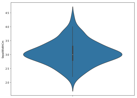
Univariate Violin Plot for the ‘sepal width (cm)’ feature.
Python3
fig, ax = pyplot.subplots(figsize =(9, 7))
sns.violinplot(ax = ax, y = df["sepal width (cm)"] )
|
Output:
Violin Plot for the ‘SepalLengthWidth’ feature
Here also, Higher density is at the mean = 3.05.
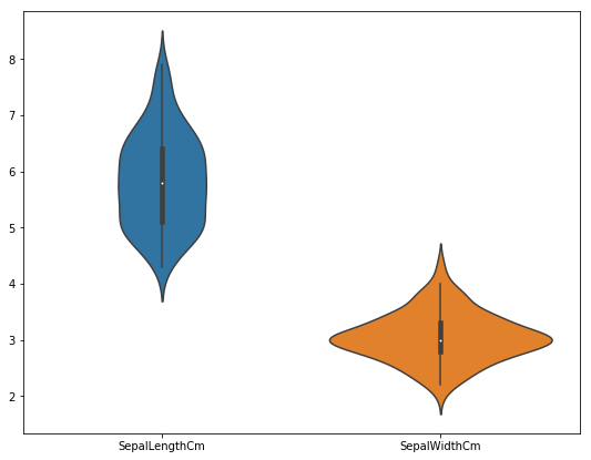
Bivariate Violin Plot comparing ‘SepalLengthCm’ and ‘SepalWidthCm’.
Python3
fig, ax = pyplot.subplots(figsize =(9, 7))
sns.violinplot(ax = ax, data = df.iloc[:, :2])
|
Output:
Bivariate Violin Plot comparing ‘sepal length (cm)’ species-wise.
Python3
fig, ax = pyplot.subplots(figsize =(9, 7))
sns.violinplot(ax = ax, x = df["target"], y = df["sepal length (cm)"], palette = 'Set1' )
|
Output:
.png)
Also Check:
Violin Plot – Frequently Asked Questions (FAQs)
What is the difference between a bar plot and a violin plot?
A bar plot represents categorical data with rectangular bars, typically showing the mean or count of each category. In contrast, a violin plot displays the distribution of numeric data across different categories, providing insight into the data’s spread and density.
What is the difference between violin plot and swarm plot?
ViolinPlot is a statistical visualization that shows the distribution of data across categories using kernel density estimation and box plots. SwarmPlot, on the other hand, displays individual data points along a categorical axis, avoiding overlap by jittering or spreading them out. While ViolinPlot emphasizes the distribution, SwarmPlot focuses on showing each data point.
What is the difference between a histogram and a violin plot?
A histogram represents the distribution of numeric data by dividing it into intervals (bins) and plotting the frequency or density of observations within each bin. In contrast, a violin plot displays the distribution of data across different categories, often using kernel density estimation to show the shape of the distribution along with summary statistics like quartiles.
When should you use a violin plot?
You should use a violin plot when you want to visualize the distribution of numeric data across different categories or groups, especially when you’re interested in comparing the shapes of distributions between groups and identifying potential differences in central tendency, spread, and skewness. It’s particularly useful when you have multiple groups or categories and want to display their distributions simultaneously.
Like Article
Suggest improvement
Share your thoughts in the comments
Please Login to comment...