Plotly is an open-source module of Python which is used for data visualization and supports various graphs like line charts, scatter plots, bar charts, histograms, area plot, etc. In this article, we will see how to plot a basic chart with plotly and also how to make a plot interactive. But before starting you might be wondering why there is a need to learn plotly, so let’s have a look at it.
Why Plotly
Plotly uses javascript behind the scenes and is used to make interactive plots where we can zoom in on the graph or add additional information like data on hover and many more things. Let’s see few more advantages of plotly –
- Plotly has hover tool capabilities that allow us to detect any outliers or anomalies in a large number of data points.
- It is visually attractive that can be accepted by a wide range of audiences.
- It allows us for the endless customization of our graphs that makes our plot more meaningful and understandable for others.
Installation
Plotly does not come built-in with Python. To install it type the below command in the terminal.
pip install plotly
plotly installation image widget
Overview of Plotly Package Structure
in Plotly, there are three main modules –
- plotly.plotly acts as the interface between the local machine and Plotly. It contains functions that require a response from Plotly’s server.
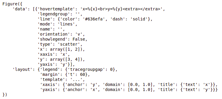
- plotly.graph_objects module contains the objects (Figure, layout, data, and the definition of the plots like scatter plot, line chart) that are responsible for creating the plots. The Figure can be represented either as dict or instances of plotly.graph_objects.Figure and these are serialized as JSON before it gets passed to plotly.js. Figures are represented as trees where the root node has three top layer attributes – data, layout, and frames and the named nodes called ‘attributes’.
Note: plotly.express module can create the entire Figure at once. It uses the graph_objects internally and returns the graph_objects.Figure instance.
Example:
Python3
import plotly.express as px
fig = px.line(x=[1, 2], y=[3, 4])
print(fig)
|
Output:
- plotly.tools module contains various tools in the forms of the functions that can enhance the Plotly experience.
After going through the basics of plotly let’s see how to create some basic charts using plotly.
Line chart
A line chart is one of the simple plots where a line is drawn to shoe relation between the X-axis and Y-axis. It can be created using the px.line() method with each data position is represented as a vertex (which location is given by the x and y columns) of a polyline mark in 2D space.
Syntax:
Syntax: plotly.express.line(data_frame=None, x=None, y=None, line_group=None, color=None, line_dash=None, hover_name=None, hover_data=None, title=None, template=None, width=None, height=None)
Example:
Python3
import plotly.express as px
df = px.data.iris()
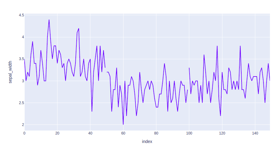
fig = px.line(df, y="sepal_width",)
fig.show()
|
Output:

In the above example, we can see that –
- The labels to the x-axis and y-axis have given automatically by plotly.
- The data of the x-axis and y-axis is shown on hover.
- We can also select a part of the data according to our needs and can also zoom out.
- Plotly also provides a set of tools (seen on the top right corner) to interact with every chart.
- Plotly also allows us to save the graph locally in a static format.
Now let’s try to customize our graph a little.
Example 1: In this example, we will use the line dash parameter which is used to group the lines according to the dataframe column passed.
Python3
import plotly.express as px
df = px.data.iris()
fig = px.line(df, y="sepal_width", line_group='species')
fig.show()
|
Output:
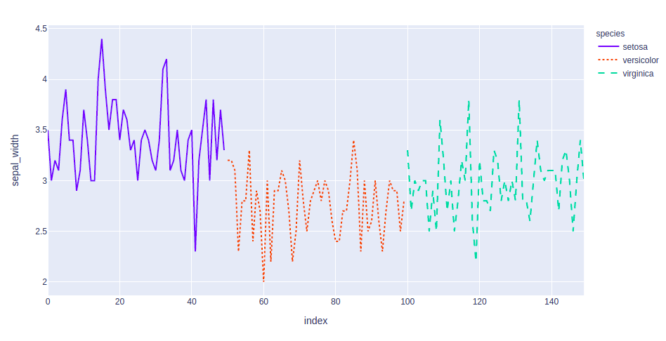
Example 2: In this example, we will group and color the data according to the species. We will also change the line format. For this we will use two attributes such – line_dash and color.
Python3
import plotly.express as px
df = px.data.iris()
fig = px.line(df, y="sepal_width", line_dash='species',
color='species')
fig.show()
|
Output:
Bar Chart
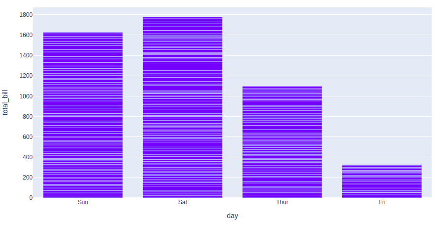
A bar chart is a pictorial representation of data that presents categorical data with rectangular bars with heights or lengths proportional to the values that they represent. In other words, it is the pictorial representation of dataset. These data sets contain the numerical values of variables that represent the length or height. It can be created using the px.bar() method.
Syntax:
plotly.express.bar(data_frame=None, x=None, y=None, color=None, facet_row=None, facet_col=None, facet_col_wrap=0, hover_name=None, hover_data=None, custom_data=None, text=None, error_x=None, error_x_minus=None, error_y=None, error_y_minus=None, title=None, template=None, width=None, height=None, **kwargs)
Example:
Python3
import plotly.express as px
df = px.data.tips()
fig = px.bar(df, x='day', y="total_bill")
fig.show()
|
Output:
Let’s try to customize this plot. Customizations that we will use –
- color: Used to color the bars.
- facet_row: Divides the graph into rows according to the data passed
- facet_col: Divides the graph into columns according to the data passed
Example:
Python3
import plotly.express as px
df = px.data.tips()
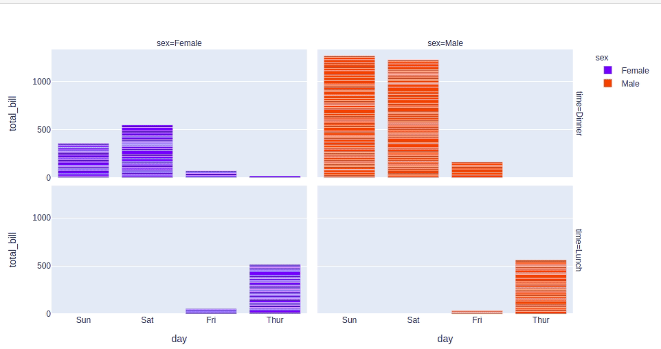
fig = px.bar(df, x='day', y="total_bill", color='sex',
facet_row='time', facet_col='sex')
fig.show()
|
Output:
Scatter Plot
A scatter plot is a set of dotted points to represent individual pieces of data in the horizontal and vertical axis. A graph in which the values of two variables are plotted along X-axis and Y-axis, the pattern of the resulting points reveals a correlation between them. it can be created using the px.scatter() method.
Syntax:
plotly.express.scatter(data_frame=None, x=None, y=None, color=None, symbol=None, size=None, hover_name=None, hover_data=None, facet_row=None, facet_col=None, facet_col_wrap=0, opacity=None, title=None, template=None, width=None, height=None, **kwargs)
Example:
Python3
import plotly.express as px
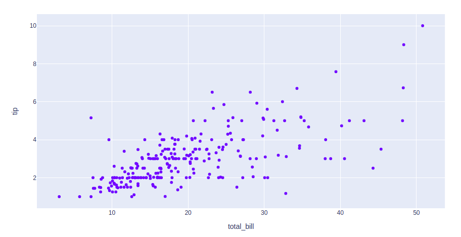
df = px.data.tips()
fig = px.scatter(df, x='total_bill', y="tip")
fig.show()
|
Output:
Let’s see various customizations available for this chart that we will use –
- color: Color the points.
- symbol: Gives a symbol to each point according to the data passed.
- size: The size for each point.
Example:
Python3
import plotly.express as px
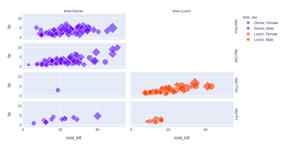
df = px.data.tips()
fig = px.scatter(df, x='total_bill', y="tip", color='time',
symbol='sex', size='size', facet_row='day',
facet_col='time')
fig.show()
|
Output:
Histogram
A histogram is basically used to represent data in the form of some groups. It is a type of bar plot where the X-axis represents the bin ranges while the Y-axis gives information about frequency. It can be created using the px.histogram() method.
Syntax:
plotly.express.histogram(data_frame=None, x=None, y=None, color=None, facet_row=None, facet_col=None, barnorm=None, histnorm=None, nbins=None, title=None, template=None, width=None, height=None)
Example:
Python3
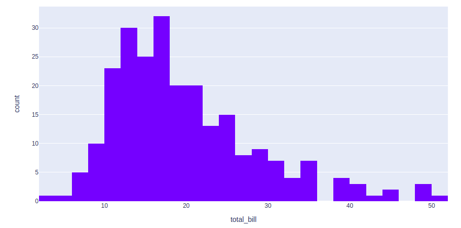
import plotly.express as px
df = px.data.tips()
fig = px.histogram(df, x="total_bill")
fig.show()
|
Output:
Let’s customize the above graph. Customizations that we will be using are –
- color: To color the bars
- nbins: To set the number of bins
- histnorm: Mode through which the bins are represented. Different values that can be passed using this argument are-
- percent or probability: The output of histfunc for a given bin is divided by the sum of the output of histfunc for all bins.
- density: The output of histfunc for a given bin is divided by the size of the bin.
- probability density: The output of histfunc for a given bin is normalized such that it corresponds to the probability that a random
- barmode: Can be either ‘group’, ‘overlay’ or ‘relative’.
- group: Bars are stacked above zero for positive values and below zero for negative values
- overlay: Bars are drawn on the top of each other
- group: Bars are placed beside each other.
Example:
Python3
import plotly.express as px
df = px.data.tips()
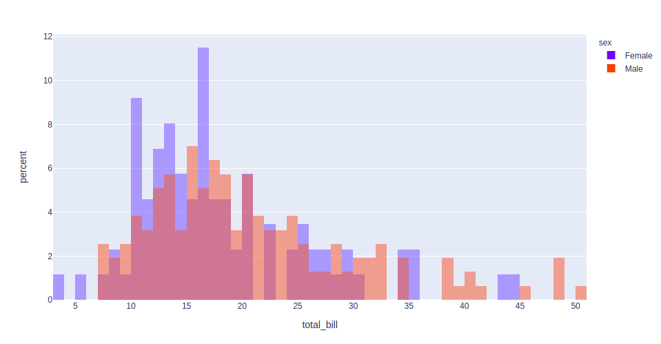
fig = px.histogram(df, x="total_bill", color='sex',
nbins=50, histnorm='percent',
barmode='overlay')
fig.show()
|
Output:
Pie Chart
A pie chart is a circular statistical graphic, which is divided into slices to illustrate numerical proportions. It depicts a special chart that uses “pie slices”, where each sector shows the relative sizes of data. A circular chart cuts in a form of radii into segments describing relative frequencies or magnitude also known as a circle graph. It can be created using the px.pie() method.
Syntax:
plotly.express.pie(data_frame=None, names=None, values=None, color=None, color_discrete_sequence=None, color_discrete_map={}, hover_name=None, hover_data=None, custom_data=None, labels={}, title=None, template=None, width=None, height=None, opacity=None, hole=None)
Example:
Python3
import plotly.express as px
df = px.data.tips()
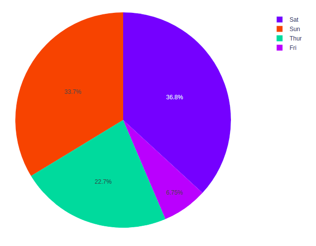
fig = px.pie(df, values="total_bill", names="day")
fig.show()
|
Output:
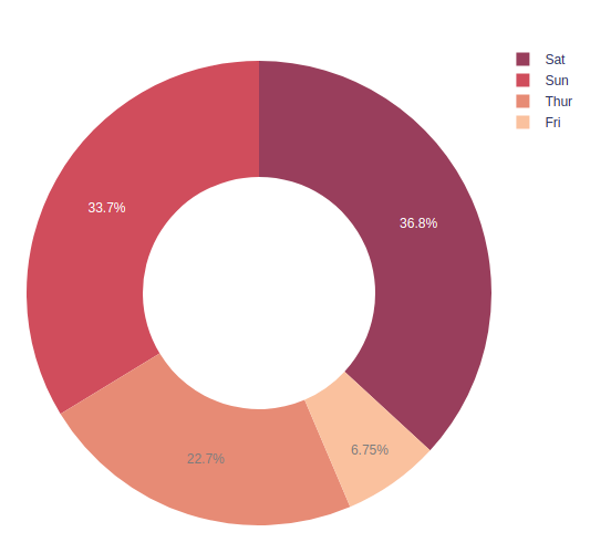
Let’s customize the above graph. Customizations that we will be using are –
- color_discrete_sequence: Strings defining valid CSS colors
- opacity: Opacity for markers. The value should be between 0 and 1
- hole: Creates a hole in between to make it a donut chart. The value should be between 0 and 1
Example:
Python3
import plotly.express as px
df = px.data.tips()
fig = px.pie(df, values="total_bill", names="day",
color_discrete_sequence=px.colors.sequential.RdBu,
opacity=0.7, hole=0.5)
fig.show()
|
Output:
Box Plot
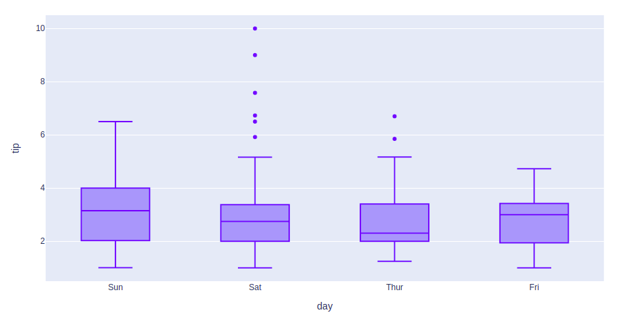
A Box Plot is also known as Whisker plot is created to display the summary of the set of data values having properties like minimum, first quartile, median, third quartile and maximum. In the box plot, a box is created from the first quartile to the third quartile, a vertical line is also there which goes through the box at the median. Here x-axis denotes the data to be plotted while the y-axis shows the frequency distribution. It can be created using the px.box() method
Syntax:
plotly.express.box(data_frame=None, x=None, y=None, color=None, facet_row=None, facet_col=None, title=None, template=None, width=None, height=None, **kwargs)
Example:
Python3
import plotly.express as px
df = px.data.tips()
fig = px.box(df, x="day", y="tip")
fig.show()
|
Output:
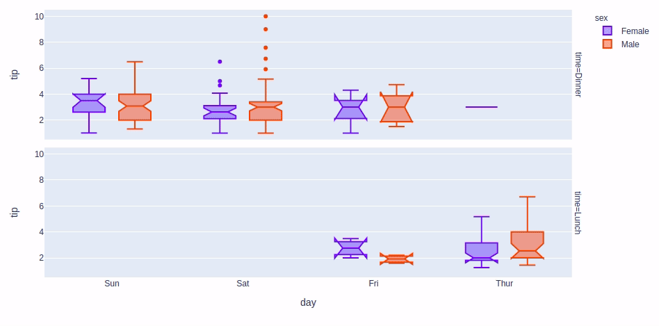
Let’s see various customizations that can be used on boxplots –
- color: used to assign color to marks
- facet_row: assign marks to facetted subplots in the vertical direction
- facet_col: assign marks to facetted subplots in the horizontal direction
- boxmode: One of ‘group’ or ‘overlay’ In ‘overlay’ mode, boxes are on drawn top of one another. In ‘group’ mode, boxes are placed beside each other.
- notched: If True, boxes are drawn with notches
Example:
Python3
import plotly.express as px
df = px.data.tips()
fig = px.box(df, x="day", y="tip", color='sex',
facet_row='time', boxmode='group',
notched=True)
fig.show()
|
Output:
Violin Plot
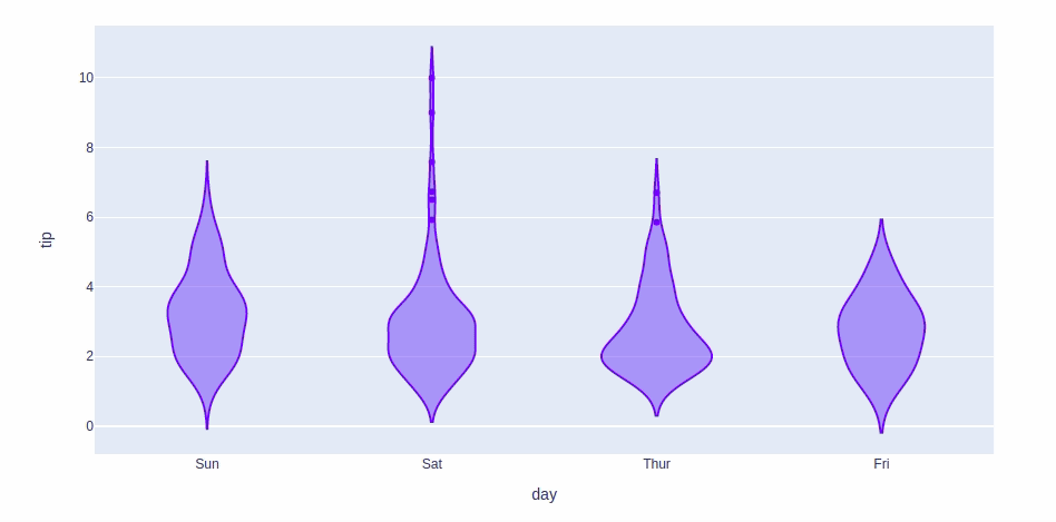
Violin Plot is a method to visualize the distribution of numerical data of different variables. It is similar to Box Plot but with a rotated plot on each side, giving more information about the density estimate on the y-axis. The density is mirrored and flipped over and the resulting shape is filled in, creating an image resembling a violin. The advantage of a violin plot is that it can show nuances in the distribution that aren’t perceptible in a boxplot. On the other hand, the boxplot more clearly shows the outliers in the data. It can be created using the px.violin() method.
Syntax:
violin(data_frame=None, x=None, y=None, color=None, facet_row=None, facet_col=None, facet_col_wrap=0, facet_row_spacing=None, facet_col_spacing=None, hover_name=None, hover_data=None, title=None, template=None, width=None, height=None, **kwargs)
Example:
Python3
import plotly.express as px
df = px.data.tips()
fig = px.violin(df, x="day", y="tip")
fig.show()
|
Output:
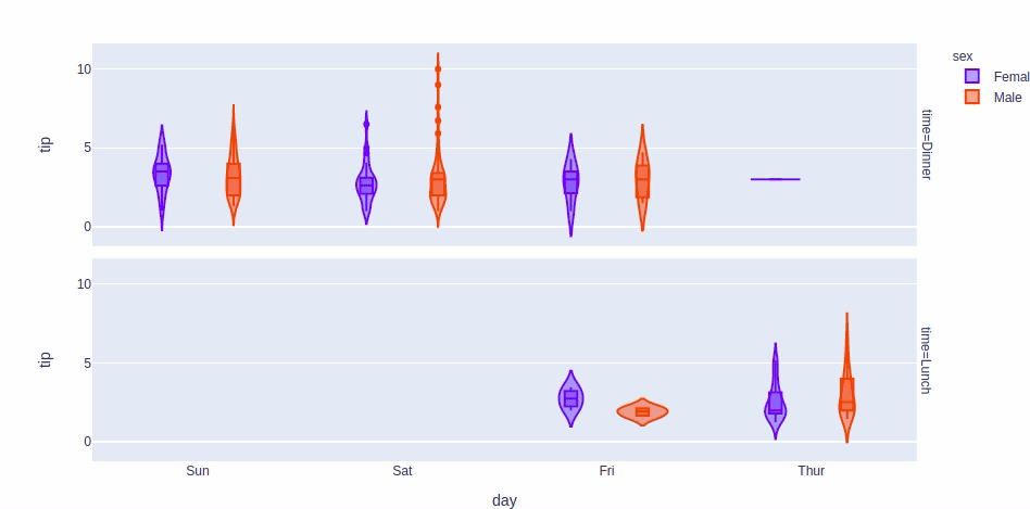
For customizing the violin plot we will use the same customizations available for the box plot except the boxmode and notched which are not available for the violin plot. We will also the box parameter. Setting this parameter to True will show a box plot inside the violin plot.
Example:
Python3
import plotly.express as px
df = px.data.tips()
fig = px.violin(df, x="day", y="tip", color='sex',
facet_row='time', box=True)
fig.show()
|
Output:
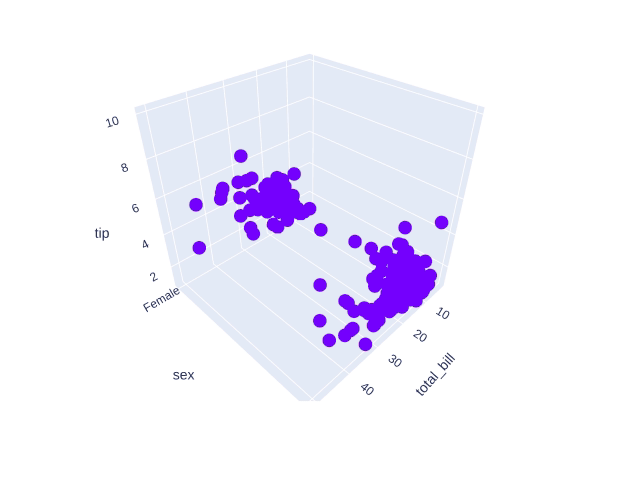
3D Scatter Plot
3D Scatter Plot can plot two-dimensional graphics that can be enhanced by mapping up to three additional variables while using the semantics of hue, size, and style parameters. All the parameter control visual semantic which are used to identify the different subsets. Using redundant semantics can be helpful for making graphics more accessible. It can be created using the scatter_3d function of plotly.express class.
Syntax:
plotly.express.scatter_3d(data_frame=None, x=None, y=None, z=None, color=None, symbol=None, size=None, range_x=None, range_y=None, range_z=None, title=None, template=None, width=None, height=None, **kwargs)
Example:
Python3
import plotly.express as px
df = px.data.tips()
fig = px.scatter_3d(df, x="total_bill", y="sex", z="tip")
fig.show()
|
Output:
Customizing the 3D scatter plot. We will use the following customization –
- color: Set the color of the markers
- size: Set the size of the marker
- symbol: Set the symbol of the plot
Example:
Python3
import plotly.express as px
df = px.data.tips()
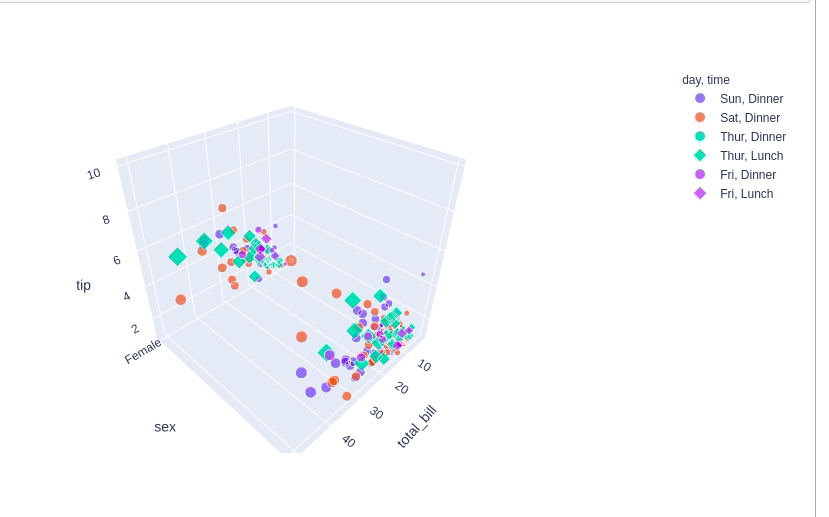
fig = px.scatter_3d(df, x="total_bill", y="sex", z="tip", color='day',
size='total_bill', symbol='time')
fig.show()
|
Output:
Adding interaction to the plot
Every graph created by the plotly provides various interactions, where we can select a part of the plot, we get information on hovering over the plot, and also a toolbar is also created with every plot that can many tasks like saving the plot locally or zooming in and out, etc. Besides all these plotly allows us to add more tools like dropdowns, buttons, sliders, etc. These can be created using the update menu attribute of the plot layout. Let’s see how to do all such things in detail.
Dropdown Menu
A drop-down menu is a part of the menu button which is displayed on a screen all the time. Every menu button is associated with a Menu widget that can display the choices for that menu button when clicked on it. In plotly, there are 4 possible methods to modify the charts by using update menu method.
- restyle: modify data or data attributes
- relayout: modify layout attributes
- update: modify data and layout attributes
- animate: start or pause an animation
Example:
Python3
import plotly.graph_objects as px
import numpy as np
import pandas as pd
df = pd.read_csv('tips.csv')
plot = px.Figure(data=[px.Scatter(
x=df['day'],
y=df['tip'],
mode='markers',)
])
plot.update_layout(
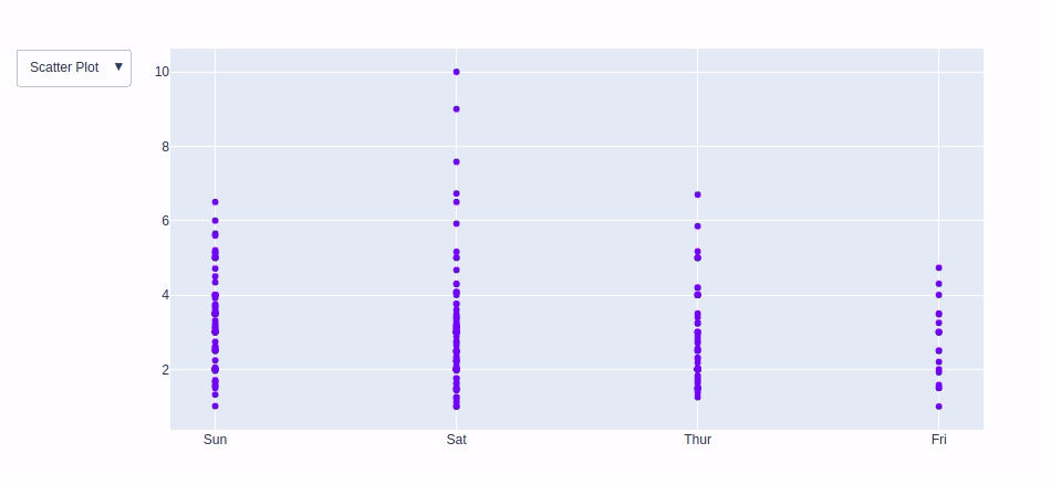
updatemenus=[
dict(buttons=list([
dict(
args=["type", "scatter"],
label="Scatter Plot",
method="restyle"
),
dict(
args=["type", "bar"],
label="Bar Chart",
method="restyle"
)
]),
direction="down",
),
]
)
plot.show()
|
Output:
Adding Buttons
In plotly, actions custom Buttons are used to quickly make actions directly from a record. Custom Buttons can be added to page layouts in CRM, Marketing, and Custom Apps. There are also 4 possible methods that can be applied in custom buttons:
- restyle: modify data or data attributes
- relayout: modify layout attributes
- update: modify data and layout attributes
- animate: start or pause an animation
Example:
Python3
import plotly.graph_objects as px
import pandas as pd
data = pd.read_csv("tips.csv")
plot = px.Figure(data=[px.Scatter(
x=data['day'],
y=data['tip'],
mode='markers',)
])
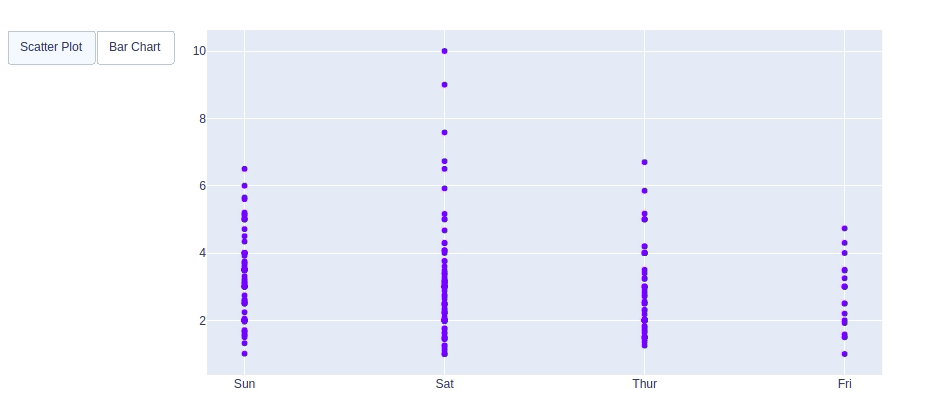
plot.update_layout(
updatemenus=[
dict(
type="buttons",
direction="left",
buttons=list([
dict(
args=["type", "scatter"],
label="Scatter Plot",
method="restyle"
),
dict(
args=["type", "bar"],
label="Bar Chart",
method="restyle"
)
]),
),
]
)
plot.show()
|
Output:
Creating Sliders and Selectors to the Plot
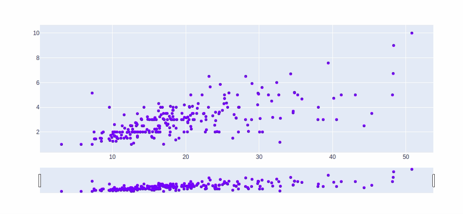
In plotly, the range slider is a custom range-type input control. It allows selecting a value or a range of values between a specified minimum and maximum range. And the range selector is a tool for selecting ranges to display within the chart. It provides buttons to select pre-configured ranges in the chart. It also provides input boxes where the minimum and maximum dates can be manually input.
Example:
Python3
import plotly.graph_objects as px
import plotly.express as go
import numpy as np
df = go.data.tips()
x = df['total_bill']
y = df['tip']
plot = px.Figure(data=[px.Scatter(
x=x,
y=y,
mode='markers',)
])
plot.update_layout(
xaxis=dict(
rangeselector=dict(
buttons=list([
dict(count=1,
step="day",
stepmode="backward"),
])
),
rangeslider=dict(
visible=True
),
)
)
plot.show()
|
Output:
Like Article
Suggest improvement
Share your thoughts in the comments
Please Login to comment...