Use different y-axes on the left and right of a Matplotlib plot
Last Updated :
23 Jan, 2022
In this article, we are going to discuss how to create y-axes of both sides of a Matplotlib plot.
Sometimes for quick data analysis, it is required to create a single graph having two data variables with different scales. For this purpose twin axes methods are used i.e. dual X or Y-axes. The matplotlib.axes.Axes.twinx() function in axes module of matplotlib library is used to create a twin Axes sharing the X-axis.
Syntax :
matplotlib.axes.Axes.twinx(self)
This method does not take any parameters, raise an error if provided. It returns the ax_twin object which indicates that a new Axes instance is created. Below examples illustrate the matplotlib.axes.Axes.twinx() function in matplotlib.axes:
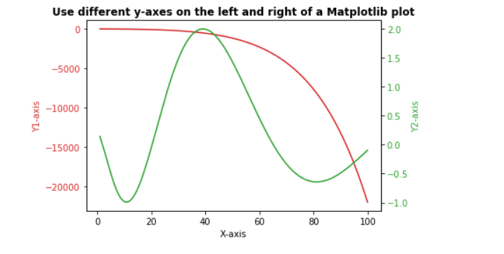
Example 1:
Python3
import numpy as np
import matplotlib.pyplot as plt
x = np.arange(1.0, 100.0, 0.191)
dataset_1 = np.exp(x**0.25) - np.exp(x**0.5)
dataset_2 = np.sin(0.4 * np.pi * x**0.5) + np.cos(0.8 * np.pi * x**0.25)
fig, ax1 = plt.subplots()
color = 'tab:red'
ax1.set_xlabel('X-axis')
ax1.set_ylabel('Y1-axis', color = color)
ax1.plot(x, dataset_1, color = color)
ax1.tick_params(axis ='y', labelcolor = color)
ax2 = ax1.twinx()
color = 'tab:green'
ax2.set_ylabel('Y2-axis', color = color)
ax2.plot(x, dataset_2, color = color)
ax2.tick_params(axis ='y', labelcolor = color)
plt.title('Use different y-axes on the left and right of a Matplotlib plot', fontweight ="bold")
plt.show()
|
Output:
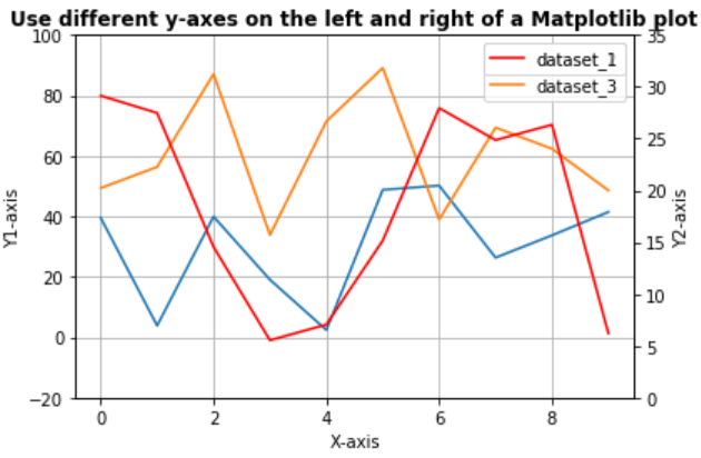
Example 2:
Python3
import numpy as np
import matplotlib.pyplot as plt
from matplotlib import rc
rc('mathtext', default='regular')
x = np.arange(10)
dataset_1 = np.random.random(10)*30
dataset_2 = np.random.random(10)*60
dataset_3 = np.random.random(10)*100
fig = plt.figure()
ax = fig.add_subplot(111)
ax.plot(x, dataset_2, '-', label='dataset_2')
ax.plot(x, dataset_3, '-', label='dataset_3')
ax2 = ax.twinx()
ax2.plot(x, dataset_1, '-r', label='dataset_1')
plt.title('Use different y-axes on the left and right of a Matplotlib plot',
fontweight="bold")
ax.legend(loc=0)
ax2.legend(loc=0)
ax.grid()
ax.set_xlabel("X-axis")
ax.set_ylabel(r"Y1-axis")
ax2.set_ylabel(r"Y2-axis")
ax2.set_ylim(0, 35)
ax.set_ylim(-20, 100)
plt.show()
|
Output:
Like Article
Suggest improvement
Share your thoughts in the comments
Please Login to comment...