Types of Responsive Layouts
Last Updated :
08 Jan, 2021
Introduction:
Responsive web design simply refers to approach that brings dynamic changes and adjust content of page according to size of device’s screen. It is website design that automatically adjust itself for various sized screens and make use of flexible layouts and images, CSS styles, media queries, etc. Its main aim to develop website that determine size and orientation of screen it is viewed on and then according change layout to fit best on screen. Responsive web design generally makes use of fluid grids, CSS styling, flexible images, etc., simply to change design of website and adjust it as per width of browser or screen. One should know about their audience more in effective manner and devices they mostly use to view website. Mostly 90 % of today’s generation use mobile phones to surf web. Therefore, responsive websites have become important and essential to bring site on top rank of SEO as well as increase growth of business and bring them ahead of their competitors.
Types of Responsive Layout
Basically, there are three different types of responsive layout. One has to determine which one is right and best for their business. Three types of responsive layout are given below:
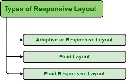
1. Adaptive or Responsive Layout
Adaptive layout, also known as responsive layout, generally build from static blocks using the absolute unit. The absolute unit generally measures length such as pixels, points, etc. Adaptive design always indicates fixed-length i.e., pixels will remain fixed whether viewed on a laptop or mobile. Pixels based image does not adjust according to browser width. The adaptive layout is easy to create as compared to the fluid layout. These layouts also load fast as there are no such adjust of size and position of elements, etc.
2. Fluid Layout
Fluid layout, also known as liquid layouts, generally fills the whole width of screen using relative unit. Relative unit can be em, %, ex, etc. Fluid layout indicates that length is always calculated in relation to other elements. % based images adjust according to browser width. Fluid layout is more difficult to create as compared to adaptive layout. In this layout, we can specify size in percentage rather than pixels. It is more flexible but take more time to load as compared to adaptive or responsive layout.
3. Fluid Responsive Layout
Fluid responsive layout is mixture of adaptive and fluid layout. It includes lot of media queries i.e., breakpoints. In this layout, element either shrink or stretch themselves according to screen size and provide custom experience. It is user-friendly because it adjusts itself according to user’s setup.
Like Article
Suggest improvement
Share your thoughts in the comments
Please Login to comment...