Types of Autocorrelation
Last Updated :
17 May, 2021
Autocorrelation:
As we discussed in this article, Autocorrelation is defined as the measure of the degree of similarity between a given time series and the lagged version of that time series over successive time periods. Autocorrelation measures the degree of similarity between a time series and the lagged version of that time series at different intervals.
Autocorrelation Function:
Suppose we have a time series {Xt} which has the following mean:
![\mu = E\left [ X_t \right ]](https://www.geeksforgeeks.org/wp-content/ql-cache/quicklatex.com-6f9a149771b468ed87db2a859bd98085_l3.png "Rendered by QuickLaTeX.com")
and the autocovariance functions
![\gamma_x\left ( t+k, t \right ) = Cov\left ( X_{t+k}, X_t \right ) \, = E\left [ \left ( X_{t+k}- \mu_{t+k} \right )\left ( X_t -\mu_t \right )\right ]](https://www.geeksforgeeks.org/wp-content/ql-cache/quicklatex.com-e75c7c79d2b0d2db6a34e2f066660d88_l3.png "Rendered by QuickLaTeX.com")
at t=0,

and the autocorrelation function is defined as:

The value of autocorrelation varies from -1 for perfectly negative autocorrelation and 1 for perfectly positive autocorrelation. The value closer to 0 is referred to as no autocorrelation.
Positive Autocorrelation:
Positive autocorrelation occurs when an error of a given sign between two values of time series lagged by k followed by an error of the same sign.

Below is the graph of the dataset that represents positive autocorrelation at lag=1:

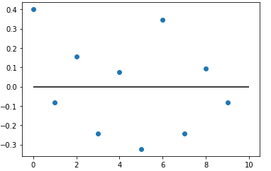
Negative Autocorrelation:
Negative autocorrelation occurs when an error of a given sign between two values of time series lagged by k followed by an error of the different sign.

Below is the graph of time series that represents negative autocorrelation at lag=1:
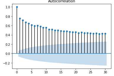
Strong Autocorrelation
We can conclude that the data have strong autocorrelation if the autocorrelation plot has similar to the following plots:
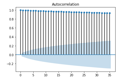
The autocorrelation plot starts with a very high autocorrelation at lag 1 but slowly declines until it becomes negative and starts showing an increasing negative autocorrelation. This type of pattern indicates a strong autocorrelation, which can be helpful in predicting future trends
The next step would be to estimate the parameters for the autoregressive model:

The randomness assumption for least-squares fitting applies to the residuals of the model. That is, even though the original data exhibit non-randomness, the residuals after fitting Yi against Yi-1 should result in random residuals.
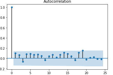
Weak Autocorrelation
We can conclude that the data have weak autocorrelation if the autocorrelation plot has similar to the following plot at lag = 1:
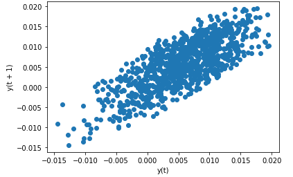
Lag plot at Lag =1
The above plot shows that there is some autocorrelation at lag=1 because if there is no autocorrelation the plot will be similar to this plot on random values with lag=1
The conclusion can be drawn from the above plot
- An underlying autoregressive model with moderate positive/negative autocorrelation.
- There were very few outliers.
The above weak autocorrelation plot have some autoregressive model that can be represented in such a form

at Yi =0, we can obtain the residual of estimators.

It is easy to perform estimation on the lag plot because of the Yi+1 and Yi as their axes.
Implementation
- In this implementation, we will be looking on how to generate correlation plots and lag plots. We will use the flicker dataset and some randomly generated samples for this purpose.
python3
import numpy as np
from numpy.random import random_sample
import pandas as pd
import matplotlib.pyplot as plt
import statsmodels.api as sm
from statsmodels.graphics.tsaplots import plot_acf
weak_Corr_df = pd.read_csv('flicker.csv', sep ='\n', header=None)
plot_acf(weak_Corr_df, alpha = 0.05)
pd.plotting.lag_plot(weak_Corr_df, lag = 1)
random_Series = pd.Series(random_sample(200))
pd.plotting.lag_plot(random_Series, lag = 1)
plot_acf(random_Series, alpha = 0.05)
|
- For Flicker dataset, the plots are as follows:
Autocorrelation Flicker data
Lag plot for flicker data
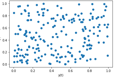
- For Random Normal datasets, the plots are as follows
Autocorrelation plot
Lag plot for random data at lag=1
Like Article
Suggest improvement
Share your thoughts in the comments
Please Login to comment...