Time Series Plot or Line plot with Pandas
Last Updated :
26 Nov, 2020
Prerequisite: Create a Pandas DataFrame from Lists
Pandas is an open-source library used for data manipulation and analysis in Python. It is a fast and powerful tool that offers data structures and operations to manipulate numerical tables and time series. Examples of these data manipulation operations include merging, reshaping, selecting, data cleaning, and data wrangling. This library allows importing data from various file formats like SQL, JSON, Microsoft Excel, and comma-separated values. This article explains how to use the pandas library to generate a time series plot, or a line plot, for a given set of data.
A line plot is a graphical display that visually represents the correlation between certain variables or changes in data over time using several points, usually ordered in their x-axis value, that are connected by straight line segments. The independent variable is represented in the x-axis while the y-axis represents the data that is changing depending on the x-axis variable, aka the dependent variable.
To generate a line plot with pandas, we typically create a DataFrame* with the dataset to be plotted. Then, the plot.line() method is called on the DataFrame.
Syntax:
DataFrame.plot.line(x, y)
The table below explains the main parameters of the method:
| Parameter |
Value |
Default Value |
Use |
| x |
Int or string |
DataFrame indices |
Set the values to be represented in the x-axis. |
| y |
Int or string |
Remaining columns in DataFrame |
Set the values to be represented in the y-axis. |
Additional parameters include color (specifies the color of the line), title (specifies the title of the plot), and kind (specifies which type of plot to use). The default variable for the “kind” parameter of this method is ‘line’. Therefore, you don’t have to set it in order to create a line plot.
Example 1:
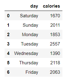
The example illustrates how to generate basic a line plot of a DataFrame with one y-axis variable. Use pandas in Python3 to plot the following data of someone’s calorie intake throughout one week, here is our dataframe.
Code:
Python3
import pandas as pd
days = [ 'Saturday' , 'Sunday' , 'Monday' , 'Tuesday' ,
'Wednesday' , 'Thursday' , 'Friday' ]
calories = [ 1670 , 2011 , 1853 , 2557 ,
1390 , 2118 , 2063 ]
df_days_calories = pd.DataFrame(
{ 'day' : days , 'calories' : calories })
df_days_calories
|
Output:
Now, Plotting the variable.
Python3
df_days_calories.plot( 'day' , 'calories' )
|
Output:
Example 2:
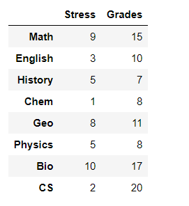
This example explains how to create a line plot with two variables in the y-axis.
A student was asked to rate his stress level on midterms week for each school subject on a scale from 1-10 (10 being the highest). He was also asked about his grade on each midterm (out of 20).
Code:
Python3
import pandas as pd
subjects = [ 'Math' , 'English' , 'History' ,
'Chem' , 'Geo' , 'Physics' , 'Bio' , 'CS' ]
stress = [ 9 , 3 , 5 , 1 , 8 , 5 , 10 , 2 ]
grades = [ 15 , 10 , 7 , 8 , 11 , 8 , 17 , 20 ]
df = pd.DataFrame(list(zip( stress , grades )),
index = subjects ,
columns = [ 'Stress' , 'Grades' ])
df
|
Output:
Create a line plot that shows the relationships between these three variables.
Code:
Output:
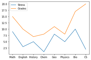
An alternative way would be to use gca() method from matplotlib.pyplot library as follows:
Python3
import pandas as pd
import matplotlib.pyplot as plt
subjects = [ 'Math' , 'English' , 'History ',
'Chem' , 'Geo' , 'Physics' , 'Bio' , 'CS' ]
stress = [ 9, 3 , 5 , 1 , 8 , 5 , 10 , 2 ]
grades = [ 15, 10 , 7 , 8 , 11 , 8 , 17 , 20 ]
df_days_calories = pd.DataFrame(
{ 'Subject' : subjects ,
'Stress': stress ,
'Grade': grades})
ax = plt.gca()
df_days_calories.plot( x = 'Subject' , y = 'Stress', ax = ax )
df_days_calories.plot( x = 'Subject' , y = 'Grade' , ax = ax )
|
Output:
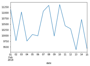
Example 3:
In this example, we will create a plot without explicitly defining variable lists. We will also add a title and change the color.
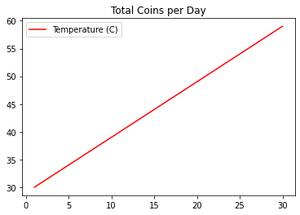
A coin collector initially has 30 coins. After that, for a duration of one month, he finds one coin every day. Show in a line plot how many coins he has each day of that month.
Python3
import pandas as pd
c = 30
df = pd.DataFrame([ c + x for x in range( 0 , 30 )],
index = [*range( 1 , 31 , 1 )],
columns = [ 'Temperature (C)' ])
df.plot(color='red', title = 'Total Coins per Day')
|
Output:
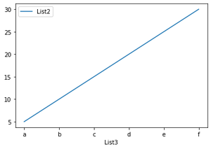
Example 4:
In this example, we will plot specific columns of a dataframe. The dataframe consists of three lists, however, we will select two lists only to add to the plot.
Code:
Python3
import pandas as pd
df = pd.DataFrame(
{'List1': [ 1 , 2 , 3 , 4 , 5 , 6 ],
'List2': [ 5 , 10 , 15 , 20 , 25 , 30 ],
'List3': [ 'a' , 'b' , 'c' , 'd' , 'e' , 'f' ]})
df.plot( 'List3' , 'List2' )
|
Output:
Like Article
Suggest improvement
Share your thoughts in the comments
Please Login to comment...