Text Animation using HTML & CSS @keyframes Rule
Last Updated :
16 Mar, 2023
Text animation is a powerful tool for creating visually engaging and interactive web pages. HTML and CSS offer a range of options for creating advanced text animation effects. In Particular, the CSS ‘@keyframes‘ rule comes in handy.
The CSS ‘@keyframes’ rule is used to define animations that change CSS styles over time. It specifies a set of keyframes or frames that represent different states of an element at specific times during the animation. The styles between the keyframes are automatically interpolated, creating a smooth animation effect. By combining keyframes with other CSS properties, you can create a wide range of creative and interactive animations for your web pages.
Please note that we will use Browsersync to start a server and provide a URL to view the HTML site, and CSS Animation and to load the respective JavaScript files. Check out this article on how to install and run Browsersync on your local machine. Feel free to use any other tool of your choosing.
In this article, we’ll explore several examples of advanced text animation using the HTML and CSS ‘@keyframes’ rule.
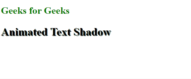
Example 1: Animated Text Shadow: An animated text-shadow can be created by using the CSS ‘text-shadow’ property along with the @keyframes rule. This property is used to specify the color, blur radius, and offset of the shadow.
Here’s an example of how to create an animated text-shadow:
HTML
<!DOCTYPE html>
<html lang="en">
<head>
<meta charset="UTF-8">
<meta http-equiv="X-UA-Compatible" content="IE=edge">
<meta name="viewport" content=
"width=device-width, initial-scale=1.0">
<title>Animated Text Shadow</title>
<style>
h2 {
font-size: 36px;
font-weight: bold;
animation: textShadow 1s ease-in-out
infinite alternate;
}
@keyframes textShadow {
from {
text-shadow: 2px 2px #333;
}
to {
text-shadow: 10px 10px #333;
}
}
</style>
</head>
<body>
<h1 style="color:green">
Geeks for Geeks
</h1>
<h2>Animated Text Shadow</h2>
</body>
</html>
|
In this example, the ‘text-shadow’ property is used to specify the color and size of the shadow. The @keyframes rule is used to specify the animation, and the animation property is used to specify the animation’s name, duration, easing, iteration count, and direction. The result is an ‘h2’ element with a moving text-shadow that changes size over time.
Output:
Text Animation using HTML & CSS @keyframes Rule
Example 2: Animated Gradient Text: An animated gradient text effect can be created using CSS linear or radial gradients along with the @keyframes rule. The ‘background-clip’ property is used to control the background of the text, and the ‘-webkit-background-clip’ property is used for compatibility with older browsers.
Here’s an example of how to create an animated gradient text:
HTML
<!DOCTYPE html>
<html lang="en">
<head>
<meta charset="UTF-8">
<meta http-equiv="X-UA-Compatible" content="IE=edge">
<meta name="viewport" content=
"width=device-width, initial-scale=1.0">
<title>Animated Text Gradient</title>
<style>
h2 {
font-size: 36px;
font-weight: bold;
animation: gradientText 5s ease-in-out infinite;
}
@keyframes gradientText {
0% {
color: red;
}
25% {
color: yellow;
}
50% {
color: blue;
}
100% {
color: green;
}
}
</style>
</head>
<body>
<h1 style="color:green">
Geeks for Geeks
</h1>
<h2>Animated Gradient Text</h2>
</body>
</html>
|
In this example, a linear gradient is used to specify the colors of the gradient, and the ‘background-clip’ and ‘-webkit-background-clip’ properties are used to control the background of the text. The @keyframes rule is used to specify the animation, and the animation property is used to specify the animation’s name, duration, easing, iteration count, and direction. The result is an ‘h2’ element with a text background that animates over.
Output:

Text Animation using HTML & CSS @keyframes Rule
Like Article
Suggest improvement
Share your thoughts in the comments
Please Login to comment...