Tableau – Filters in Dashboard
Last Updated :
22 Oct, 2020
In this article we will learn how to apply various filters in a dashboard in tableau.
- Tableau : Tableau is a very powerful data visualization tool that can be used by data analysts, scientists, statisticians, etc. to visualize the data and get a clear opinion based on the data analysis. Tableau is very famous as it can take in data and produce the required data visualization output in a very short time.
- Dashboard : A dashboard could also be a set of several views, letting you compare a selection of data simultaneously. For example, if you’ve got a group of views that you simply review a day , you’ll create a dashboard that displays all the views directly, instead of navigate to separate worksheets. Like worksheets, you access dashboards from tabs at the lowest of a workbook. Data in sheets and dashboards is connected; once you modify a sheet, any dashboards containing it change, and therefore the other way around . Both sheets and dashboards update with the newest available data from the info source.
- Filtering: Filter a visualization to limit and customize the data displayed on visualization in a dashboard. For example, you can filter the visualization to display only selected geographical regions, the top five most-profitable regions, or those regions with more than $1 million in revenue.
Dataset used in the given examples is Dataset.
Filters in Tableau can be used using the below steps:
1. Open Tableau tool and connect a dataset into it.
2. Drag and drop the one sheet of connected dataset.
3. Click on Sheet1 to open the tableau worksheet.
4. On clicking Sheet1 you will get whole dataset attributes on left side and a worksheet for work.
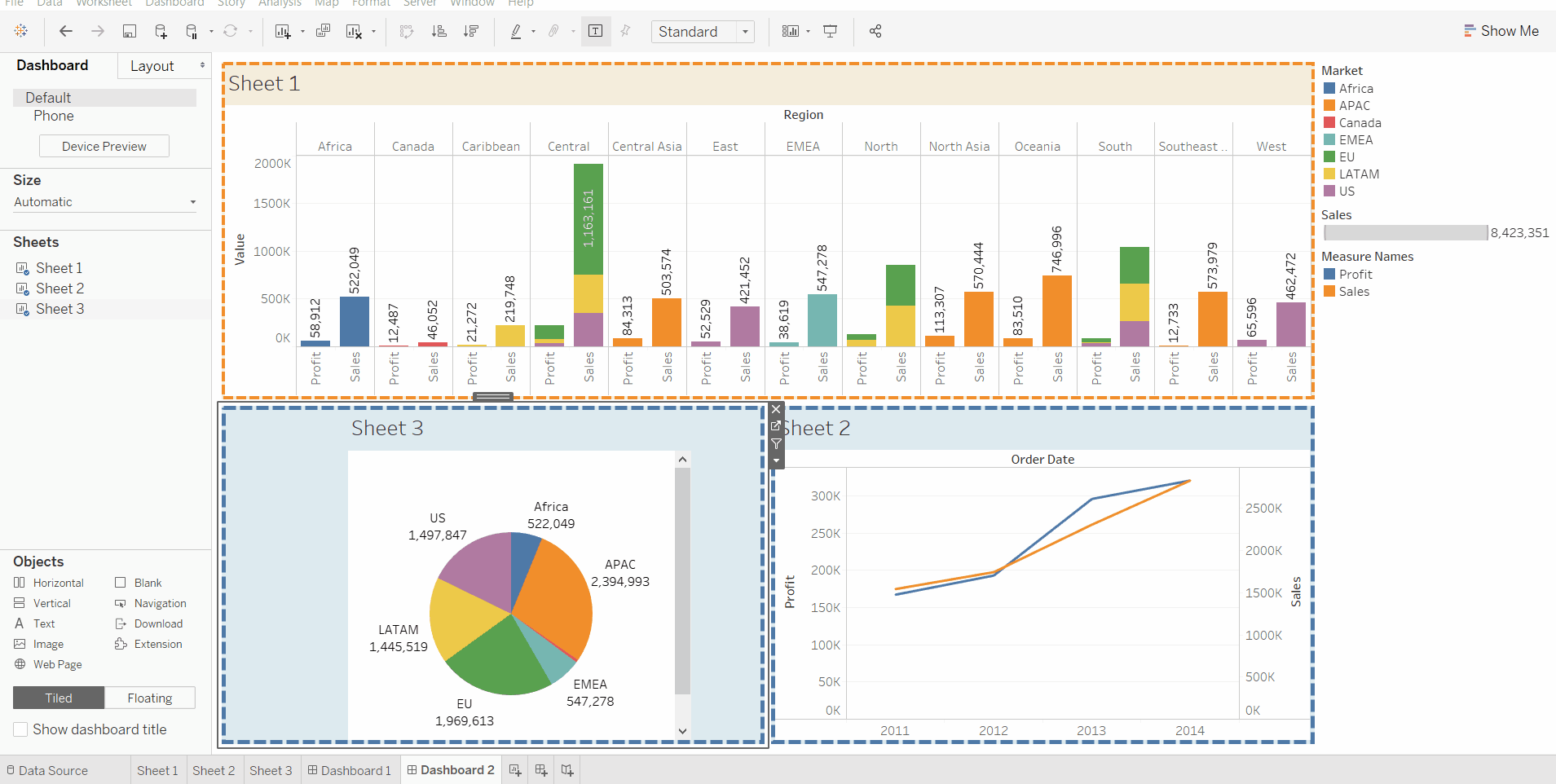
5. To create a dashboard you have to form at least one worksheet of any information with any features like crosstab, maps, charts, graphs, etc. For this you have to follow some steps :
- Ready with the sheets and work for dashboard.
- Click on square + sign in (the bottom left) to open a new dashboard.
- Drag and drop the sheets according to your choice.
- Add some modifications (optional).
6. To apply filters in dashboard we must select a sheet, use filter and then apply it on full dashboard.
- This can be done by two ways :
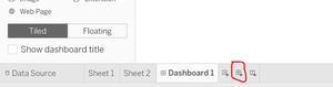
By clicking on funnel :
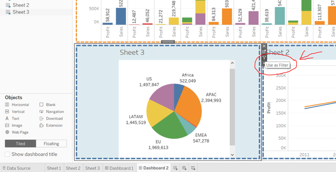
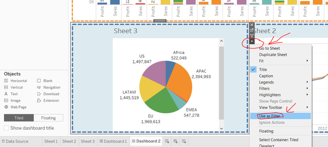
By clicking use a filter followed by down arrow :
Example 1:
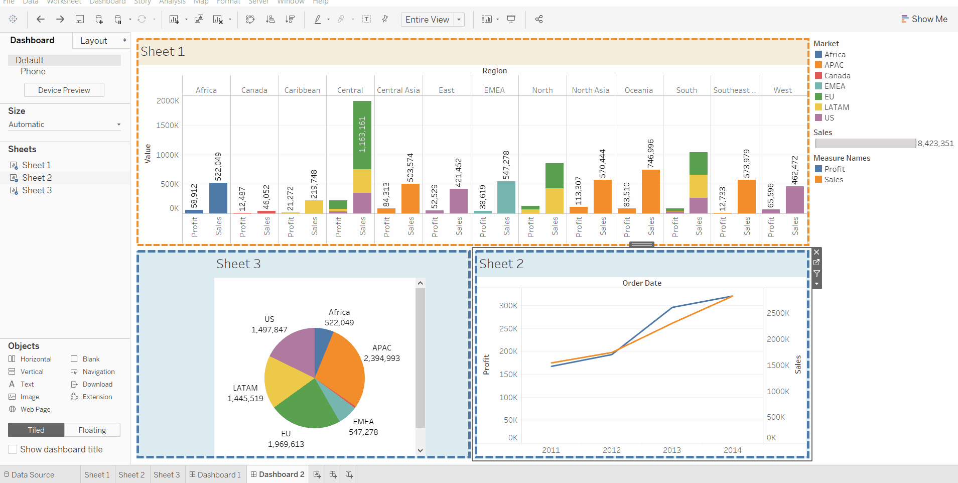
In this example we simply select a region of a pie chart and apply the filter. Finally, the result is formed from the all graphs but for that selected specific region only.


Example 2:
In this example we will show how to apply filter in a specific sheet of visualization without effecting others.
Example 3:
In this example we will learn how to remove filter in dashboard. It is just similar as adding a filter. One can remove filter by any of the above mentioned two methods.
Like Article
Suggest improvement
Share your thoughts in the comments
Please Login to comment...