Standard Deviation Plot
Last Updated :
12 Jan, 2022
A standard deviation plot is used to check if there is a deviation between different groups of data. These groups can be generated manually or can be decided based on some property of the dataset.
Standard deviation plots can be formed of :
- Vertical Axis: Group Standard deviation
- Horizontal Axis: Group Identifier/ Label of the groups.
A reference straight line is plotted among the overall standard deviation.
The standard deviation plot is used to answer the following questions:
- Is there any shift in the variation?
- What is the magnitude of the shift in the variation?
- Is there any distinct pattern in the shift of the variation?
A standard deviation plot is generally used to measure the scale, the same scale measure can also be used to find with mean absolute plot and average deviation plot. These plots also provide better accuracy in terms of identifying outliers.
Uses of Standard Deviation plot
- A standard deviation plot is generally used to measure the scale, the same scale measure can also be found with mean absolute plot and average deviation plot. These plots also provide better accuracy in terms of identifying outliers.
- A common assumption in many analyses such as 1-factor analysis that the variance is the same for different levels of factor variables. A standard deviation plot can be used to verify that.
- We can also verify the constant variance assumptions of univariate data by dividing the data into equal size partitions and plotting variance for each of the partitions.
Implementation
- In this implementation, we use the Delhi weather dataset from Kaggle. The link to the dataset can be found here
Python3
import matplotlib.pyplot as plt
import pandas as pd
import seaborn as sns
sns.set_style('darkgrid')
%matplotlib inline
sns.mpl.rcParams['figure.figsize'] = (10.0, 8.0)
df =pd.read_csv('weather.csv')
df['datetime_utc'] = pd.to_datetime(df['datetime_utc']).dt.date
df.head()
month_Df =df.groupby(df['datetime_utc'].dt.strftime('%B'))[" _tempm"].std()
new_order = ['January', 'February', 'March', 'April', 'May', 'June', 'July',
'August', 'September', 'October', 'November', 'December']
month_Df=month_Df.reindex(new_order)
month_Df
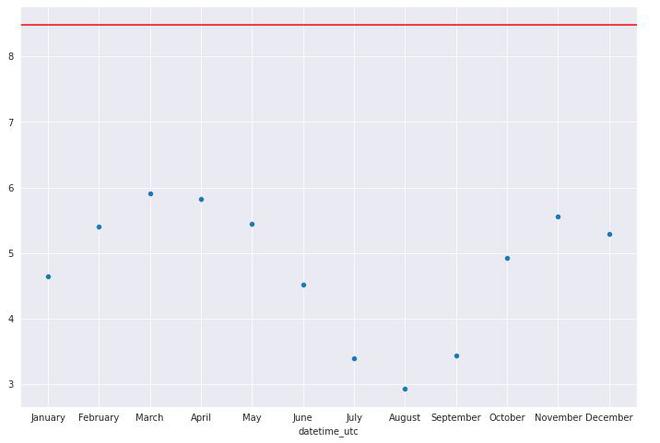
graph =sns.scatterplot(y= month_Df.values, x= month_Df.index)
graph.axhline(df[" _tempm"].std(), color='red')
plt.show()
|
datetime_utc    _conds    _dewptm    _fog    _hail    _heatindexm    _hum    _precipm    _pressurem    _rain    _snow    _tempm    _thunder    _tornado    _vism    _wdird    _wdire    _wgustm    _windchillm    _wspdm
0    1996-11-01    Smoke    9.0    0    0    NaN    27.0    NaN    1010.0    0    0    30.0    0    0    5.0    280.0    West    NaN    NaN    7.4
1    1996-11-01    Smoke    10.0    0    0    NaN    32.0    NaN    -9999.0    0    0    28.0    0    0    NaN    0.0    North    NaN    NaN    NaN
2    1996-11-01    Smoke    11.0    0    0    NaN    44.0    NaN    -9999.0    0    0    24.0    0    0    NaN    0.0    North    NaN    NaN    NaN
3    1996-11-01    Smoke    10.0    0    0    NaN    41.0    NaN    1010.0    0    0    24.0    0    0    2.0    0.0    North    NaN    NaN    NaN
4    1996-11-01    Smoke    11.0    0    0    NaN    47.0    NaN    1011.0    0    0    23.0    0    0    1.2    0.0    North    NaN    NaN    0.0
datetime_utc
April        5.817769
August       2.928722
December     5.288852
February     5.404892
January      4.646874
July         3.394908
June         4.520245
March        5.905230
May          5.441476
November     5.556417
October      4.930381
September    3.437260
Name:  _tempm, dtype: float64
Standard deviation Plot
Implementation
Like Article
Suggest improvement
Share your thoughts in the comments
Please Login to comment...