Stacked Column Chart with Stacked Trendlines in Excel
Last Updated :
01 Jun, 2021
A line that bounds a particular chart and shows the behavior as it propagates is known as a trend line. It is generally used for analytics purposes to get a close approximate idea from the chart. The chart can be of any type like Bar Chart, Scattered Chart, Line Chart, etc. By default, we can’t directly plot a Trendline over a Stacked Column Chart. Excel doesn’t provide us the flexibility to add Trendlines directly to a stacked column chart.
In this article we are going to discuss three different methods to add Trendlines on a stacked column chart using a suitable example shown below :
Example: Consider the table shown below. It consists of the details of the number of students enrolled in our various courses from the year 2017 to 2020.

Implementation :
Follow the below steps to implement a Stacked Column Chart with Stacked Trendlines in Excel:
- Insert the data in the cells.
- Now select the data set and go to Insert and then select “Chart Sets”. In the drop-down select Stacked Column.


Stacked Column
Now, to add Trendline(s) in a chart click on the “+” button in the top right corner of the chart. But wait, you can observe that there is no Trendline option.

Since there is no Trendline option for stacked columns. Now we are going to discuss three alternate methods to add stacked Trendlines.
Method 1 :
The steps are :
- Select the stacked column chart.
- Click on the Design tab from the top of the Excel window.
- Click on Add Chart Element dropdown.
- Select lines and then Series Lines.
- Stacked lines will be added.


Stacked Lines
Now, you can do the necessary format on the added stacked lines by selecting the stacked lines and then right-click on it and select “Format Series Lines.”

To add data labels in the chart :

Method 2 :
This is a color blending method. We will fill the stack area using the colors and then increase the transparency. The steps are :
- Again select the data set and copy it using CTRL+C.
- Left-click on the chart to select it.
- Now click on the Paste Options from the top left corner of the Excel window.
- From the drop-down select Paste Special.
- Now check the two boxes in the Paste Special window as shown below and click OK.

Now the copied data will be added to the chart as shown below. It will be a clone of the previous chart and will be stacked over the previous chart as shown below:

The topmost four levels are the copied data, and we need to blend them and modify them to look like a Stacked Trendline. In order to do so :
- Select the chart (only the brown color portion) which is needed to be blended.
- Right-click on it and select Change Series Chart Type.

- A new window opens. In that select Combo and then click on the Custom Combination icon as highlighted in the below image.
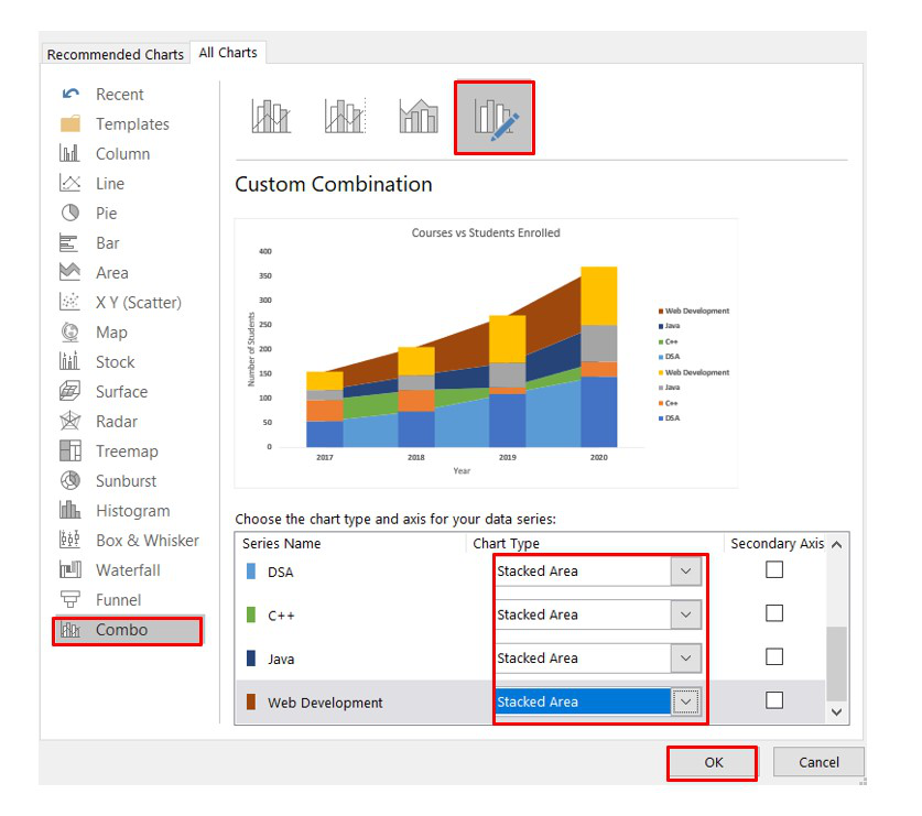
- Now, modify the newly added stacked column Chart Type from Stacked Column to “Stacked Area.” Don’t change the initial stack column Chart Type. You can easily differentiate them by seeing the colors in Series Name. The copied Series Name will have different colors compared to the original one.
Now, the stacked column of the copied data will be converted to a stack area. Now we can reduce the transparency and make it look like a Trendline. The steps are as follows :
- Delete the legends for the copied data.

- Now select the Stack Area and right-click on it. Select Format Data Series. You have to do this step for the four different stacked areas.

- It is the most important step. In the Format Data Series window, first, change the Fill from “Automatic” to “Solid Fill.”
Now, change the color according to the stacked chart for the data set. For example: For the course “DSA” the color is deep blue in the above chart. So, we need to change the color of the stacked area into deep blue and then increase the transparency to 60-65% so that it becomes blended. Repeat this step for all the stacked areas.

Finally, after all the modifications, the chart will look like this:

Method 3 :
Create the cloned version of the original chart as discussed in Method 2. Now, open the “Change Chart Type” window and then change the newly added stacked columns Chart Type to “Stacked Line with Markers.” Do it for all the copied data set.

You can change the color of the line and the line type by simply selecting and right-clicking on it and then select Format. It is recommended to use the same color as in the stacked column as we have discussed in Method 2.
Finally, after all the modifications and changing the chart style the chart looks like this:

Like Article
Suggest improvement
Share your thoughts in the comments
Please Login to comment...