Stacked Bar chart in pygal
Last Updated :
10 Jul, 2020
Pygal is a Python module that is mainly used to build SVG (Scalar Vector Graphics) graphs and charts. SVG is a vector-based graphics in the XML format that can be edited in any editor. Pygal can create graphs with minimal lines of code that can be easy to understand and write.
Stacked Bar Chart
This graph is similar to the bar chart but the only difference is that the values are stacked in it. It can be created using the StackedBar() method.
Syntax:
line_chart = pygal.StackedBar()
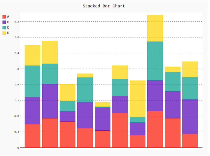
Example 1:
Python3
import pygal
import numpy
bar_chart = pygal.StackedBar()
bar_chart.title = 'Stacked Bar Chart'
bar_chart.add('A', numpy.random.rand(10))
bar_chart.add('B', numpy.random.rand(10))
bar_chart.add('C', numpy.random.rand(10))
bar_chart.add('D', numpy.random.rand(10))
bar_chart
|
Output:
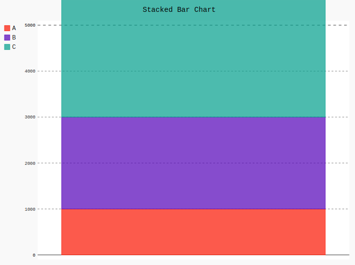
Example 2:
Python3
import pygal
bar_chart = pygal.StackedBar()
bar_chart.title = 'Stacked Bar Chart'
bar_chart.range = [0, 5000]
bar_chart.add('A', 1000)
bar_chart.add('B', 2000)
bar_chart.add('C', 3500)
bar_chart
|
Output:
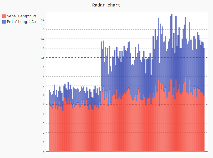
Example 3: Using Iris dataset
Python3
import pygal
import pandas
bar_chart = pygal.StackedBar()
bar_chart.title = 'Stacked Bar chart'
df = pandas.read_csv('Iris.csv')
bar_chart.add("SepalLengthCm", df['SepalLengthCm'])
bar_chart.add("PetalLengthCm", df['PetalLengthCm'])
bar_chart
|
Output:
Like Article
Suggest improvement
Share your thoughts in the comments
Please Login to comment...