If you are a machine learning enthusiast you must have done the Titanic project in which you would have predicted whether a person will survive or not.
Spaceship Titanic Project using Machine Learning in Python
In this article, we will try to solve one such problem which is a slightly modified version of Titanic which is the Spaceship Titanic. The problem statement of this project is like a spaceship having people from different planets on a voyage but due to some reasons, some people have been transported to another dimension. Our task is to predict who will get transported and who will remain on the spaceship.
Importing Libraries and Dataset
Python libraries make it easy for us to handle the data and perform typical and complex tasks with a single line of code.
- Pandas – This library helps to load the data frame in a 2D array format and has multiple functions to perform analysis tasks in one go.
- Numpy – Numpy arrays are very fast and can perform large computations in a very short time.
- Matplotlib/Seaborn – This library is used to draw visualizations.
- Sklearn – This module contains multiple libraries that have pre-implemented functions to perform tasks from data preprocessing to model development and evaluation.
- XGBoost – This contains the eXtreme Gradient Boosting machine learning algorithm which is one of the algorithms that helps us to achieve high accuracy on predictions.
Python3
import numpy as np
import pandas as pd
import matplotlib.pyplot as plt
import seaborn as sb
from sklearn.model_selection import train_test_split
from sklearn.preprocessing import LabelEncoder, StandardScaler
from sklearn import metrics
from sklearn.svm import SVC
from xgboost import XGBClassifier
from sklearn.linear_model import LogisticRegression
import warnings
warnings.filterwarnings('ignore')
|
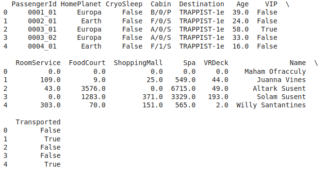
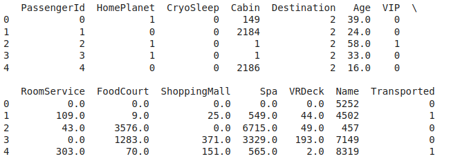
Now let’s load the dataset into the panda’s data frame and print its first five rows.
Python3
df = pd.read_csv('spaceship_titanic.csv')
df.head()
|
Output:
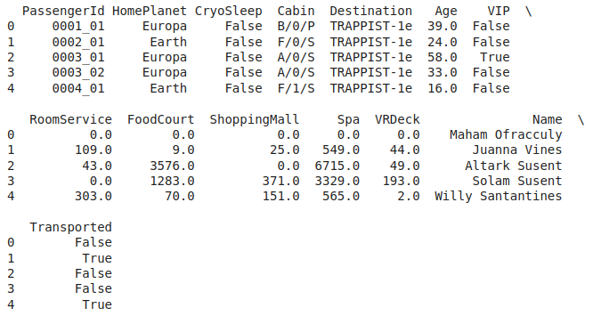
First five rows of the dataset
The data present in different columns have the meaning as follows:
| HomePlanet |
The home planet of the passenger |
| CryoSleep |
This is a kind of animation in which a passenger will be suspended during the whole voyage and remain confined to their cabin. |
| VIP |
Indicates whether the person has opted for VIP service or not. |
|
RoomService, FoodCourt,
shopping mall, Spa, VRDeck
|
Commodities on which passengers of the spaceship can choose to spend. |
| Transported |
This is the target column. This indicates whether the passenger has been transported to another dimension or not. |
Output:
(8693, 14)
Let’s check which column of the dataset contains which type of data.
Output:
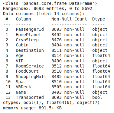
Information regarding data in the columns
As per the above information regarding the data in each column we can observe that there are null values in approximately all the columns.
Output:
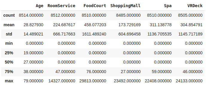
Descriptive statistical measures of the dataset
Data Cleaning
The data which is obtained from the primary sources is termed the raw data and required a lot of preprocessing before we can derive any conclusions from it or do some modeling on it. Those preprocessing steps are known as data cleaning and it includes, outliers removal, null value imputation, and removing discrepancies of any sort in the data inputs.
Python3
df.isnull().sum().plot.bar()
plt.show()
|
Output:
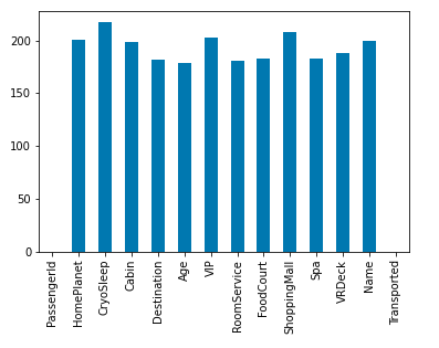
Bar chart for null value count column wise
One of the naive methods to perform the imputation is to simply impute null by mean in the case of continuous data and mode in the case of categorical values but here we will try to explore the relationship between independent features and then we’ll use them to impute the null values smartly.
Python3
col = df.loc[:,'RoomService':'VRDeck'].columns
df.groupby('VIP')[col].mean()
|
Output:

The average expenditure of travelers grouped by VIP status
As expected expenditure of VIP people is a little bit on the higher side as compared to those who are non-VIP.
Python3
df.groupby('CryoSleep')[col].mean()
|
Output:

The average expenditure of travelers grouped by CryoSleep status
Passengers in CryoSleep are confined to their cabins and suspended in the animation during the whole voyage so, they won’t be able to spend on the services available onboard. Hence we can simply put 0 in the case where CryoSleep is equal to True.
Python3
temp = df['CryoSleep'] == True
df.loc[temp, col] = 0.0
|
By using the relation between the VIP people and their expenditure on different leisures let’s impute null values in those columns.
Python3
for c in col:
for val in [True, False]:
temp = df['VIP'] == val
k = df[temp].mean()
df.loc[temp, c] = df.loc[temp, c].fillna(k)
|
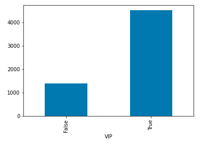
Now let’s explore the relationship between the VIP feature and HomePlanet Feature.
Python3
sb.countplot(data=df, x='VIP',
hue='HomePlanet')
plt.show()
|
Output:
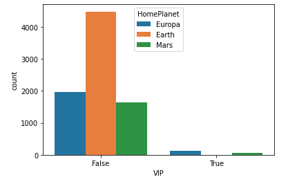
Bar graph depicting the relationship between VIP and home planet feature
Here we can observe that there is a significant relationship between being a non-VIP and coming from Earth and being a VIP and coming from Europa. The probability of these two events is high.
Python3
col = 'HomePlanet'
temp = df['VIP'] == False
df.loc[temp, col] = df.loc[temp, col].fillna('Earth')
temp = df['VIP'] == True
df.loc[temp, col] = df.loc[temp, col].fillna('Europa')
|
We will simply impute the age null values by mean but before that, we will check for outliers.
Python3
sb.boxplot(df['Age'],orient='h')
plt.show()
|
Output:
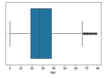
Boxplot to detect outlier’s in the age column
We will calculate the mean by excluding outliers and then impute the nulls by that value.
Python3
temp = df[df['Age'] < 61]['Age'].mean()
df['Age'] = df['Age'].fillna(temp)
|
Now let’s explore the relation between CryoSleep and Transported.
Python3
sb.countplot(data=df,
x='Transported',
hue='CryoSleep')
plt.show()
|
Output:

Bar graph depicting the relationship between Transported and CryoSleep feature
Here we can observe that those who are in CryoSLeep have higher chances of getting transported but we cannot use the relation between the target column and independent feature to impute it else we will have to face Data Leakage.
Python3
df.isnull().sum().plot.bar()
plt.show()
|
Output:

Remaining count of null values
So, there are still null values in the data. We tried to fill as many null values as possible using the relation between different features. Now let’s fill the remaining values using the Naive method of filling null values that we discussed earlier.
Python3
for col in df.columns:
if df[col].isnull().sum() == 0:
continue
if df[col].dtype == object or df[col].dtype == bool:
df[col] = df[col].fillna(df[col].mode()[0])
else:
df[col] = df[col].fillna(df[col].mean())
df.isnull().sum().sum()
|
Output:
0
Finally, we get rid of the null values from the dataset.
Feature Engineering
There are times when multiple features are provided in the same feature or we have to derive some features from the existing ones. We will also try to include some extra features in our dataset so, that we can derive some interesting insights from the data we have. Also if the features derived are meaningful then they become a deciding factor in increasing the model’s accuracy significantly.
Output:
First five rows of the dataset
Here we can see that PassengerId and Cabin seem to contain some information in the cubbed form. Like in the PassengerId RoomNo_PassengerNo is an expected way to write the clubbed information.
Python3
new = df["PassengerId"].str.split("_", n=1, expand=True)
df["RoomNo"] = new[0].astype(int)
df["PassengerNo"] = new[1].astype(int)
df.drop(['PassengerId', 'Name'],
axis=1, inplace=True)
|
Now we will fill each room no with the maximum number of passengers it is holding.
Python3
data = df['RoomNo']
for i in range(df.shape[0]):
temp = data == data[i]
df['PassengerNo'][i] = (temp).sum()
|
Now RoomNo does not have any relevance in getting Transported so, we’ll remove it.
Python3
df.drop(['RoomNo'], axis=1,
inplace=True)
sb.countplot(data=df,
x = 'PassengerNo',
hue='VIP')
plt.show()
|
Output:
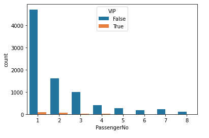
Comparison between the number of people living in sharing as compared to VIP people
Here it is clear that VIP people sharing a room is not that common.
Python3
new = df["Cabin"].str.split("/", n=2, expand=True)
data["F1"] = new[0]
df["F2"] = new[1].astype(int)
df["F3"] = new[2]
df.drop(['Cabin'], axis=1,
inplace=True)
|
Now let’s combine all the expenses into one column and name it as
Python3
df['LeasureBill'] = df['RoomService'] + df['FoodCourt']\
+ df['ShoppingMall'] + df['Spa'] + df['VRDeck']
|
Exploratory Data Analysis
EDA is an approach to analyzing the data using visual techniques. It is used to discover trends, and patterns, or to check assumptions with the help of statistical summaries and graphical representations. Although we have explored the relationship between different independent features in the data cleaning part up to a great extent there are some things that are still left.
Python3
x = df['Transported'].value_counts()
plt.pie(x.values,
labels=x.index,
autopct='%1.1f%%')
plt.show()
|
Output:
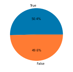
Pie chart for the number of data for each target
Data is balanced for both the classes which are good news with respect to the model’s training.
Python3
df.groupby('VIP').mean()['LeasureBill'].plot.bar()
plt.show()
|
Output:
Bar chart for an average expenditure of VIP and non-VIP person
High LeasureBill is normal for VIP category people.
Python3
for col in df.columns:
if df[col].dtype == object:
le = LabelEncoder()
df[col] = le.fit_transform(df[col])
if df[col].dtype == 'bool':
df[col] = df[col].astype(int)
df.head()
|
Output:
First five rows of the dataset
Now let’s check the data for the presence of any highly correlated features.
Python3
plt.figure(figsize=(10,10))
sb.heatmap(df.corr()>0.8,
annot=True,
cbar=False)
plt.show()
|
Output:

Heat map for the highly correlated features
From the above heat map, we can see that there are no highly correlated features which implies we are good to go for our model development part.
Model Training
Now we will separate the features and target variables and split them into training and the testing data by using which we will select the model which is performing best on the validation data.
Python3
features = df.drop(['Transported'], axis=1)
target = df.Transported
X_train, X_val,\
Y_train, Y_val = train_test_split(features, target,
test_size=0.1,
random_state=22)
X_train.shape, X_val.shape
|
Output:
((7823, 15), (870, 15))
Now, let’s normalize the data to obtain stable and fast training.
Python3
scaler = StandardScaler()
X_train = scaler.fit_transform(X_train)
X_val = scaler.transform(X_val)
|
Now let’s train some state-of-the-art machine learning models and compare them which fit better with our data.
Python3
from sklearn.metrics import roc_auc_score as ras
models = [LogisticRegression(), XGBClassifier(),
SVC(kernel='rbf', probability=True)]
for i in range(len(models)):
models[i].fit(X_train, Y_train)
print(f'{models[i]} : ')
train_preds = models[i].predict_proba(X_train)[:, 1]
print('Training Accuracy : ', ras(Y_train, train_preds))
val_preds = models[i].predict_proba(X_val)[:, 1]
print('Validation Accuracy : ', ras(Y_val, val_preds))
print()
|
Output:
LogisticRegression() :
Training Accuracy :  0.8690381072928551
Validation Accuracy :  0.8572836732098188

XGBClassifier() :
Training Accuracy :  0.9076025527327106
Validation Accuracy :  0.8802491838724721

SVC(probability=True) :
Training Accuracy :  0.8886869084652786
Validation Accuracy :  0.8619207614363845
Model Evaluation
From the above accuracies, we can say that XGBClassifier’s performance is the best among all the three models that we have trained. Let’s plot the confusion matrix as well for the validation data using the XGBClassifier model.
Python3
y_pred = models[1].predict(X_val)
cm = metrics.confusion_matrix(Y_val, y_pred)
disp = metrics.ConfusionMatrixDisplay(confusion_matrix=cm)
disp.plot()
plt.show()
|
Output:
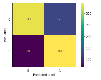
Classification report for the validation data
Here from the confusion matrix, we can conclude one thing the model is facing difficulty in predicting negative examples as negative.
Python3
print(metrics.classification_report
(Y_val, models[1].predict(X_val)))
|
Output:
              precision    recall  f1-score   support

           0       0.82      0.79      0.81       458
           1       0.78      0.80      0.79       412

    accuracy                           0.80       870
   macro avg       0.80      0.80      0.80       870
weighted avg       0.80      0.80      0.80       870
Share your thoughts in the comments
Please Login to comment...