Seaborn | Distribution Plots
Last Updated :
25 Aug, 2022
Seaborn is a Python data visualization library based on Matplotlib. It provides a high-level interface for drawing attractive and informative statistical graphics. This article deals with the distribution plots in seaborn which is used for examining univariate and bivariate distributions. In this article we will be discussing 4 types of distribution plots namely:
- joinplot
- distplot
- pairplot
- rugplot
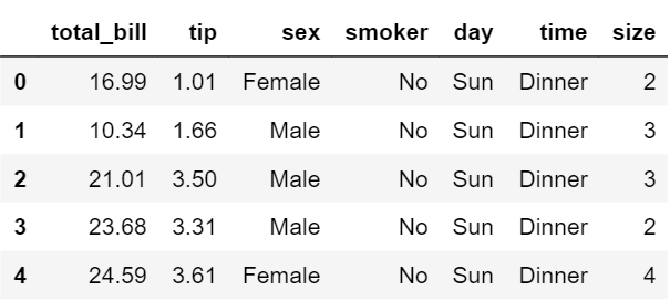
Besides providing different kinds of visualization plots, seaborn also contains some built-in datasets. We will be using the tips dataset in this article. The “tips” dataset contains information about people who probably had food at a restaurant and whether or not they left a tip, their age, gender and so on. Lets have a look at it. Code :
Python3
import seaborn as sns
import matplotlib.pyplot as plt % matplotlib inline
from warnings import filterwarnings
df = sns.load_dataset('tips')
df.head()
|
 Now, lets proceed onto the plots.
Displot
It is used basically for univariant set of observations and visualizes it through a histogram i.e. only one observation and hence we choose one particular column of the dataset. Syntax:
distplot(a[, bins, hist, kde, rug, fit, ...])
Example:
Python3
sns.set_style('whitegrid')
sns.distplot(df['total_bill'], kde = False, color ='red', bins = 30)
|
Output: 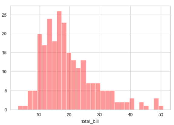 Explanation:
- KDE stands for Kernel Density Estimation and that is another kind of the plot in seaborn.
- bins is used to set the number of bins you want in your plot and it actually depends on your dataset.
- color is used to specify the color of the plot
Now looking at this we can say that most of the total bill given lies between 10 and 20.
Joinplot
It is used to draw a plot of two variables with bivariate and univariate graphs. It basically combines two different plots. Syntax:
jointplot(x, y[, data, kind, stat_func, ...])
Example:
Python3
sns.jointplot(x ='total_bill', y ='tip', data = df)
|
Output: 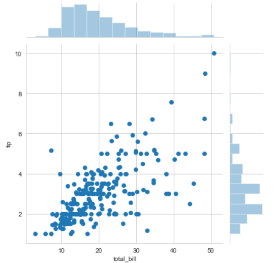
Python3
sns.jointplot(x ='total_bill', y ='tip', data = df, kind ='kde')
|
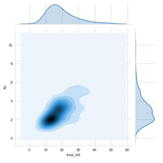 Explanation:
- kind is a variable that helps us play around with the fact as to how do you want to visualise the data.It helps to see whats going inside the joinplot. The default is scatter and can be hex, reg(regression) or kde.
- x and y are two strings that are the column names and the data that column contains is used by specifying the data parameter.
- here we can see tips on the y axis and total bill on the x axis as well as a linear relationship between the two that suggests that the total bill increases with the tips.
- hue sets up the categorical separation between the entries if the dataset.
- palette is used for designing the plots.
Like Article
Suggest improvement
Share your thoughts in the comments
Please Login to comment...