Seaborn | Categorical Plots
Last Updated :
08 Oct, 2021
Plots are basically used for visualizing the relationship between variables. Those variables can be either be completely numerical or a category like a group, class or division. This article deals with categorical variables and how they can be visualized using the Seaborn library provided by Python.
Seaborn besides being a statistical plotting library also provides some default datasets. We will be using one such default dataset called ‘tips’. The ‘tips’ dataset contains information about people who probably had food at a restaurant and whether or not they left a tip for the waiters, their gender, whether they smoke and so on.
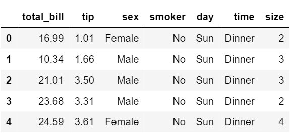
Let us have a look at the tips dataset.
Code
Python3
import seaborn as sns
from warnings import filterwarnings
df = sns.load_dataset('tips')
df.head()
|
Now lets proceed onto the plots so that we can how we can visualize these categorical variables.
Barplot
A barplot is basically used to aggregate the categorical data according to some methods and by default its the mean. It can also be understood as a visualization of the group by action. To use this plot we choose a categorical column for the x axis and a numerical column for the y axis and we see that it creates a plot taking a mean per categorical column.
Syntax:
barplot([x, y, hue, data, order, hue_order, …])
Example:
Python3
sns.set_style('darkgrid')
sns.barplot(x ='sex', y ='total_bill', data = df, palette ='plasma')
import numpy as np
sns.barplot(x ='sex', y ='total_bill', data = df,
palette ='plasma', estimator = np.std)
|
Output:
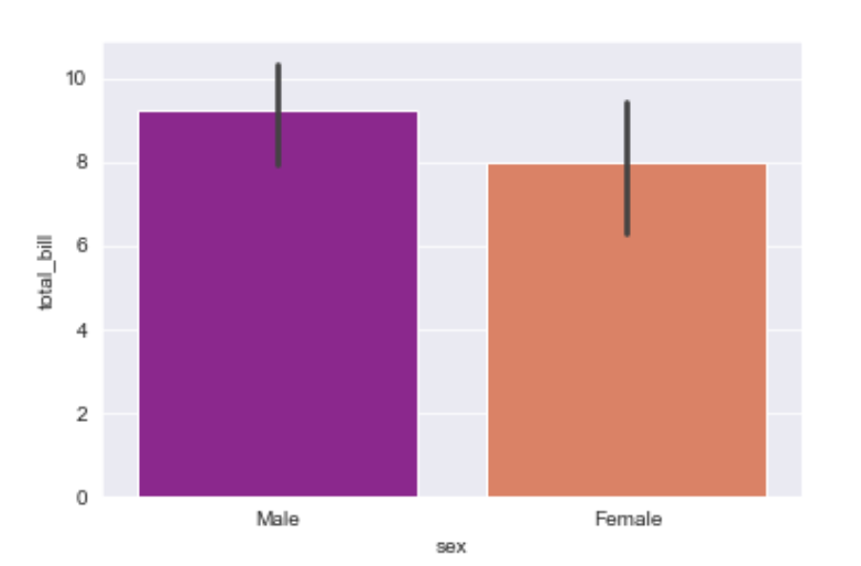
Explanation/Analysis
Looking at the plot we can say that the average total_bill for the male is more as compared to the female.
- palette is used to set the color of the plot
- estimator is used as a statistical function for estimation within each categorical bin.
Countplot
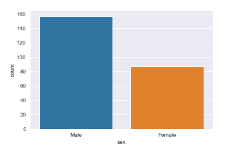
A countplot basically counts the categories and returns a count of their occurrences. It is one of the most simple plots provided by the seaborn library.
Syntax:
countplot([x, y, hue, data, order, …])
Example:
Python3
sns.countplot(x ='sex', data = df)
|
Output:
Explanation/Analysis
Looking at the plot we can say that the number of males is more than the number of females in the dataset. As it only returns the count based off a categorical column, we need to specify only the x parameter.
Boxplot
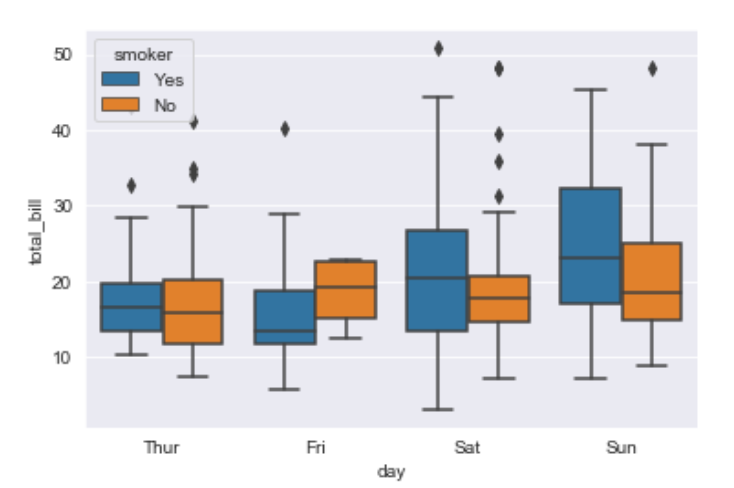
A boxplot is sometimes known as the box and whisker plot.It shows the distribution of the quantitative data that represents the comparisons between variables. boxplot shows the quartiles of the dataset while the whiskers extend to show the rest of the distribution i.e. the dots indicating the presence of outliers.
Syntax:
boxplot([x, y, hue, data, order, hue_order, …])
Example:
Python3
sns.boxplot(x ='day', y ='total_bill', data = df, hue ='smoker')
|
Output:
Explanation/Analysis –
x takes the categorical column and y is a numerical column.Hence we can see the total bill spent each day.”hue” parameter is used to further add a categorical separation. By looking at the plot we can say that the people who do not smoke had a higher bill on Friday as compared to the people who smoked.
Violinplot
It is similar to the boxplot except that it provides a higher, more advanced visualization and uses the kernel density estimation to give a better description about the data distribution.
Syntax:
violinplot([x, y, hue, data, order, …])
Example:
Python3
sns.violinplot(x ='day', y ='total_bill', data = df, hue ='sex', split = True)
|
Output:
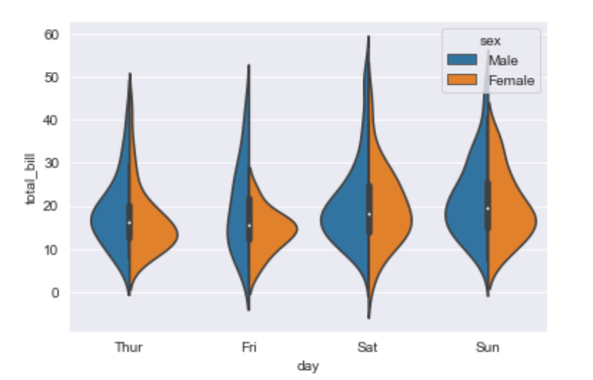
Explanation/Analysis –
- hue is used to separate the data further using the sex category
- setting split=True will draw half of a violin for each level. This can make it easier to directly compare the distributions.
Stripplot
It basically creates a scatter plot based on the category.
Syntax:
stripplot([x, y, hue, data, order, …])
Example:
Python3
sns.stripplot(x ='day', y ='total_bill', data = df,
jitter = True, hue ='smoker', dodge = True)
|
Output:
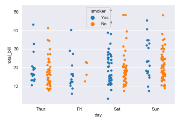
Explanation/Analysis –
- One problem with strip plot is that you can’t really tell which points are stacked on top of each other and hence we use the jitter parameter to add some random noise.
- jitter parameter is used to add an amount of jitter (only along the categorical axis) which can be useful when you have many points and they overlap, so that it is easier to see the distribution.
- hue is used to provide an addition categorical separation
- setting split=True is used to draw separate strip plots based on the category specified by the hue parameter.
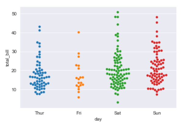
Swarmplot
It is very similar to the stripplot except the fact that the points are adjusted so that they do not overlap.Some people also like combining the idea of a violin plot and a stripplot to form this plot. One drawback to using swarmplot is that sometimes they dont scale well to really large numbers and takes a lot of computation to arrange them. So in case we want to visualize a swarmplot properly we can plot it on top of a violinplot.
Syntax:
swarmplot([x, y, hue, data, order, …])
Example:
Python3
sns.swarmplot(x ='day', y ='total_bill', data = df)
|
Output:
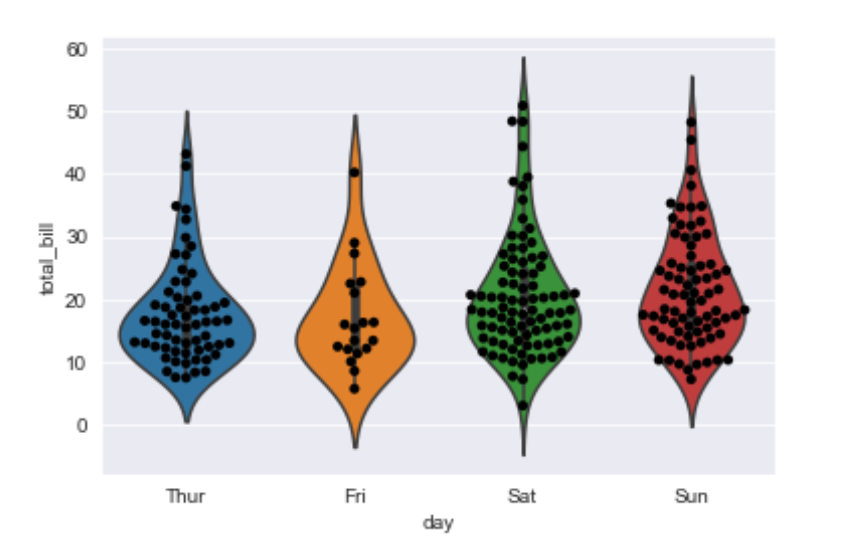
Example:
Python3
sns.violinplot(x ='day', y ='total_bill', data = df)
sns.swarmplot(x ='day', y ='total_bill', data = df, color ='black')
|
Output:
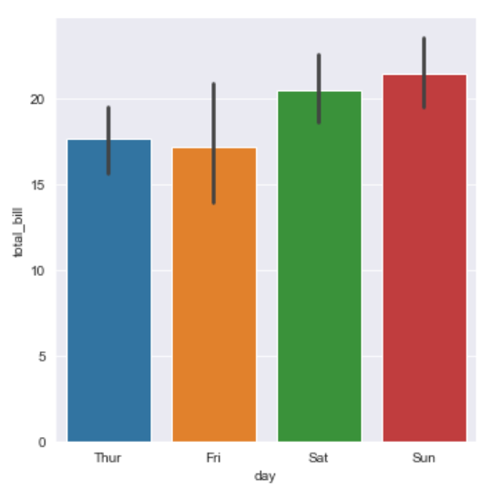
Factorplot
It is the most general of all these plots and provides a parameter called kind to choose the kind of plot we want thus saving us from the trouble of writing these plots separately. The kind parameter can be bar, violin, swarm etc.
Syntax:
sns.factorplot([x, y, hue, data, row, col, …])
Example:
Python3
sns.factorplot(x ='day', y ='total_bill', data = df, kind ='bar')
|
Output:
Like Article
Suggest improvement
Share your thoughts in the comments
Please Login to comment...