Scatter plot using Plotly in Python
Last Updated :
11 Feb, 2024
Plotly Python is a library which is used to design graphs, especially interactive graphs. It can plot various graphs and charts like histogram, barplot, boxplot, spreadplot and many more. It is mainly used in data analysis as well as financial analysis. Plotly python is an interactive visualization library.
Scatter Plot
A scatter plot is a diagram where each value is represented by the dot graph. Python Scatter plot needs arrays for the same length, one for the value of x-axis and other value for the y-axis. Each data is represented as a dot point, whose location is given by x and y columns. It can be created using the scatter() method of plotly.express. PLot scatter plot allows for interactive exploration.
Syntax: plotly.express.scatter(data_frame=None, x=None, y=None, color=None, symbol=None, size=None, hover_name=None, hover_data=None, custom_data=None, text=None, facet_row=None, facet_col=None, facet_col_wrap=0, error_x=None, error_x_minus=None, error_y=None, error_y_minus=None, animation_frame=None, animation_group=None, category_orders={}, labels={}, orientation=None, color_discrete_sequence=None, color_discrete_map={}, color_continuous_scale=None, range_color=None, color_continuous_midpoint=None, symbol_sequence=None, symbol_map={}, opacity=None, size_max=None, marginal_x=None, marginal_y=None, trendline=None, trendline_color_override=None, log_x=False, log_y=False, range_x=None, range_y=None, render_mode=’auto’, title=None, template=None, width=None, height=None)
Plotly Express Scatter Plot
Using px.scatter, every data point is depicted as a marker on the plot, and its position is determined by the values in the x and y columns of the dataset.
The code imports the plotly.express library and plot scatter plot of the Iris dataset. The Iris dataset is a classic dataset in machine learning that contains measurements of the sepal length, sepal width, petal length, and petal width of 150 iris flowers.
Let’s take sepal width on the x-axis and the sepal length on the y-axis.
Python3
import plotly.express as px
df = px.data.iris()
fig = px.scatter(df, x="sepal_width", y="sepal_length")
fig.show()
|
Output:

plotly scatter plot
The purple dots represent the individual iris flowers, showcasing a positive correlation between sepal width and sepal length.
Plotly Scatter : Changing color
Color of dots of the scatter plot can be changed using the color argument of the scatter() method. Changing Color of the points according to particulary column. Here, let’s determine by the species column. This means that each data point in the scatter plot will be represented by its sepal width on the x-axis, sepal length on the y-axis, and the color will indicate the species of the iris flower.
Python3
import plotly.express as px
df = px.data.iris()
fig = px.scatter(df, x="sepal_width", y="sepal_length",
color="species")
fig.show()
|
Output:
.webp)
Plotly Scatter : Changing Size
The size of the dots of the scatter plot can be changed using the size argument of the scatter() method. The size parameter sets the size of the markers in the scatter plot based on the values in the specified column of the dataset here ‘petal_length’ is used.
The hover_data parameter is set to ‘petal_width’, which means that when you hover over any point in the scatter plot, a small pop-up or tooltip will appear, displaying the value of the ‘petal_width’ column for the corresponding data point.
Python3
import plotly.express as px
df = px.data.iris()
fig = px.scatter(df, x="sepal_width", y="sepal_length",
color="species", size='petal_length',
hover_data=['petal_width'])
fig.show()
|
Output:

Plotly Scatter : Changing Symbol
Python3
import plotly.express as px
df = px.data.iris()
fig = px.scatter(df, x="sepal_width", y="sepal_length",
color="species", size='petal_length',
symbol="species",
hover_data=['petal_width'])
fig.show()
|
Output:

Plotly Scatter : Plot Multiple Scatter Plot Python
To plot multiple scatter plots in Plotly Express with the Iris dataset, you can use the scatter_matrix function. This function creates a matrix of scatter plots, where each variable is plotted against every other variable.
Python3
import plotly.express as px
iris = px.data.iris()
fig = px.scatter_matrix(iris,
dimensions= ["sepal_length", "sepal_width", "petal_length", "petal_width"],
color="species")
fig.show()
|
Output:
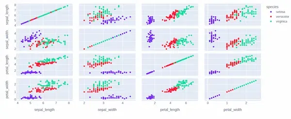
The scatter plot matrix shows the relationships between the four different measurements of the Iris flower dataset: sepal length, sepal width, petal length, and petal width. The color of each data point represents the species of the iris flower (setosa, versicolor, or virginica). Below are some insights received from the plot:
- Sepal length vs. sepal width: There is a positive correlation between sepal length and sepal width, meaning that flowers with wider sepals tend to also have longer sepals.
- Sepal length vs. petal length: There is also a positive correlation between sepal length and petal length, but it is weaker than the correlation between sepal length and sepal width. This means that there is more variability in petal length for a given sepal length.
- Sepal length vs. petal width: There is a very weak correlation between sepal length and petal width. This means that petal width is not a good predictor of sepal length.
- Sepal width vs. petal length: There is a positive correlation between sepal width and petal length, but it is weaker than the correlation between sepal length and sepal width.
- Sepal width vs. petal width: There is a weak positive correlation between sepal width and petal width. This means that flowers with wider sepals tend to also have wider petals, but there is some variability.
- Petal length vs. petal width: There is a positive correlation between petal length and petal width. This means that flowers with longer petals tend to also have wider petals. This is especially true for Iris virginica, which tends to have the largest petals overall.
Conclusion
In summary, Plotly Express is efficient for interactive and insightful visualization, showcasing relationships between variables through scatter plots and scatter matrices with color-coded and symbol-enhanced species differentiation.
Like Article
Suggest improvement
Share your thoughts in the comments
Please Login to comment...