React Suite Progress Component
Last Updated :
10 Apr, 2023
React Suite is a popular front-end library with a set of React components that are designed for the middle platform and back-end products. Progress component allows the user to display the current progress of an operation flow. We can use the following approach in ReactJS to use the React Suite Progress Component.
Progress.Line Props:
- classPrefix: It is used to denote the prefix of the component CSS class
- percent: It is used to set the completion percentage.
- showInfo: It is used to indicate whether to display text or not.
- status: It is used to set the status of the Progress.
- strokeColor: It is used to denote the line color.
- strokeWidth: It is used to set the line width.
- vertical: The progress bar is vertically displayed.
Progress.Circle Props:
- classPrefix: It is used to denote the prefix of the component CSS class
- gapDegree: It is used to denote the gap degree of the half-circle.
- gapPosition: It is used to denote the gap position.
- percent: It is used to set the completion percentage.
- showInfo: It is used to indicate whether to display text or not.
- status: It is used to set the status of the Progress.
- strokeColor: It is used to denote the line color.
- strokeLinecap: It is used to denote the end of different types of open paths
- strokeWidth: It is used to set the line width.
- trailColor: It is used to set the unfilled part color.
- trailWidth: It is used to set the unfilled part width.
Creating React Application And Installing Module:
Step 1: Create a React application using the following command:
npx create-react-app foldername
Step 2: After creating your project folder i.e. foldername, move to it using the following command:
cd foldername
Step 3: After creating the ReactJS application, Install the required module using the following command:
npm install rsuite
Project Structure: It will look like the following.

Project Structure
Example: Now write down the following code in the App.js file. Here, App is our default component where we have written our code.
Filename: App.js
javascript
import React from 'react'
import 'rsuite/dist/styles/rsuite-default.css';
import { Progress } from 'rsuite'
const { Line, Circle } = Progress
export default function App() {
return (
<div style={{
display: 'block', width: 700, paddingLeft: 30
}}>
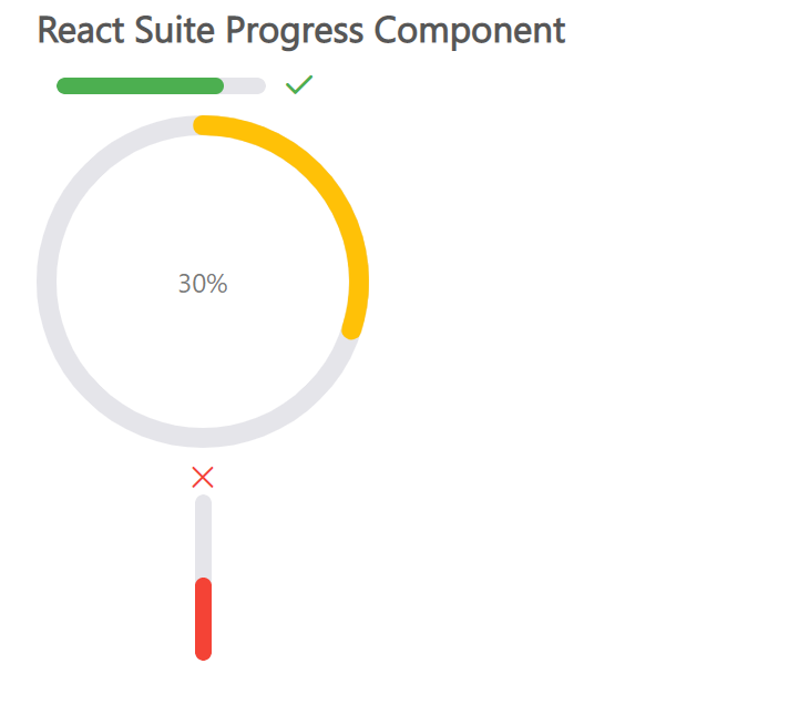
<h4>React Suite Progress Component</h4>
<div style={{ width: 200 }}>
<Line percent={80} status='success' />
<Circle percent={30} strokeColor="#ffc107" />
<Line vertical percent={50} status="fail" />
</div>
</div>
);
}
|
Step to Run Application: Run the application using the following command from the root directory of the project:
npm start
Output: Now open your browser and go to http://localhost:3000/, you will see the following output:
Example 2
In this example, we will learn , how can we make a Dynamic progress component. We will display, green colour and OK icon as soon as progress is completed.
Javascript
import "rsuite/dist/rsuite.min.css";
import React, { useState } from "react";
import { Progress, ButtonGroup, Row, Col, Button } from "rsuite";
import "rsuite/dist/rsuite.min.css";
const { Line, Circle } = Progress;
export default function App() {
const [percent, setPercent] = React.useState(30);
const decline = () => {
const value = Math.max(percent - 10, 0);
setPercent(value);
};
const increase = () => {
const value = Math.min(percent + 10, 100);
setPercent(value);
};
const status = percent === 100 ? "success" : null;
const color = percent === 100 ? "#52c41a" : "#3385ff";
return (
<div
style={{
display: "block",
width: 700,
paddingLeft: 30
}}
>
<h1 style={{ color: "green" }}>GeeksforGeeks</h1>
<h4>React Suite Progress Component</h4>
<ButtonGroup>
<Button onClick={decline}>-</Button>
<Button onClick={increase}>+</Button>
</ButtonGroup>
<hr />
<div style={{ width: 120, marginTop: 10 }}>
<Progress.Circle
percent={percent}
strokeColor={color}
status={status}
/>
</div>
</div>
);
}
|
OUTPUT
Reference: https://rsuitejs.com/components/progress/
Like Article
Suggest improvement
Share your thoughts in the comments
Please Login to comment...