React Suite <Dropdown.Item> Props
Last Updated :
25 Jun, 2022
React Suite is a popular front-end library with a set of React components that are designed for the middle platform and back-end products.
Dropdowns are used to show different options to users to choose from. Users can select among them as per their choice. There are different ways of representing content in the dropdown. There are different props for each dropdown item for the user to design the menu accordingly.
<Dropdown.Item> Props:
- active: It is used to make the state active for the current option.
- children: It is used to denote the primary content.
- classPrefix: It is used to denote the prefix of the component CSS class.
- componentClass: It can be used as a custom element type for this component.
- disabled: It is used to disable the current option.
- divider: It is used to indicate whether to display the divider.
- eventKey: It is used to denote the value of the current option.
- icon: It is used to set the icon.
- onSelect: It is a function that is triggered on select of the current option.
- panel: It is used to display a custom panel.
- renderItem: It is used for the custom rendering item.
Approach: Let us create a React project and install React Suite module .Then we will create a UI that will showcase React Suite Dropdown Item Props.
Creating React Project:
Step 1: To create a react app, you need to install react modules through npx command. “npx” is used instead of “npm” because you will be needing this command in your app’s lifecycle only once.
npx create-react-app project_name
Step 2: After creating your react project, move into the folder to perform different operations.
cd project_name
Step 3: After creating the ReactJS application, Install the required module using the following command:
npm install rsuite
Project Structure: After running the commands mentioned in the above steps, if you open the project in an editor you can see a similar project structure as shown below. The new component user makes or the code changes, we will be performing will be done in the source folder.

Project Structure
Example 1: We are creating a UI that shows different React Suite Dropdown Items with its props.
App.js
import React from "react";
import { Dropdown } from 'rsuite'
import '../node_modules/rsuite/dist/rsuite.min.css';
import PageIcon from '@rsuite/icons/Page';
class App extends React.Component {
render() {
return (
<div style={{margin:100}}>
<h4>React Suite Dropdown Item Props</h4>
<br /><br />
<Dropdown title="Dropdown">
<Dropdown.Item >Item A</Dropdown.Item>
<Dropdown.Item >Item B</Dropdown.Item>
<Dropdown.Item icon={<PageIcon />}>
Icon Item
</Dropdown.Item>
<Dropdown.Item disabled>Disabled Item</Dropdown.Item>
<Dropdown.Item active>Active Item</Dropdown.Item>
</Dropdown>
</div>
);
}
}
export default App;
|
Step to Run Application: Run the application using the following command from the root directory of the project:
npm start
Output: Now open your browser and go to http://localhost:3000/, you will see the following output:
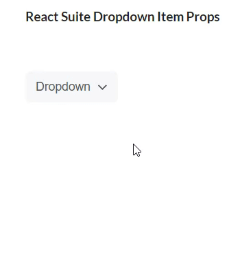
Dropdown Item Props
Example 2: We are creating a UI that shows different React Suite Dropdown Item with its props.
App.js
import React from "react";
import { Dropdown } from 'rsuite'
import '../node_modules/rsuite/dist/rsuite.min.css';
import PageIcon from '@rsuite/icons/Page';
class App extends React.Component {
render() {
return (
<div style={{margin:100}}>
<h4>React Suite Dropdown Item Props</h4><br /><br />
<Dropdown title="Dropdown">
<Dropdown.Item >Item A - 1</Dropdown.Item>
<Dropdown.Item >Item A - 2</Dropdown.Item>
<Dropdown.Item divider />
<Dropdown.Item disabled>Item B - 1</Dropdown.Item>
<Dropdown.Item disabled>Item B - 2</Dropdown.Item>
<Dropdown.Item divider />
<Dropdown.Item active>Item C - 1</Dropdown.Item>
</Dropdown>
</div>
);
}
}
export default App;
|
Output: Now open your browser and go to http://localhost:3000/, you will see the following output:
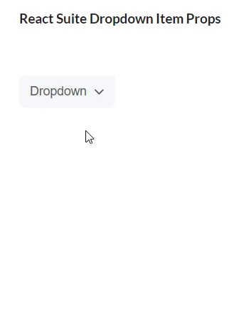
Dropdown with Divider Prop
Reference: https://rsuitejs.com/components/dropdown/#code-lt-dropdown-item-gt-code
Like Article
Suggest improvement
Share your thoughts in the comments
Please Login to comment...